Material Design
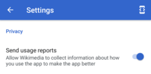
Material Design (codenamed Quantum Paper)[1] is a design language that Google developed in 2014. Expanding on the "card" motifs that debuted in Google Now, Material Design uses more grid-based layouts, responsive animations and transitions, padding, and depth effects such as lighting and shadows.

Google announced Material Design on June 25, 2014, at the 2014 Google I/O conference.
Overview
Designer Matías Duarte explained that, "unlike real paper, our digital material can expand and reform intelligently. Material has physical surfaces and edges. Seams and shadows provide meaning about what you can touch." Google states that their new design language is based on paper and ink but implementation takes place in an advanced manner.[2][3][4]
Material Design will gradually be extended throughout Google's array of web and mobile products, providing a consistent experience across all platforms and applications. Google has also released application programming interfaces (APIs) for third-party developers to incorporate the design language into their applications.[5][6][7] The main purpose of material design is creation of new visual language that combines principles of good design with technical and scientific innovation.
In 2018, Google detailed a revamp of the language, with a focus on providing more flexibility for designers to create custom "themes" with varying geometry, colors, and typography. Google released Material Theme Editor exclusively for the macOS design application Sketch.[8][9]
Implementation
As of 2019, most of Google's mobile applications for Android had applied the new design language, including Gmail, YouTube, Google Drive, Google Docs, Sheets and Slides, Google Maps, all of the Google Play-branded applications, and to an extent the Chrome browser and Google Keep. The desktop web-interfaces of Google Drive, Docs, Sheets, Slides and Inbox have incorporated it as well. More recently, it has started to appear in Chrome OS, such as in the system settings, file manager, and calculator apps.
The canonical implementation of Material Design for web application user interfaces is called Polymer.[10] It consists of the Polymer library, a shim that provides a Web Components API for browsers that do not implement the standard natively, and an elements catalog, including the "paper elements collection" that features visual elements of the Material Design.[11]
See also
References
- "Exclusive: Quantum Paper And Google's Upcoming Effort To Make Consistent UI Simple". Techcrunch. Retrieved 11 June 2014.
- "Google's new 'Material Design' UI coming to Android, Chrome OS and the web". Engadget. Retrieved 26 June 2014.
- "Google's New, Improved Android Will Deliver A Unified Design Language". Co.Design. Retrieved 26 June 2014.
- "Google Reveals Details About Android L at Google IO". Anandtech. Retrieved 26 June 2014.
- Chris Smith (30 July 2014). "Google's Material Design is about to change the way we look at the worldwide web". BGR.
- "We just played with Android's L Developer Preview". Engadget. AOL. Retrieved 26 June 2014.
- "Google's next big Android redesign is coming in the fall". The Verge. Vox Media. Retrieved 26 June 2014.
- Amadeo, Ron (2018-09-13). "Android 9 Pie, thoroughly reviewed". Ars Technica. Retrieved 2019-01-25.
- "Google makes its Material Design system easier to customize". TechCrunch. Retrieved 2019-01-25.
- "Polymer paper elements". Google. Archived from the original on 2015-02-14.
- "Material design with Polymer". Google. Archived from the original on 2014-08-20.
