Goode homolosine projection
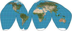
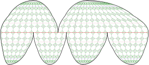
The Goode homolosine projection (or interrupted Goode homolosine projection) is a pseudocylindrical, equal-area, composite map projection used for world maps. Normally it is presented with multiple interruptions. Its equal-area property makes it useful for presenting spatial distribution of phenomena.


Development
The projection was developed in 1923 by John Paul Goode to provide an alternative to the Mercator projection for portraying global areal relationships. Goode offered variations of the interruption scheme for emphasizing the world’s land and the world’s oceans. Some variants include extensions that repeat regions in two different lobes of the interrupted map in order to show Greenland or eastern Russia undivided. The homolosine evolved from Goode’s 1916 experiments in interrupting the Mollweide projection.[1]
Because the Mollweide is sometimes called the "homolographic projection", Goode fused the two names "homolographic" and "sinusoidal" to create the name "homolosine".[2] Common in the 1960s, the Goode homolosine projection is often called an "orange-peel map" because of its resemblance to the flattened rind of a hand-peeled orange. In its most common form, the map interrupts the North Atlantic, the South Atlantic, the South Pacific, the Indian Ocean, and the entire east/west meridian of the map.
Details
Up to latitudes 40°44′11.8″N/S, the map is projected according to the sinusoidal projection’s transformation. The higher latitudes are the top sections of a Mollweide projection, grafted to the sinusoidal midsection where the scale of the two projections matches. This grafting results in a kink in the meridians along the parallel of the graft. The projection’s equal-area property follows from the fact that its source projections are themselves both equal-area.
See also
References
- Snyder, John Parr (1993). Flattening the earth : two thousand years of map projections. Chicago: University of Chicago Press. pp. 167–168. ISBN 9780226767475. OCLC 26764604.
- Monmonier, Mark S. (2015). Mapping It Out: Expository Cartography for the Humanities and Social Sciences. University of Chicago Press. p. 40. ISBN 9780226217857. OCLC 905918505.
Further reading
- Goode, J.P. (1925). "The Homolosine projection – a new device for portraying the Earth's surface entire". Annals of the Association of American Geographers. 15 (3): 119–125. doi:10.2307/2560812. JSTOR 2560812.
- Susan., Schulten (2001). The geographical imagination in America, 1880–1950. Chicago: University of Chicago Press. ISBN 9780226740553. OCLC 44578714.
External links
- Table of examples and properties of all common projections, from radicalcartography.net.
- Non-interrupted Goode Homolosine example (PDF)