Forest plot
A forest plot, also known as a blobbogram, is a graphical display of estimated results from a number of scientific studies addressing the same question, along with the overall results.[1] It was developed for use in medical research as a means of graphically representing a meta-analysis of the results of randomized controlled trials. In the last twenty years, similar meta-analytical techniques have been applied in observational studies (e.g. environmental epidemiology) and forest plots are often used in presenting the results of such studies also.

| Wikimedia Commons has media related to Forest plots. |
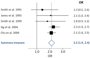
Although forest plots can take several forms, they are commonly presented with two columns. The left-hand column lists the names of the studies (frequently randomized controlled trials or epidemiological studies), commonly in chronological order from the top downwards. The right-hand column is a plot of the measure of effect (e.g. an odds ratio) for each of these studies (often represented by a square) incorporating confidence intervals represented by horizontal lines. The graph may be plotted on a natural logarithmic scale when using odds ratios or other ratio-based effect measures, so that the confidence intervals are symmetrical about the means from each study and to ensure undue emphasis is not given to odds ratios greater than 1 when compared to those less than 1. The area of each square is proportional to the study's weight in the meta-analysis. The overall meta-analysed measure of effect is often represented on the plot as a dashed vertical line. This meta-analysed measure of effect is commonly plotted as a diamond, the lateral points of which indicate confidence intervals for this estimate.
A vertical line representing no effect is also plotted. If the confidence intervals for individual studies overlap with this line, it demonstrates that at the given level of confidence their effect sizes do not differ from no effect for the individual study. The same applies for the meta-analysed measure of effect: if the points of the diamond overlap the line of no effect the overall meta-analysed result cannot be said to differ from no effect at the given level of confidence.
Forest plots date back to at least the 1970s. One plot is shown in a 1985 book about meta-analysis.[2]:252 The first use in print of the expression "forest plot" may be in an abstract for a poster at the Pittsburgh (US) meeting of the Society for Clinical Trials in May 1996.[3] An informative investigation on the origin of the notion "forest plot" was published in 2001.[4] The name refers to the forest of lines produced. In September 1990, Richard Peto joked that the plot was named after a breast cancer researcher called Pat Forrest and as a result the name has sometimes been spelled "forrest plot".[4]
Example

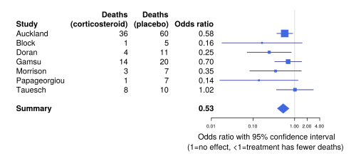
This blobbogram is from an iconic medical review; it shows clinical trials of the use of corticosteroids to hasten lung development in pregnancies where a baby is likely to be born prematurely. Long after there was enough evidence to show that this treatment saved babies' lives, the evidence was not widely known and the treatment was not widely used. After a systematic review made the evidence better-known, the treatment was used more, preventing thousands of pre-term babies from dying of infant respiratory distress syndrome. However, when the treatment was rolled out in lower- and middle-income countries, it was found that more pre-term babies died. It is thought that this may be because of the higher risk of infection, which is more likely to kill a baby in places with lower-quality medical care.[5] The current version of the medical review states that there is "little need" for further research into the usefulness of the treatment in higher-income countries, but further research is needed on how best to treat lower-income and higher-risk mothers, and optimal dosage.
Reading a forest plot
Study identities
Studies included in the meta-analysis and incorporated into the forest plot will generally be identified in chronological order on the left hand side by author and date. There is no significance given to the vertical position assumed by a particular study.
Standardized mean difference
The chart portion of the forest plot will be on the right hand side and will indicate the mean difference in effect between the test and control groups in the studies. A more precise rendering of the data shows up in number form in the text of each line, while a somewhat less precise graphic representation shows up in chart form on the right. The vertical line (y-axis) indicates no effect. The horizontal distance of a box from the y-axis demonstrates the difference between the test and control (the experimental data with control data subtracted out) in relation to no observable effect, otherwise known as the magnitude of the experimental effect.
Confidence interval whiskers
The thin horizontal lines—sometimes referred to as whiskers—emerging from the box indicate the magnitude of the confidence interval. The longer the lines, the wider the confidence interval, and the less reliable the data. The shorter the lines, the narrower the confidence interval and the more reliable the data.
If either the box or the confidence interval whiskers pass through the y-axis of no effect, the study data is said to be statistically insignificant.
Weight
The meaningfulness of the study data, or power, is indicated by the weight (size) of the box. More meaningful data, such as those from studies with greater sample sizes and smaller confidence intervals, is indicated by a larger sized box than data from less meaningful studies, and they contribute to the pooled result to a greater degree.
Heterogeneity
The forest plot is able to demonstrate the degree to which data from multiple studies observing the same effect, overlap with one another. Results that fail to overlap well are termed heterogeneous and is referred to as the heterogeneity of the data—such data is less conclusive. If the results are similar between various studies, the data is said to be homogeneous, and the tendency is for these data to be more conclusive.
The heterogeneity is indicated by the I2. A heterogeneity of less than 50% is termed low, and indicates a greater degree of similarity between study data than an I2 value above 50%, which indicates more dissimilarity.
See also
- Galbraith plot
- Funnel plot
- The Cochrane (organisation) logo is a forest plot
- A forest plot helps determine whether further research is needed
References
- Lalkhen, AG (2008). "Statistics V: Introduction to clinical trials and systematic reviews" (PDF). Continuing Education in Anaesthesia Critical Care & Pain. 8 (4): 143–146. doi:10.1093/bjaceaccp/mkn023. Retrieved 2009-11-11.
- Larry V. Hedges and Ingram Olkin (1985). Statistical Methods for Meta-Analysis. Orlando: Academic Press. ISBN 978-0-12-336380-0.
- Bijnens L, Collette L, Ivanov A, Hoctin Boes G, Sylvester R (1996). Can the forest plot be simplified without losing relevant information in meta-analyses? Communication at the meeting of the SCT, Pittsburgh, Pennsylvania, 5–8 May 1996. Controlled Clinical Trials 17(2S): 124.
- Steff Lewis & Mike Clarke (June 2001). "Forest plots: trying to see the wood and the trees". BMJ. 322 (7300): 1479–1480. doi:10.1136/bmj.322.7300.1479. PMC 1120528. PMID 11408310.
- Iain Chalmers (October 4, 2016). "Should the Cochrane logo be accompanied by a health warning?".