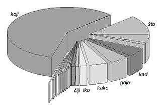
Frequency distribution
In statistics, a frequency distribution is a list, table or graph that displays the frequency of various outcomes in a sample.[1] Each entry in the table contains the frequency or count of the occurrences of values within a particular group or interval.
Example
Here is an example of a univariate (single variable) frequency table. The frequency of each response to a survey question is depicted.
| Rank | Degree of agreement | Number |
|---|---|---|
| 1 | Strongly agree | 20 |
| 2 | Agree somewhat | 30 |
| 3 | Not sure | 20 |
| 4 | Disagree somewhat | 15 |
| 5 | Strongly disagree | 15 |
A different tabulation scheme aggregates values into bins such that each bin encompasses a range of values. For example, the heights of the students in a class could be organized into the following frequency table.
| Height range | Number of students | Cumulative number |
|---|---|---|
| less than 5.0 feet | 25 | 25 |
| 5.0–5.5 feet | 35 | 60 |
| 5.5–6.0 feet | 20 | 80 |
| 6.0–6.5 feet | 20 | 100 |

A frequency distribution shows us a summarized grouping of data divided into mutually exclusive classes and the number of occurrences in a class. It is a way of showing unorganized data notably to show results of an election, income of people for a certain region, sales of a product within a certain period, student loan amounts of graduates, etc. Some of the graphs that can be used with frequency distributions are histograms, line charts, bar charts and pie charts. Frequency distributions are used for both qualitative and quantitative data.
Construction
- Decide the number of classes. Too many classes or too few classes might not reveal the basic shape of the data set, also it will be difficult to interpret such frequency distribution. The maximum number of classes may be determined by formula: or (approximately) where n is the total number of observations in the data. (The latter will be much too large for large data sets such as population statistics.)
- Calculate the range of the data (Range = Max – Min) by finding the minimum and maximum data values. Range will be used to determine the class interval or class width.
- Decide the width of the classes, denoted by h and obtained by (assuming the class intervals are the same for all classes).
Generally the class interval or class width is the same for all classes. The classes all taken together must cover at least the distance from the lowest value (minimum) in the data to the highest (maximum) value. Equal class intervals are preferred in frequency distribution, while unequal class intervals (for example logarithmic intervals) may be necessary in certain situations to produce a good spread of observations between the classes and avoid a large number of empty, or almost empty classes.[2]
- Decide the individual class limits and select a suitable starting point of the first class which is arbitrary; it may be less than or equal to the minimum value. Usually it is started before the minimum value in such a way that the midpoint (the average of lower and upper class limits of the first class) is properly placed.
- Take an observation and mark a vertical bar (|) for a class it belongs. A running tally is kept till the last observation.
- Find the frequencies, relative frequency, cumulative frequency etc. as required.
Joint frequency distributions
Bivariate joint frequency distributions are often presented as (two-way) contingency tables:
| Dance | Sports | TV | Total | |
|---|---|---|---|---|
| Men | 2 | 10 | 8 | 20 |
| Women | 16 | 6 | 8 | 30 |
| Total | 18 | 16 | 16 | 50 |
The total row and total column report the marginal frequencies or marginal distribution, while the body of the table reports the joint frequencies.[3]
Applications
Managing and operating on frequency tabulated data is much simpler than operation on raw data. There are simple algorithms to calculate median, mean, standard deviation etc. from these tables.
Statistical hypothesis testing is founded on the assessment of differences and similarities between frequency distributions. This assessment involves measures of central tendency or averages, such as the mean and median, and measures of variability or statistical dispersion, such as the standard deviation or variance.
A frequency distribution is said to be skewed when its mean and median are significantly different, or more generally when it is asymmetric. The kurtosis of a frequency distribution is a measure of the proportion of extreme values (outliers), which appear at either end of the histogram. If the distribution is more outlier-prone than the normal distribution it is said to be leptokurtic; if less outlier-prone it is said to be platykurtic.
Letter frequency distributions are also used in frequency analysis to crack ciphers, and are used to compare the relative frequencies of letters in different languages and other languages are often used like Greek, Latin, etc.
See also
- Count data
- Cross tabulation
- Cumulative frequency
- Empirical distribution function
Notes
- Australian Bureau of Statistics, http://www.abs.gov.au/websitedbs/a3121120.nsf/home/statistical+language+-+frequency+distribution
- Manikandan, S (1 January 2011). "Frequency distribution". Journal of Pharmacology & Pharmacotherapeutics. 2 (1): 54–55. doi:10.4103/0976-500X.77120. ISSN 0976-500X. PMC 3117575. PMID 21701652.
- Stat Trek, Statistics and Probability Glossary, s.v. Joint frequency
External links

- Learn 7 ways to make frequency distribution table in Excel