Cartographic propaganda
Cartographic propaganda is a map created with the goal of achieving a result similar to traditional propaganda. The map can be outright falsified, or created using subjectivity with the goal of persuasion.[1] The idea that maps are subjective is not new; cartographers refer to maps as a human-subjective product and some view cartography as an "industry, which packages and markets spatial knowledge"[2] or as a communicative device distorted by human subjectivity.[3] However, cartographic propaganda is widely successful because maps are often presented as a miniature model of reality, and it is a rare occurrence that a map is referred to as a distorted model, which sometimes can "lie" and contain items that are completely different from reality.[4] Because the word propaganda has become a pejorative, it has been suggested that mapmaking of this kind should be described as “persuasive cartography,” defined as maps intended primarily to influence opinions or beliefs – to send a message – rather than to communicate geographic information.[5][6]
History
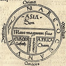
The T-O map is a historical example of cartographic propaganda during the Middle Ages. During the Renaissance maps became more widely used in general and their use began to take on a more cultural and political character, more similar to the cartographic propaganda that is seen today.[7] This use was especially practiced in Italy, where the competition for resources between city states in the central and northern Italian heartlands led to a precocious awareness of the practical utility of maps for military and strategic purposes, as well as civilian uses such as the planning of forts, canals, and aqueducts.[7] In sequence, the usage of cartographic propaganda has increased remarkably alongside the rise of the modern state.[8]
The interwar period in Germany fostered the development of cartographic propaganda.[9] German propagandists discovered the advantages of cartography in the re-representation of reality.[10] For the Nazi regime, the most important goal in producing maps was their efficiency in providing communication between the ruler and the masses.[10] The use of maps in this manner can be referred to as "suggestive cartography," as being capable of dynamic representations of power.
This period of geopolitical cartographic development was a continuous process associated with Nazis and World War II; the development of cartographic propaganda is closely related to the wider Nazi propaganda machine (Tyner 1974). There were three different categories of propaganda maps that were used by the Nazi propaganda machine; (1) maps used to illustrate the condition of Germany as a people and nation are identified; (2) maps taking an aim at the morale of the Allies via a mental offensive through maps specifically designed to keep the U.S. neutral in the war by changing the perception of threats; and (3) maps as blue-prints of the post-war world. During this period, this approach to cartography expanded to Italy, Spain, and Portugal as cartographers and propagandists found inspiration in the "positivistic trends of the German world."[11]
This more overt use of maps as propaganda continued into the Cold War period. Post-World War II U.S. cartographers modified projections to create a menacing image of the Soviet Union by making the Soviet Union appear larger and thus more threatening. This approach was also applied to other nearby communist countries, thereby accentuating the rise of communism as a whole. The April 1, 1946, issue of Time published a map entitled 'Communist Contagion,' which focused on the communist threat of the Soviet Union. In this map the strength of the Soviet Union was enhanced by a split-spherical presentation of Europe and Asia which made the Soviet Union seem larger as a result of the break in the center of the map. Communist expansion was also emphasized in this map as it presented the Soviet Union in a vivid red color, a color commonly associated with danger (and communism as a whole), and categorized neighboring states in terms of the danger of contagion, using the language of disease (states were referred to as quarantined, infected or exposed, adding to the presentation of these countries as dangerous or threatening). More generally, during the Cold War period, small-scale maps served to make dangers appear menacing; some maps were made to make Vietnam appear close to Singapore and Australia; or Afghanistan to the Indian Ocean.[12] Similarly, maps illustrating rocket positions used a polar azimuth projection with the North Pole at its center, which gave the map reader the perception that there existed a relatively small distance between the countries on opposing sides of the Cold War.[13]
Methods
Scale, map projection, and symbolization are characteristics of cartography that can be selectively applied that will therefore transform a map into cartographic propaganda.
Scale and generalization
Scales are used to relate distance because maps are usually smaller than the area they represent.[14] Because of the need for a scale, the cartographer often makes use of map generalization as a way to ensure clarity.[15] The size of the scale affects the use of generalization; a smaller scale forces a higher level of generalization.
There are two types of map generalization; geometric and content. The methods of geometric generalization are selection, simplification, displacement, smoothing, and enhancement.[16] Content generalization promotes clarity of the purpose or meaning of a map by filtering out details irrelevant to the map's function or theme.[17] Content generalization has two essential elements; selection and classification.[17] Selection serves to suppress information and classification is the choice of relevant features.
Map projection
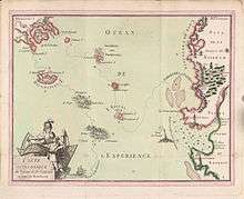
Map projection is the method of presenting the curved, three-dimensional surface of the planet into a flat, two-dimensional plane.[18] The flat map, even with a constant scale, stretches some distances and shortens others, and varies the scale from point to point.[18] Choice of map projection affects the map's size, shape, distance and/or direction. Map projection has been used to create cartographic propaganda by making small areas bigger and large areas bigger still.[19] Arno Peters' attack on the Mercator Projection in 1972 is an example of the subjectivity of map projection; Peters argued that it is an ethnocentric projection.[20]
Symbolization
Symbols are used in maps to complement map scale and projection by making visible the features, places, and other locational information represented on a map.[21] Because map symbolization describes and differentiates features and places, "map symbols serve as a geographic code for storing and retrieving data in a two-dimensional geographic framework."[21] Map symbolization tells the map reader what is relevant and what is not.[22] As a result, the selection of symbols can be done subjectively and with a propagandistic intent.
Historical themes
The map is a symbol of the state and has thus been used throughout history as a symbol of power and nationhood.[23] As a symbol the map has served many purposes of the state including the exertion of rule, legitimation of rule, assertion of national unity, and was even used for the mobilization of war.
Exerting imperial rule in medieval and renaissance Europe
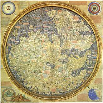
Cartographic propaganda in Medieval Europe spoke to the emotions rather than to reason and often reflected the prestige of empires.[24]
The Fra Mauro World Map (1450) was intended for display in Venice and shows the Portuguese discoveries in Africa and emphasizes the feats of Marco Polo.[24] The British East India Company commissioned a copy in 1804, implying that Britain was heir to the Portuguese empire.[25]
"The Americas" (1562) was created by Diego Gutiérrez and serves as a powerful celebration of Spain's New World Empire.[26] In this map, King Philip II is shown riding the turbulent Atlantic Ocean on a chariot; this illustration is reminiscent of the Roman God Neptune. References like this were intended to strengthen Spain's image in Europe and its claim to the Americas.
European rulers often tried to intimidate visiting envoys by displaying maps of their masters' lands and forts, with the implication that the maps were a first step towards conquest.[27] For example, in 1527, during festivities for the French ambassador in England, maps depicting aerial views of French towns being successfully besieged by the English decorated the walls of a Greenwich pavilion specially built for the ambassador's visit.[27]
Legitimizing colonial rule
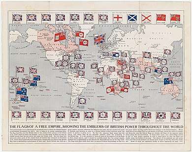
Colonial powers used the map as an intellectual tool to legitimize territorial conquest.[28] Ramsay Muir's Cambridge Modern Historical Atlas (Cambridge, 1912) compiled a selection of British triumphs. Less glorious and unsuccessful earlier struggles with the Mysore and the Marathas were ignored.[29]
Maps during the colonial period were also used to organize and rank the rest of the world according to the European powers.[29] Edward Quin used color to depict civilization in Historical Atlas in a Series of Maps of the World (London, 1830). In the introduction of the atlas Quin wrote, "we have covered alike in all the periods with a flat olive shading...barbarous and uncivilized countries such as the interior of Africa at the present moment."[29]
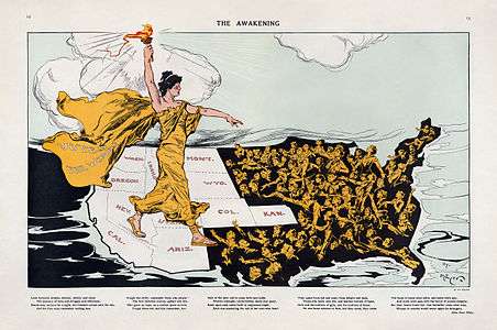
Asserting national unity
A single overview map of an entire country serves as an assertion of national unity.[30] The national atlas commissioned during the rule of Elizabeth I bound together maps of the various English counties and asserted their unity under Elizabeth's rule.[30] A few decades later, Henry VI of France celebrated the reunification of his kingdom through the creation of the atlas, "Le theatre francoys."[31] The atlas includes an impressive engraving proclaiming the glory of king and kingdom.[31]
Political use in the 19th and 20th centuries
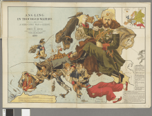
In the later nineteenth and twentieth centuries the political potential of cartographic shapes became used more widely and began to be used for more blatantly propagandistic purposes.[32] Map and globe can be used as symbols for abstract ideas because they are familiar to the masses and they harbor emotive connotations.[32] Maps are often incorporated as an emblematic element in a larger design or are used to provide the visual framework on which a scenario is played out.[32]
Fred W. Rose created two propaganda posters depicting the British general election in 1880 in which he used the map of England, "Comic Map of the British Isles indicating the Political Situation in 1880" and "The overthrow of His Imperial Majesty King Jingo I: A Map of the Political Situation in 1880 by Nemesis.".[33] He was also the creator of the 1899 "Angling in troubled waters".
Henri Dron used the figure of the world map in the 1869 propaganda poster, "L'Europe des Points Noirs."[34]
Coaxing during World War I and II
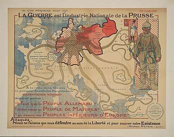
Cartographic propaganda during WWI and WWII was used to polarize states along the lines of war and did so by appealing to the masses. Fred Rose's "Serio-comic war map for the year 1877" portrayed the Russian Empire as an octopus stretching out its tentacles vying for control in Europe and was intended to solicit distrust of the Russian Empire within Europe.[35] This concept was used again in 1917 during WWI, when France commissioned a map which portrayed Prussia as the octopus.[35] The octopus appeared again in 1942 as (Vichy) France intended to sustain its citizens' morale and cast Winston Churchill as the octopus, a demonic green-faced, red-lipped, cigar-smoking creature attempting to seize Africa and the Middle East.[36]
Targets
Political persuasion often concerns territorial claims, nationalities, national pride, borders, strategic positions, conquests, attacks, troop movements, defenses, spheres of influence, regional inequality, etc.[37] The goal of cartographic propaganda is to mold the map’s message by emphasizing supporting features while suppressing contradictory information.[23] Successful cartographic propaganda is geared toward an audience.
Political leadership
Before the U.S. had entered into WWII, U.S. President Franklin D. Roosevelt came to possess a German map of Central and South America that depicted all Latin American republics reduced to “five vassal states...bringing the whole continent under their (Nazi) domination.”[38] FDR viewed this as an open threat to “our great life line, the Panama Canal" and therefore mean that “the Nazi design is not only against South America, but against the U.S. as well.”[38] This map was undoubtedly propaganda, yet its target audience could have either been the German or American public. The map was first discovered by the British and then brought to the attention of FDR. Although Berlin claimed that it was a forgery, the origin of the map is still unknown.[38]
Some Nazi maps were commissioned as an attempt to divert sympathy from Britain and deter Allied aggression. The Nazi map, "A Study in Empires" compares the size of Germany (264,300 sq. mi) to that of the British Empire (13,320,854 sq. mi), arguing that Britain, not Germany, is the aggressor nation.[39]
The Nazi regime also used maps to persuade the United States to remain neutral during WWII by flattering both isolationism and Monroe Doctrine militarism.[40] "Spheres of Influence," created and published in 1941, uses bold lines traced around sections of the globe to send a clear message to Americans: stay in your own hemisphere and out of Europe.[40]
Military leadership
Cartographic propaganda can be used to mislead the enemy and its military by distorting maps and the information they contain which is used in military strategic planning.[41]
In 1958 the Soviet Union launched the Soviet Map Distortion Policy which resulted in the thinning and distortion of detail in all unclassified maps.[42] Then in 1988 the Soviet Union’s chief cartographer, Viktor R. Yashchenko, admitted that Soviet maps had been faked for nearly 50 years.[43] The Soviet Union had deliberately falsified virtually all public maps of the country, misplacing streets, distorting boundaries, and omitting geographical features.[43] These were orders administered by the Soviet secret police. Western experts said the maps were distorted out of fear of aerial bombing or foreign intelligence operations.[43]
Referenda
Maps are often used to persuade the electorate to vote in a particular direction in referenda and plebicites and are most effective when portraying highly emotive issues. A recent example is the map produced by the Vote Leave campaign for Brexit, which aimed to persuade the voter of the vulnerability of the UK to uncontrolled immigration from the Middle East after a scenario of increased EU expansion. The use of graphical devices, such as the use of bold red arrows to suggest a threat of invasion, communicated a sense of fear and supported the theme of taking back control of borders.[44]
The masses
Cartographic propaganda during the Cold War often appealed to the fear of the masses. During the Cold War period, maps of “us” versus “them” were drawn to emphasize the threat represented by the USSR and its allies.[45]
R.M. Chapin, Jr. created the map, “Europe From Moscow,” in 1952. The map was drawn from a different perspective, from Moscow looking onward toward Europe which made it easy for the map reader to imagine (red) armies sweeping across Western Europe.[45]
The classroom
Adolf Hitler's schoolroom map of "Deutschland" in 1935 presented all the German-speaking areas surrounding Germany without borders, claiming them as part of the Reich.[46] This gave the impression that the Reich extended over Austria and the German-speaking areas in Poland, Czechoslovakia, and even France.[46]
M. Tomasik created the "Pictorial Map of European Russia," which was published in Warsaw in 1896 and 1903, provoked an image of Utopia in Russia. The map was intended for display in Polish schools and was meant to appeal directly to the emotions of teachers and through them to those they taught.[47] The map illustrated Russia as a nation rich in natural resources and failed to mention the famine that occurred only five years earlier (1891-5) during which half a million people had died.[47] The map also communicated the message of Russian unity; the nation's provinces were shown linked together by a new rail network and contributing to the nation's well-being.[47]
Border disputes
The intentional misrepresentation of national boundaries by nations in border disputes is sometimes called "cartographic aggression".[48] For instance, both China and India attempted to address the lack of treaties or agreed boundaries in the Sino-Indian border dispute by issuing official maps with displayed borders beyond what each nation controlled leading up to the 1962 Sino-Indian War.[49][50]
Libyan maps were issued from around 1969 showing the Aozou Strip, then-contested with Chad, as part of Libya. The dispute which led to long-drawn desultory warfare between the two countries was later settled by the International Court of Justice in 1994 which awarded the entire area to Chad.[51]
In the build-up to the Invasion of Kuwait, Iraqi maps were issued around 1990 that showed Kuwait as a province of Iraq.[52]
In late 2012, China began issuing passports that displays a map showing Aksai Chin, parts of Arunachal Pradesh, and disputed sections of the disputed sections of the South China Sea as part of China. In response, immigration officials in India, Vietnam, and the Philippines reacted by enacting a policy of inserting their own forms and maps into the travel documents of Chinese visitors.[53]
See also
- Cartographic censorship
- Fantasy map
- Mainland
- Omission of Taiwan from maps of China
- Omission of Tasmania from maps of Australia
- Satellite map images with missing or unclear data
References
- Tyner, 1974
- Sorrell, P.E. (December 1981). "Cartography: A manufacturing industry concerned with the Processing, Transformation, Packaging and Transportation of Spatial Data". The Cartographic Journal. 18 (2): 84–90. doi:10.1179/caj.1981.18.2.84.
- Wood, Michael (December 1972). "Human Factors in Cartographic Communication". The Cartographic Journal. 9 (2): 123–132. doi:10.1179/caj.1972.9.2.123.
- Boardman, David (1983). Graphicacy and Geography Teaching. London: Croom Helm. p. 129.
- Tyner, Judith A. (2015). "Persuasive Cartography.” In Cartography in the Twentieth Century, ed. Mark Monmonier, 1087-95. Vol. 6 of The History of Cartography. Chicago: University of Chicago Press.
- Mode, PJ. "Persuasive Cartography". The PJ Mode Collection. Cornell University Library. Retrieved 22 September 2015.
- Barber and Harper 2010, p. 16.
- Black 1997; Black 2008
- Boria 2008
- Speier, Hans (1941). "Magic Geography". Social Research. 8 (3): 310–330. JSTOR 40981787.
- Boria 2008, p. 287; Cairo 2006
- Black 1997; Black 2008
- Black 2008
- Monmonier 1996, p. 5.
- Monmonier 1996, p. 25.
- Monmonier 1996, p. 26.
- Monmonier 1996, p. 35.
- Monmonier 1996, p. 8.
- Monmonier 1996, p. 94.
- Crampton 2010
- Monmonier 1996, p. 18.
- Monmonier 1996, p. 19.
- Monmonier 1996
- Barber and Harper 2010, p. 52.
- "Fra Mauro World Map". Magnificent Maps: Power, Propaganda, and Art. The British Library. Retrieved 28 October 2012.
- "The americas". Magnificent Maps: Power, Propaganda, and Art. The British Library. Retrieved 28 October 2012.
- Barber and Harper 2010, p. 35.
- Monmonier 1996, p. 90.
- Black, Jeremy (2003). "Mapping the Past: Historical Atlases". Orbis. 47 (2): 277–293. doi:10.1016/S0030-4387(03)00002-4.
- Monmonier 1996, p. 88.
- Monmonier 1996, p. 89.
- Barber and Harper 2010, p. 161.
- Barber and Harper 2010, p. 162.
- Barber and Harper 2010, p. 163.
- Barber and Harper 2010, p. 164.
- Barber and Harper 2010, p. 165.
- Monmonier 1996, p. 87.
- Bratzel, John F.; Rout, Leslie B. (1985). "FDR and the 'Secret Map'". The Wilson Quarterly (1976-). 9 (1): 167–173. JSTOR 40257685.
- Monmonier 1996, p. 102.
- Monmonier 1996, p. 107.
- Monmonier 1996, p. 115.
- "Soviet Map Distortion Policy" (PDF). CIA.gov. Retrieved 28 October 2012.
- Keller, Bill (September 3, 1988). "Soviet Aide Admits Maps Were Faked for 50 Years". The New York Times. Retrieved 28 October 2012.
- Kent, Alexander (2016). "Political Cartography: From Bertin to Brexit". The Cartographic Journal. 53 (3): 199–201. doi:10.1080/00087041.2016.1219059.
- Walbert, David. "Map skills and higher-order thinking". Learn NC. Archived from the original on 2013-04-15.
- Barber and Harper 2010, p. 159.
- Barber and Harper 2010, p. 156.
- A Case of Cartographic Aggression by B. K. Nijm, The Professional Geographer, Vol.33, Issue 2, p. 251, May 1981
- TIME magazine article 1959
- Open Society Archives,15 March 1961, p. ii
- DARFUR : THE LONG ROAD TO DISASTER by Milland Burr and Robert O. Collins, Markus and Wiener Publishers, 2008, pp. 85–87 etc.
- San Francisco Chronicle book review 2005
- Newman, Scott (28 November 2012). "All Over The Map: Cartography And Conflict". NPR. Retrieved 29 May 2020.
Bibliography
- Barber, Peter and Tom Harper (2010). Magnificent Maps: Power, Propaganda, and Art. London: The British Library. ISBN 9780712350938.
- Black, J. (1997). Maps and politics. Chicago: University of Chicago Press.
- Black, J. (2008). Where to Draw the Line. History Today, 58(11), 50-55. ISSN 0018-2753 Questia 1G1-189160110
- Boria, Edoardo (2008). "Geopolitical Maps: A Sketch History of a Neglected Trend in Cartography". Geopolitics. 13 (2): 278–308. doi:10.1080/14650040801991522. S2CID 143488540.
- Cairo, Heriberto (2006). ""Portugal is not a Small Country": Maps and Propaganda in the Salazar Regime". Geopolitics. 11 (3): 367–395. doi:10.1080/14650040600767867. S2CID 143453025.
- Crampton, Jeremy W. and John Krygier. 2006. "An Introduction to Critical Cartography"
- Crampton, Jeremy (2010). A Critical Introduction to Cartography and GIS. Wiley Blackwell Publishing. ISBN 9781444317428
- Guntram, Henrik Herb (1997). Under the map of Germany: nationalism and propaganda 1918-1945. London: Routledge. ISBN 9780415127493
- Mode, PJ. (2015). "Persuasive Cartography". The PJ Mode Collection. Cornell University Library.
- Monmonier, Mark (1996). How to Lie with Maps. Chicago: The University of Chicago Press. ISBN 9780226534213
- Tyner, Judith Ann (1974). Persuasive Cartography. Los Angeles: University of California.
- Thrower, Norman J.W. (2007). Maps & Civilization. Chicago: University of Chicago.
Further reading
- Boggs, S. W. (1947). "Cartohypnosis". The Scientific Monthly. 64 (6): 469–476. Bibcode:1947SciMo..64..469B. JSTOR 19200.
- Davis, Bruce (1985). "Maps on Postage Stamps as Propaganda". The Cartographic Journal. 22 (2): 125–130. doi:10.1179/caj.1985.22.2.125.
- Demko, G.J., and W. Hezlep. "USSR: Mapping the Blank Spots." Focus 39 (Spring 1989): 20-21.
- Edney, Matthew H. (1986). "Politics, Science, and Government Mapping Policy in the United States, 1800–1925". The American Cartographer. 13 (4): 295–306. doi:10.1559/152304086783887262.
- Kent, Alexander (2016). "Political Cartography: From Bertin to Brexit". The Cartographic Journal. 53 (3): 199–201. doi:10.1080/00087041.2016.1219059.
- MacEachren, Alan M. (1994). Some Truth with Maps: A Primer on Symbolization and Design. Washington, D.C.: Association of American Geographers. ISBN 9780892912148.
- McDermott, Paul D. (1969). "Cartography in Advertising". Cartographica: The International Journal for Geographic Information and Geovisualization. 6 (2): 149–155. doi:10.3138/W35R-163R-T13Q-HPV4.
- Monmonier, Mark (1995). Drawing the Line: Tales of Maps and Cartocontroversy. New York: Henry Holt and Co. ISBN 9780805025811.
- Monmonier, Mark (1989). Maps with the News: The Development of American Journalistic Cartography. Chicago: University of Chicago Press. ISBN 9780226534114.
- Monmonier, Mark (1994). "The Rise of the National Atlas". Cartographica: The International Journal for Geographic Information and Geovisualization. 31: 1–15. doi:10.3138/T3NN-QL75-753L-25G7.
- Quam, Louis O. (1943). "The Use of Maps in Propaganda". Journal of Geography. 42: 21–32. doi:10.1080/00221344308986602.
- Robinson, Arthur H.; Morrison, Joel L.; Muehrcke, Phillip C.; Jon Kimerling, A.; Guptill, Stephen C. (1995). Elements of Cartography (6th ed.). New York: John Wiley. ISBN 9788126524549.
- Schmidt, Benjamin (1997). "Mapping an Empire: Cartographic and Colonial Rivalry in Seventeenth-Century Dutch and English North America". The William and Mary Quarterly. 54 (3): 549–578. doi:10.2307/2953839. JSTOR 2953839.
- Snyder, John P. (1993). Flattening the Earth: Two Thousand Years of Map Projections. Chicago: University of Chicago Press. ISBN 9780226767475.
- Tyner, Judith A. (1982). "Persuasive cartography". Journal of Geography. 81 (4): 140–144. doi:10.1080/00221348208980868.
- Woodward, David. "Map Design and the National Consciousness: Typography and the Look of Topographic Maps," Technical Papers of the American Congress on Surveying and Mapping (Spring 1992): 339-347.
External links
- Mark Monmonier, Writings
- The British Library "Magnificent Maps" Exhibition, 2010. British Library
- A.W.Ward, G.W.Prothero and Stanley Leathes (editors), E.A.Benians (assist.edit.). The Cambridge Modern Historical Atlas, 1912. Cambridge University Press 1912.
