Protected intersection
A protected intersection is an at-grade road junction in which cyclists and pedestrians are separated from cars. Vehicles turning right (in countries driving on the right, or left in countries driving on the left) are separated by a car length from crossing cyclists and pedestrians, providing increased reaction times and visibility. Drivers looking to turn right have better visibility to cyclists and pedestrians as they can look to the side for conflicts instead of over their shoulders.
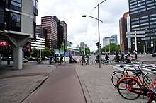
This type of intersection is common in the bike-friendly Netherlands and in outlying suburban areas in China . A few other countries and jurisdictions are beginning to install protected intersections similar to those in the Netherlands [1], including U.S. cities Salt Lake City,[2] Austin, Davis, Silver Spring[3], and Boston,[4] and Canadian cities Ottawa, Vancouver, and Waterloo.
Features
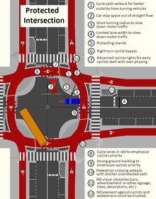
A number of features make this intersection safer. A corner refuge island, a setback crossing of the pedestrians and cyclists, generally between 1.5–7 metres of setback, a forward stop bar, which allows cyclists to stop for a traffic light well ahead of motor traffic who must stop behind the crosswalk. Separate signal staging or at least an advance green for cyclists and pedestrians is used to give cyclists and pedestrians no conflicts or a head start over traffic. The design makes a right turn on red, and sometimes left on red depending on the geometry of the intersection in question, possible in many cases, often without stopping.[5]
Strong ground marking is key to define the cycle lane path and its priority. Wide strips are painted aside the cycle way and 'shark teeth' (triangles with pointy end oriented toward the non priority vehicles) are used to remind priority to the right turning motorists and sometimes also on the motor lane inlet in the intersection.
In addition to ground marking, the cycle lane color play a role to remind cyclist priority, the lane losing its color if the designer decides that the cycle lane shall lose priority (which is uncommon on this type of intersection). In the Netherlands, the cycle way red color is not painted but embedded in asphalt to increase durability and reduce costs.
Also often the cycle lane is slightly raised in the crossing, to again invite motorists to decrease speed.
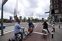
Cyclists ideally have a protected bike lane on the approach to the intersection, separated by a concrete median with splay curbs if possible, and have a protected bike lane width of at least 2 metres if possible (one way). In the Netherlands, most one way cycle paths are at least 2.5 metres wide.[6]
Reduced radius could increase difficulties to turn for larger vehicles (trucks and busses), so in some cases, partly 'climbable' islands have been devised, similarly to what could be found on center island of some small roundabout.
Protected roundabouts
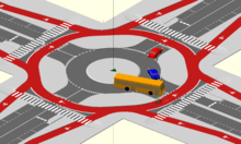
Protected roundabouts are a variation of protected intersections for lower traffic flow, without the traffic lights.[7]
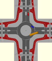
Alternative design with increased distance from intersection for cycle and pedestrian crossing and motorists having priority over cyclists may be safer and more practical with double direction cycle path.[8]
Design and publications
In The Netherlands, a not for profit organisation working on standardisation and research on traffic, transport and infrastructure, the CROW (dutch) [9], have published since 2006 a design manual for all cycling infrastructure, with an English version of the last edition of 2017.[10]
The concept of Dutch protected intersection got international public attention after an April 2011 blog post ‘State of art bikeway design, or is it ?’ by Mark Wagenbuur [11][12] on David Hembrow blog associated with a video [13] criticising a US junction design published in NACTO design guide, his post trying to explain the Dutch philosophy of pedestrian and cyclist friendly junctions. To emphasize his point, the video schematics were based upon dimensions and schematics of the NACTO publication.
A month later, Mark Wagenbuur published another post trying to clarify the concept and avoid misunderstanding: ‘State of the art bike way design - a further look ’ [14][15] with a new video [16].
In the USA, Nick Falbo, a member of a US planning firm which was originating the NACTO design, Alta planning+design, published in February 2014 a small web presentation site ‘protectedintersection.com’ [17] of his interpretation of Mark Wagenbuur posts.
In February 2014, David Hembrow published a blog post «The myth of standard Dutch junction» [18]
The same month, Mark Wagenbuur published on his own blog a new clarification post ‘Junction design in the Netherlands’[19] criticising some design he considers being a wrong interpretation of his posts.
Then Alta planning+design published in December 2015 a PDF presentation with a short USA history, schematics and dimensions and some examples of realisations of ‘protected intersections’ in the USA and Canada which may differ from the Dutch practice. [1]
See also
References
- "Evolution of the Protected Intersection" (PDF). Alta planning+design. December 2015.
- "Why Salt Lake City Chose to Build the First Protected Intersection for Bicycling in the U.S." CityLab. Retrieved 10 July 2015.
- "Montgomery Co. to get first 'protected intersection' on the East Coast". WTOP-FM. Retrieved 2020-02-08.
- "FOUR U.S. CITIES ARE RACING TO OPEN THE COUNTRY'S FIRST PROTECTED INTERSECTION". People for Bikes. Retrieved 10 July 2015.
- "Out of the Box Transcript.docx" (PDF). Retrieved 2018-04-04.
- "How wide is a Dutch cycle path? | BICYCLE DUTCH". Bicycledutch.wordpress.com. 2015-10-01. Retrieved 2018-04-04.
- Video:Dutch roundabout and blog post on the Youtube Chain and web site 'BicycleDutch'◘
- David Hembrow 2014 post about safer roundabouts, with 2018 update and statistics
- "CROW: Dutch technology platform for transport, infrastructure and public space".
- "Design manual for bicycle traffic". CROW. 2017.
- "blog post: State of art bikeway design, or is it? ?". A view from the cycle path. 7 April 2011.
- "blog post:State of art bikeway design, or is it?". Bicycle dutch. 7 April 2011.
- "Video: Junction design the Dutch - cycle friendly - way". BicycleDutch. 3 April 2011.
- "blog post: State of the art bike way design - a further look". A view from the cycle path. 5 May 2011.
- "blog post: State of the art bike way design - a further look". Bicycle dutch. 5 May 2011.
- "Video: Dutch junction design - safer for cyclists". BicycleDutch. 30 April 2011.
- "Protected Intersection". Nick Falbo. February 2014. Retrieved 8 January 2015.
- "blog post: The myth of standard Dutch junction". A view from the cycle path. February 2014.
- "Junction design in the Netherlands | BICYCLE DUTCH". Bicycledutch.wordpress.com. 23 February 2014. Retrieved 2018-04-04.