Pressure–volume diagram
A pressure–volume diagram (or PV diagram, or volume–pressure loop)[1] is used to describe corresponding changes in volume and pressure in a system. They are commonly used in thermodynamics, cardiovascular physiology, and respiratory physiology.
| Thermodynamics | ||||||||||||
|---|---|---|---|---|---|---|---|---|---|---|---|---|
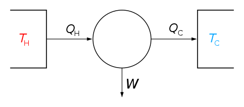 The classical Carnot heat engine | ||||||||||||
|
||||||||||||
| ||||||||||||
PV diagrams, originally called indicator diagrams, were developed in the 18th century as tools for understanding the efficiency of steam engines.
Description
A PV diagram plots the change in pressure P with respect to volume V for some process or processes. Typically in thermodynamics, the set of processes forms a cycle, so that upon completion of the cycle there has been no net change in state of the system; i.e. the device returns to the starting pressure and volume.
The figure shows the features of a typical PV diagram. A series of numbered states (1 through 4) are noted. The path between each state consists of some process (A through D) which alters the pressure or volume of the system (or both).
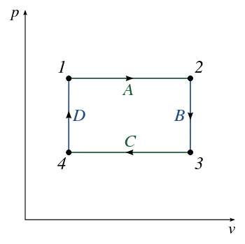
A key feature of the diagram is that the amount of energy expended or received by the system as work can be estimated as the area under the curve on the chart. However, note that this only applies when the vertical axis is pressure (not volume), and that pressure is equal to external pressure. An example is, during gas expansion, the work done by gas on the piston is equal to the integral of external pressure over the change in volume, but not the integral of internal pressure over the change in volume; If the external pressure is zero (as in gas expanding into vacuum), the work done by gas is zero.
For a cyclic diagram, the net work is that enclosed by the curve. In the example given in the figure, the processes 1-2-3 produce a work output, but processes from 3-4-1 require a smaller energy input to return to the starting position / state; thus the net work is the difference between the two.
Note that this figure is highly idealized, and a diagram showing the processes in a real device would tend to depict a more complex shape of the PV curve. (See section Applications, below).
History
.jpg)
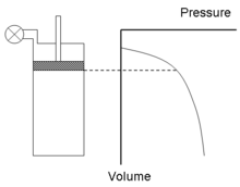
The PV diagram, then called an indicator diagram, was developed by James Watt and his employee John Southern (1758–1815) to improve the efficiency of engines.[2] In 1796, Southern developed the simple, but critical, technique to generate the diagram by fixing a board so as to move with the piston, thereby tracing the "volume" axis, while a pencil, attached to a pressure gauge, moved at right angles to the piston, tracing "pressure".
The gauge enabled Watt to calculate the work done by the steam while ensuring that its pressure had dropped to zero by the end of the stroke, thereby ensuring that all useful energy had been extracted. The total work could be calculated from the area between the "volume" axis and the traced line. The latter fact had been realised by Davies Gilbert as early as 1792 and used by Jonathan Hornblower in litigation against Watt over patents on various designs. Daniel Bernoulli had also had the insight about how to calculate work.
Watt used the diagram to make radical improvements to steam engine performance and long kept it a trade secret. Though it was made public in a letter to the Quarterly Journal of Science in 1822,[3] it remained somewhat obscure. John Farey, Jr. only learned of it on seeing it used, probably by Watt's men, when he visited Russia in 1826.
In 1834, Émile Clapeyron used a diagram of pressure against volume to illustrate and elucidate the Carnot cycle, elevating it to a central position in the study of thermodynamics.[4]
Later instruments (illus.) used paper wrapped around a cylindrical barrel with a pressure piston inside it, the rotation of the barrel coupled to the piston crosshead by a weight- or spring-tensioned wire.
In 1869 the British marine engineer Nicholas Procter Burgh wrote a full book on the indicator diagram explaining the device step by step. He had noticed that "a very large proportion of the young members of the engineering profession look at an indicator diagram as a mysterious production."[5]
Applications
Thermodynamics
PV diagrams can be used to estimate the net work performed by a thermodynamic cycle. The net work is the area enclosed by the PV curve in the diagram. This usage derived from the development of indicator diagrams which were used to estimate the performance of a steam engine.[6] Specifically, the diagram records the pressure of steam versus the volume of steam in a cylinder, throughout a piston's cycle of motion in a steam engine. The diagram enables calculation of the work performed and thus can provide a measure of the power produced by the engine.[7]
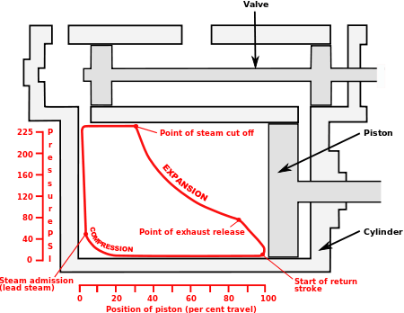
To exactly calculate the work done by the system it is necessary to calculate the integral of the pressure with respect to volume. One can often quickly calculate this using the PV diagram as it is simply the area enclosed by the cycle.
Note that in some cases specific volume will be plotted on the x-axis instead of volume, in which case the area under the curve represents work per unit mass of the working fluid (i.e. J/kg).
Medicine
In cardiovascular physiology, the diagram is often applied to the left ventricle, and it can be mapped to specific events of the cardiac cycle. PV loop studies are widely used in basic research and preclinical testing, to characterize the intact heart's performance under various situations (effect of drugs, disease, characterization of mouse strains),
The sequence of events occurring in every heart cycle is as follows. The left figure shows a PV loop from a real experiment; letters refer to points.
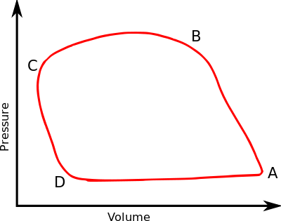 Example PV loop diagram of a mouse left ventricle
.svg.png) Human heart
Human heart
- A is the end-diastolic point; this is the point where contraction begins. Pressure starts to increase, becomes rapidly higher than the atrial pressure, and the mitral valve closes. Since pressure is also lower than the aortic pressure, the aortic valve is closed as well.
- Segment AB is the contraction phase. Since both the mitral and aortic valves are closed, volume is constant. For this reason, this phase is called isovolumic contraction.
- At point B, pressure becomes higher than the aortic pressure and the aortic valve opens, initiating ejection.
- BC is the ejection phase, volume decreases. At the end of this phase, pressure lowers again and falls below aortic pressure. The aortic valve closes.
- Point C is the end-systolic point.
- Segment CD is the isovolumic relaxation. During this phase, pressure continues to fall. The mitral valve and aortic valve are both closed again so volume is constant.
- At point D pressure falls below the atrial pressure and the mitral valve opens, initiating ventricular filling.
- DA is the diastolic filling period. Blood flows from the left atrium to the left ventricle. Atrial contraction completes ventricular filling.
As it can be seen, the PV loop forms a roughly rectangular shape and each loop is formed in an anti-clockwise direction.
Very useful information can be derived by examination and analysis of individual loops or series of loops, for example:
- the horizontal distance between the top-left corner and the bottom-right corner of each loop is the stroke volume[8]
- the line joining the top-left corner of several loops is the contractile or inotropic state.[9]
See external links for a much more precise representation.
See also
References
- Nosek, Thomas M. "Section 3/3ch5/s3ch5_16". Essentials of Human Physiology. Archived from the original on 2016-03-24.
- Bruce J. Hunt (2010) Pursuing Power and Light, page 13, The Johns Hopkins University Press ISBN 0-8018-9359-3
- (Anonymous), "Account of a steam-engine indicator," Quarterly Journal of Science, vol. 13, page 95 (1822).
- Clapeyron, E. (1834) "Mémoire sur la puissance motrice de la chaleur" (Memoir on the motive power of heat), Journal de l'École Royale Polytechnique, vol. 14, no. 23, pages 153–190, 160–162.
- Nicholas Procter Burgh. The Indicator Diagram Practically Considered. E. & F. N. Spon, 1869. p. 1
- Walter, John (2008). "The Engine Indicator" (PDF). pp. xxv–xxvi. Archived from the original (PDF) on 2012-03-10.
- Richard L. Hills and A. J. Pacey (January 1972) "The measurement of power in early steam-driven textile mills," Technology and Culture, vol. 13, no. 1, pages 25–43.
- "Diagram at uc.edu". Archived from the original on 2008-06-22. Retrieved 2006-12-12.
- Systolic dysfunction
Bibliography
- Cardwell, D. S. L. (1971). From Watt to Clausius: The Rise of Thermodynamics in the Early Industrial Age. Heinemann: London. pp. 79–81. ISBN 0-435-54150-1.
- Miller, D. P. (2011). "The Mysterious Case of James Watt's '"1785" Steam Indicator': Forgery or Folklore in the History of an Instrument?". International Journal for the History of Engineering & Technology. 81: 129–150. doi:10.1179/175812110x12869022260231.
- Pacey, A. J. & Fisher, S. J. (1967) "Daniel Bernoulli and the vis viva of compressed air", The British Journal for the History of Science 3 (4), p. 388–392, doi:10.1017/S0007087400002934
- British Transport Commission (1957) Handbook for Railway Steam Locomotive Enginemen, London : B.T.C., p. 81, (facsimile copy publ. Ian Allan (1977), ISBN 0-7110-0628-8)
External links
| Wikimedia Commons has media related to Pressure-volume diagrams. |
- Walter, John. "The Engine Indicator. A collectors' guide to mechanical and optical/mechanical designs, 1800 to date". Canadian Museum of Making.
- Diagram at hofstra.edu
- Diagram at cvphysiology.com
- Interactive demonstration at davidson.edu
- Lohff B (1999). "1899: the first mathematical description of the pressure-volume diagram by Otto Frank (1865-1944)". Sudhoffs Arch. 83 (2): 131–51. PMID 10705804.