Tactile paving
Tactile paving (also called Tenji blocks, truncated domes, detectable warnings, tactile tiles, tactile ground surface indicators, tactile walking surface indicators, or detectable warning surfaces) is a system of textured ground surface indicators found on footpaths, stairs and railway station platforms, to assist pedestrians who are vision impaired.
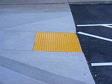
Tactile warnings provide a distinctive surface pattern of truncated domes, cones or bars, detectable by a long cane or underfoot, which are used to alert the vision-impaired of approaching streets and hazardous surface or grade changes. There is disagreement between the design and user community as to whether installing the aid inside buildings may cause a tripping hazard.
A system of tactile paving was first instituted in Japan at pedestrian crossings and other hazardous road situations; the United Kingdom, Australia and the United States picked up the standard in the early 1990s. Canada started incorporating them into transportation first in the 1990s, and then added them to other aspects of the built environment in the early 2000s.
History

Tactile paving was first developed by Seiichi Miyake in 1965.[1] The paving was first introduced in a street in Okayama city, Japan, in 1967. Its use gradually spread throughout Japan and then around the world. Tactile paving is widely used in subway stations and sidewalks.
Today, yellow tactile paving is ubiquitous in Japan. For aesthetic reasons, for example in front of hotels, the colour of the paving might be non-standard, to match the colour of the pavement or stone floor. Sometimes the paving contours are produced with steel stripes and dots.
Tactile tiles spread rapidly after their adoption by Japan National Railways (later known as Japan Railway). In 1985, the system was formally named "Hazard Guide for the Vision Impaired" (視覚障害者誘導用). Its modern form can be classified into two types: one has small, round bumps upon the surface of the block, which are felt through a sole, and the second is a directional aid, with long, slender bumps being installed on the surface.
However, many types have been manufactured and installed as an experiment. This has resulted in a situation which may be confusing for both the vision-impaired and the elderly. Usually the color of a tile is used to check the proper direction. If the color is not the usual one, there may be confusion. That has led to the standardisation of the system throughout Japan.
Now, the use of tactile tiles is spreading throughout the world. Many tactile tiles have been installed at subway stations and on sidewalks in Seoul, Korea. The installation in Seoul is more challenging than in Japan, because the surface of various sidewalks in Seoul is not flat, so there are many places where the meaning of a tactile tile is not clearly conveyed.
Tactile tiles were adopted at each facility used for the Sydney Olympic Games in 2000, and are ubiquitous in Australian public transport facilities. That trend has also been apparent in the UK, the US, and throughout the world.[2]
Tactile patterns
Blister tactile
These are used for pedestrian crossings. The purpose of the blister surface is to provide a warning to vision-impaired people who would otherwise, in the absence of a change of height of >25 mm, find it difficult differentiate between where the footway ends and the carriageway begins. The surface is therefore an essential safety feature for this group of road users at pedestrian crossing points where the footway is flush to the carriageway, to enable wheelchair users to cross unimpeded. The profile of the blister tactile surface consists of rows of flat-topped blisters in a square pattern. [3]
Offset blister tactile
The offset blister tactile is also known as the "platform edge (off-street) warning surface". The purpose of this surface is to warn vision-impaired people of the edge of all off-street railway platforms. The off-set blister tactile surface consists of flat-topped domes (blisters), spaced 66.5 mm from the center of one dome to the next one.
Tactile paving units can be manufactured in any suitable paving material and may be any color that provides a good contrast with the surrounding area, to assist partially-sighted people. The current guidance recommends that the off-set blister tactile surface be used for all off-street rail platforms including:
- Heavy rail platforms
- Off-street light rapid transit (LRT) platforms
- Underground platforms
It should not be used for on street (LRT) platforms[3]
Lozenge tactile
The lozenge tactile is also known as the platform edge (on-street) warning surface. The purpose of the platform edge (on-street) warning surface is to warn vision-impaired people that they are approaching the edge of an on-street light rapid transit (LRT) platform. The profile of the lozenge tactile warning surface comprises rows of 6±0.5-mm high lozenge shapes, which have rounded edges so as not to cause a trip hazard. The tactile paving units can be manufactured in any suitable paving material. The surface is usually buff colored, but can be any color, other than red, that provides a good contrast with the surrounding area, to assist partially-sighted people.
The lozenge tactile paving units should be installed to a depth of 400 mm parallel to the platform edge and set back a minimum of 500 mm from the edge. They should never be installed closer to the edge than that, because pedestrians may not have sufficient time to stop walking once they have detected the tactile warning surface.[3]
Corduroy hazard warning tactile
The purpose of the corduroy surface is to warn vision-impaired people of the presence of specific hazards: steps, level crossings, or the approach to an on-street light rapid transit (LRT) platform. It is also used where a footway joins a shared route. It conveys the message "hazard, proceed with caution".
The profile of the corduroy tactile surface comprises rounded bars running transversely across the direction of pedestrian travel. The bars are 6±0.5-mm high, 20-mm wide, and spaced 50 mm from the centre of one bar to the centre of the next. The tactile paving units can be manufactured in any suitable paving material. The surface is usually buff coloured, but can be any colour, other than red, that provides a good contrast with the surrounding area to assist partially sighted people.
The corduroy tactile can be used for any situation (other than pedestrian crossings) where vision-impaired individuals need to be warned of a hazard, such as:
- the top or bottom of stairs
- the foot of a ramp
- a level crossing
- where people may unintentionally walk directly on to the platform at a railway station
- where a footway joins a shared route[3]
Cycle way tactile
The purpose of the tactile surface used in conjunction with a segregated shared cycle track and footpath is to advise vision-impaired people of the correct side to enter. The purpose of the central delineator strip is to help vision-impaired pedestrians keep to the pedestrian side.
The cycle way tactile comprises a series of continuous raised, flat-topped bars, each 5±0.5-mm high, 30-mm wide and spaced 70 mm apart. The central delineator strip should be 12–20-mm high, 150-mm wide, with sloping sides and a flat top of 50 mm. The delineator strip should be made of a white material.
The tactile surface should be used on any segregated shared route where the pedestrian side is not physically separated from the cyclist side. The tactile surface should be laid at the beginning and end of the shared segregated route, at regular intervals along its length, and at any junctions with other pedestrians or cyclist routes.[3]
Directional or guidance tactile
The purpose of the guidance path surface is to guide vision-impaired people along a route when the traditional cues, such as a property line or kerb edge, are not available. It can also be used to guide people around obstacles, for example street furniture in a pedestrianized area. The surface has been designed so that people can be guided along the route either by walking on the tactile surface or by maintaining contact with a long white cane.
The guidance tactile compromises a series of raised, flat-topped bars running in the direction of pedestrian travel. The bars are 5.5±0.5-mm high, 35-mm wide, and spaced 45-mm apart. It is recommended that the guidance path tactile be in a contrasting color to the surrounding area, to assist partially-sighted people. The guidance surface is recommended for use in the following circumstances:
- Where the traditional guidance given by a standard footway between the property line and carriageway does not exist
- Where pedestrians need to be guided around obstacles
- Where a number of visually impaired people need to find a specific location and in transport terminals to guide people between facilities.[3]
Role of color and contrast
The United Kingdom Department for Transport guidance on the installation and use of tactile paving places a heavy emphasis on the role of contrast. The guidance repeatedly states that tactile paving should be chosen to provide strong color contrast with the surrounding paving material, because studies have shown that this aids partially-sighted individuals.[4] Most tactile paving is available in a range of colors and materials making good color contrast easy to achieve with appropriate choice of tactile paving.
There are only two cases where the color of a tactile has a specific meaning:
- Red is reserved for use with blister tactile to denote a controlled pedestrian crossing
- Buff blister tactile are reserved for use at uncontrolled pedestrian crossings
Where installation of tactile paving of a specified color e.g. red blister paving at a controlled crossing, would result in the tactile paving being of a similar color to the surrounding paving, a contrast strip of at least 150 mm should be installed to clearly demarcate the tactile area.
Detectable warning surface specifications
Size
- ISO/FDIS 23599, Assistive products for blind and vision-impaired people—Tactile walking surface indicators.
- CEN/TS 15209, Tactile paving surface indicators produced from concrete, clay and stone
Location
- ISO/FDIS 23599,Assistive products for blind and vision-impaired people—Tactile walking surface indicators.
- CEN/TS 15209, Tactile paving surface indicators produced from concrete, clay and stone
Dome size and spacing
- ISO/FDIS 23599,Assistive products for blind and vision-impaired people—Tactile walking surface indicators.
- CEN/TS 15209, Tactile paving surface indicators produced from concrete, clay and stone
Dome alignment
- ISO/FDIS 23599,Assistive products for blind and vision-impaired people—Tactile walking surface indicators.
- CEN/TS 15209, Tactile paving surface indicators produced from concrete, clay and stone
Opposing views
Arguments have been made that the money spent on installing tactile pavement could have been much better spent making other improvements that vision-impaired people have actually requested, such as faster repairs to broken pavement,[6] and that more thought should have been put into balancing the needs of vision-impaired pedestrians and mobility-impaired pedestrians, such as wheelchair and cane users who can trip on the bumps.[7]
By country
North America
Canada
In Canada, detectable warning surfaces have in recent years started to be found in many provincial and municipal building standards (supplements to the building codes). These standards require detectable warning surfaces in prescribed locations, such as on the slopes of pedestrian curb cuts/curb ramps, exterior and interior ramps, at the top of stairs and on landings, and at the edge of rail platforms. Detectable warning surfaces include both truncated domes and tactile bars.
One of the first architectural standards for buildings requiring the use of detectable warning surfaces was the City of London's Facility Accessibility Design Standards (FADS). The difference from the American ADA standards is the two different types of tactile surfaces required.[8] At stairs, detectable warning surfaces are required (long bars that in the United States are called "directional bars" but are placed at perpendicular to the main path of travel), whereas offset truncated dome detectable warning surfaces are used for ramps, elevated platforms (like those found at the edges of boarding platforms in transit facilities), and at other areas where pedestrian ways blend with vehicular ways.
Mexico
Tijuana uses landmark installations before crosswalks that are similar to those used in California. There are, however, no installations of tactile ground surface indicators.[9]
United States
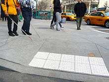
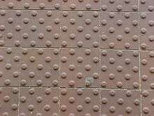
In the U.S., tactile warnings systems are required by the Americans with Disabilities Act of 1990 (ADA). The federal government, through studies and guidance provided by advocates and the Access Board,[10] now mandates detectable warnings in prescribed locations, such as on the surface of pedestrian curb cuts and at the edges of rail platforms. Detectable warnings have been required for the edges of rail platforms in the United States since 1991. Detectable warnings for pedestrian curb cuts were suspended for study in 1994, and became officially required in 2001.
The ADA Accessibility Guidelines (ADAAG) require these warnings on the surface of curb ramps, which remove a tactile cue otherwise provided by curb faces, and at other areas where pedestrian ways blend with vehicular ways. They are also required along the edges of boarding platforms in transit facilities and the perimeter of reflecting pools. The raised pattern of domes also known as truncated domes are the preferred design for detectable warning tiles and pavers.
The usage of tactile paving in many circumstances is required in the United States as part of the ADA.[11]
Adoption of truncated dome-mats has been controversial in some areas including Sacramento, California in 2001.[12] Specifications for current enforceable ADA detectable warnings truncated domes regulation for the general public, is the United States Department of Justice 28 CFR part 36 Revised as of July 1, 1994.
Excerpt from ADA 4.3 Accessible Routes, 4.3.6 Surface Textures, 4.5 Ground Floor Surfaces, 4.5.3 - Carpet, 4.5.4 - Gratings - Textures.
- "To date it appears none-of the detectable warnings manufactured, comply with 4.3.6 of the ADAAG. In addition, testing for being a non-hazardous surface placed in public walkways has not been conducted. In the appendix - some common sense reasons are illustrated about textures and their effects on the mobility impaired - A.4.5 Ground and Floor Surfaces. A4.5.1 General. People who have difficulty walking or maintaining balance or who use crutches, canes, or walkers, and those with restricted gaits are particularly sensitive to slipping and tripping hazards. For such people, a stable and regular surface is necessary for safe walking, particularly on stairs. Wheelchairs can be propelled most easily on surfaces that are hard, stable, and regular. Soft loose sand or gravel, wet clay, and irregular surfaces such as cobblestones can significantly impede wheelchair movement. 705 below has not been adopted by the DOJ for the general public and is therefore not enforced by the DOJ.
- Specifications for ADA Detectable Warning Truncated Domes
- United States Access Board – ADAAG Specifies:
- 705 Detectable Warnings
- 705.1 General. Detectable Warnings shall consist of a surface of truncated domes and shall comply with 705.
- 705.1.1 Dome Size. Truncated domes in a detectable warning surface shall have a base diameter of 0.9 inch (23 mm) minimum and 1.4 inch (36 mm) maximum, a top diameter of 50 percent of the base diameter minimum to 65 percent of the base diameter maximum, and a height of 0.2 inch (5.1 mm).
- 705.1.2 Dome Spacing. Truncated domes in a detectable warning surface shall have a center-to-center spacing of 1.6 inches (41 mm) minimum and 2.4 inches (61 mm) maximum, and a base-to-base spacing of 0.65 inch (17mm) minimum, measured between the most adjacent domes on a square grid.
- 705.1.3 Contrast. Detectable Warning Surfaces shall contrast visually with adjacent walking surfaces either light-on-dark, or dark-on-light."
Asia
China
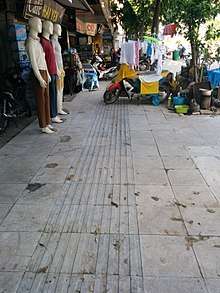
Tactile ground surface indicators are installed broadly in major cities such as Beijing, Shanghai, Dalian and Guangzhou. They can also be found winding through suburban areas surrounding major cities; the volume of blocks installed is second only to Japan. Both warning and directional blocks are used, and installed in a manner roughly the same as in Japan. Some areas have their own rules, however, such as in parts of Guangzhou where no blocks are installed in places where directional blocks intersect, a location where warning blocks would normally be installed. Block colors include yellow, grey, green, brown and beige. As in Korea, because installation methods are adopted from Japan, many of the same errors are found. Maintenance is also inconsistent; in many places one can see broken blocks that have been left unrepaired.[9]
Hong Kong
In Hong Kong, warning and directional blocks are found at and around rail stations, and warning blocks are installed before crosswalks and at medians in the city center. Blocks are yellow, silver, black, grey, green and brown. Installation methods are roughly the same as in Japan.[9]
Indonesia
Tactile directional blocks are being integrated into many Indonesian cities (such as Denpasar, Bali), although the implementation of the technology has not always been consistent.
In Jakarta, warning blocks indicating the entrance to parking lots are installed on the sidewalks in the Jalan Thamrin business area, an installation method unique to Indonesia. Blocks of this type are installed at nearly every parking lot entrance, making for a great many installations. Warning blocks are also installed before some crosswalks in the Jalan Thamrin area. No blocks are installed outside this area, however. Blocks are yellow in color.[9]
Japan
Although the tactile pavings were first installed in Okayama city in 1967 and were widely installed throughout Japan, tactile pavings were not standardized until 2001 by Japanese Industrial Standards (JIS).[13] Tactile pavers are installed at almost all curb ramps in Japan. Directional tactile pavers are installed on sidewalk and pedestrian crossings frequently used by vision-impaired people, such as a route between transit facilities and buildings such as hospitals, schools for vision-impaired, community centres, major shopping centres, government buildings and so on.
Since 1994, Japanese law require buildings exceeding floor area of 2,000 square metres (22,000 sq ft) to install and maintain tactile pavings near stairs, ramps, escalators and major pathways.[14] Schools, hospitals, theatres, arenas, community centres, exhibition halls, department stores, hotels, office, multidwelling units, or senior homes with floor space less than 2,000 square metres (22,000 sq ft), must spend reasonable effort to install and maintain tactile pavings inside the building, but it is not required. The original law was replaced by another one in 2006, with wider scope including outdoor areas.[15]
Also by law, all transit facilities in Japan must install directional tactile pavers connecting the path from public entrance to the boarding area or manned booth. All stairs, escalators and ramps must be marked with blister tactile pavers.[16] Airport boarding bridges are exempt from installing tactile pavers, given that handrails are installed and other technical requirements are met. Boarding areas for passenger ferries are also exempt if the area is exposed to waves and tactile pavers might create a trip hazard.
 Low-profile directional tactile markings are installed on busy pedestrian crossings in Japan.
- JIS compliant tactile paver.
 Older non-JIS compliant tactile paver.
 Tactile pavings installed on a platform at a Japanese train station. Horizontal tactile paving at the bottom indicates the 'inner' side, away from the rail tracks.
 Tactile pavings combined with platform screen doors.
- Portable tactile mat being used to block off an escalator under maintenance
 Installation of tactile paving on sidewalk.
 Tactile pavings with LED for people with limited vision.
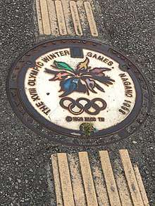 Tactile paving before and after a stylized 1998 Winter Olympics manhole cover in Nagano
Malaysia
In Kuala Lumpur, blocks are installed mainly at railway, LRT, MRT and monorail stations, and the surrounding sidewalks. In some locations, warning and directional blocks are installed as in Japan, while in other locations, directional indicators are carved into the pavement and warning blocks are installed where directional markers intersect and where pedestrians are to stop. The latter practice is often followed at railway and LRT stations, but the two types were found to coexist at one location. Blocks are yellow, silver and grey.[9] In addition, Pulau Tikus and Brickfields has installed tactile paving to helping vision-impaired people get to surrounding places.
Singapore
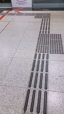
In Singapore, warning and directional blocks are installed primarily around subway stations and in some housing estates. Many crosswalks are also equipped with warning blocks. Installation rules are roughly the same as in Japan. Blocks are silver, yellow and grey.[9]
South Korea
In Korea, warning blocks and directional blocks are installed in accordance with Japanese rules in many locations including sidewalks, subway and rail stations and platforms, public facilities and large shopping centers. The configuration of the blocks, with the exception of some subway stations in Seoul, is the same as in Japan. Blocks are yellow, silver, brown, white and grey. Because installation methods have been adopted unchanged from Japan, many of the same errors are found.[9]
Taiwan
As in Korea and China, warning blocks and directional blocks are installed in accordance with rules nearly identical to those in Japan. Most blocks are yellow, with grey blocks also in use. Tactile ground surface indicators are frequently installed across the entire sloped area leading to a crosswalk, creating an obstacle for wheelchair users and others. In addition, although there are many stepped areas on sidewalks in city centers, very few are marked with warning blocks. This is dangerous for people with impaired vision, and fails to accommodate their needs.[9]
Thailand
In central Bangkok, warning and directional blocks are used on many sidewalks. Warning blocks are also installed at the top and bottom of stairways at subway and monorail stations. Blocks are not, however, installed at rail stations or rail platforms. Installation rules are roughly the same as in Japan. Blocks are yellow or grey. Many damaged blocks seem to be left unrepaired. Bangkok is a city with many vendors who set up their shops on sidewalks, which frequently cover the blocks.[9]
India
In the metropolitan cities of Mumbai and Delhi, warning and directional blocks, resembling those in Japan, have been installed in sidewalks leading to, and inside metro stations. Delhi Metro has the most accessible public transport infrastructure in the country. It has tactile paving from entry to exit. Such tiles can also be located on pavements near shopping plazas, and particularly around the Delhi University campus. The tiles are yellow. Although, the tiles within the metro stations are continually cared-for, the maintenance of those set over the sidewalks is generally neglected. The Jawaharlal Nehru University, Delhi also has tactile paving on its walkways.[17]
India has one of the largest populations of people with disabilities, but the development of pedestrian walkways with tactile paving is at infancy. In 2015, the Government of India has launched the Accessible India Campaign to make the nation's infrastructure more inclusive and accessible.
The upcoming Kochi Metro rail project, in state of Kerala, will also have entry to exit tactile paving, along the lines of the Delhi Metro.[18]
Australasia
Australia
The Australian Human Rights and Equal Opportunity Commission (HREOC) released guidelines on access to buildings and services[19] in 2007, under the Disability Discrimination Act 1992. This recommends the use of Australian Standard AS/NZS 1428.4:2002 Design for access and mobility - Tactile indicators. The standard specifies the use of truncated cones, rather than domes (as used in the USA). HREOC describes the use of the standard.[20]
In Sydney, blocks are installed at rail and light rail station platforms, before exterior stairways, before exterior obstacles, and at airports and bus stops. Warning blocks and directional blocks are similar to those used in Japan, and installed in the same way, including at the Opera House and other well-known tourist spots. Unlike many other countries, however, blocks are not installed before crosswalks. At some rail and light rail stations, directional blocks lead from at or near the ticket gates to the platform. Blocks are yellow, silver, blue, green and grey. Blue blocks are frequently used at rail stations while yellow is often used at light rail stations.[9]
New Zealand
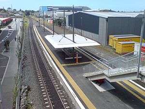
AS/NZS 1428.4.1:2009 provides the requirements relating to tactile ground surface indicators in New Zealand. Generally, the Standard (AS 1428.4.1:2009) makes available the provisions relating to tactile indicators within the built environment, while the New Zealand Transport Agency's RTS 14 'Guidelines for facilities for blind and vision impaired pedestrians' facilitates the requirements for tactile indicators within the road environment. Both apply various similar compliance prerequisites to tactile indicators, such as visual contrast, slip resistance in wet and dry conditions, the mean coefficient of friction, resistance to impact (shear strength), weathering resistance and UV stability, wear resistance, and general adhesion/bond strength, particularly when immersed in water.
In general, tactile indicators in New Zealand are required to:
- be detectable by tactile means;
- have a luminance-contrast to the surrounding substrate of:
- not less than 30% across its entire area, if the tactile indicators are the same colour as the underlying surface for integrated tactile indicators;
- not less than 45% if the tactile indicators are discrete (individually drilled and glued); and
- not less than 65% for a diameter 25±1 on the raised section for composite-construction (made of two materials that are different colours) tactile indicators.
- be placed across the direction of travel to ensure detectability; and
- have a top surface that doesn't protrude more than 4-5mm above the substrate.
Warning tactile indicators in New Zealand are mandatory at pedestrian cross-walks (also called pram ramps or kerb crossings in New Zealand), at the approaches to stairways, ramps, escalators and moving walkways, the approach to railway level crossings, bus hoarding areas, median cut-throughs, along the entire length of railway platform edges, and before any abrupt changes in grade to the walking surface (1:8 change with a kerb height of more than 70mm). Warning tactile indicators in New Zealand need to be installed to the full width of the approach to the obstacle/hazard so as to minimise the risk of a vision-impaired person stepping over or through the pad and encountering the obstacle. In any event, the warning tactile indicator pad should be no less than 900mm wide, except where that is physically impossible.
Directional tactile indicators are required to be installed at cross-walks, public transport access points and significant public facilities to provide directional guidance for vision-impaired people who have to deviate from the continuous accessible path of travel in order to gain access to the aforementioned. Directional tactile indicators should always point in the directional of travel to achieve this.
Europe
Belgium
In Brussels, blocks are installed before crosswalks, at bus stops and at subway and rail stations and platforms. Most blocks are grey, with yellow, silver and black blocks also used. Brussels has a mix of locations where the blocks (warning and directional) and installation methods are similar to those in Japan and locations where block configuration and installation methods are unique to Belgium.
One of the Belgium-specific blocks uses metal disks of roughly 85mm in diameter and 8mm in height. In Japan, the prescribed size of warning block protrusions is 22mm in diameter (±1.5mm) and 5mm in height, a size designed to promote mobility by the vision impaired without impeding the movement of wheelchair users or elderly pedestrians. Given the large size, height and slipperiness of the metal disks used in the Belgian blocks, they are likely to present a significant obstacle for wheelchair users, children and the elderly. In one part of the city, metal bars are embedded in the road surface where warning blocks would be expected—at the top of stairs and escalators, for example. Being only 3mm in height, these protrusions create no obstacle for wheelchair users or elderly pedestrians but also seem likely to go unnoticed by the vision impaired. In some places, similar metal bars are embedded in the road surface and serve a directional function. Rubber warning blocks are also sometimes installed at bus stops where directional blocks intersect. Brussels, therefore, presents a mix of block types and installation styles that may create confusion for people with impaired vision.[9]
France
In Paris, warning blocks are installed before crosswalks, at the tops and bottoms of stairs leading in and out of subway stations, and on subway and train platforms. In some areas, blocks serving a directional function are installed within crosswalks. Most blocks are white, but black, grey and pale yellow are also used. To protect the scenery, subway station signs and other prominent man-made objects are not installed near historical sites such as the Arc de Triomphe, the Paris National Opera, the Louvre or the Place de la Concorde. However, tactile ground surface indicators, in colors that stand out (white and yellow), are an exception. Since 2008, Paris has been emphasizing barrier-free accessibility, including such experimental efforts as the uniquely configured blocks installed at the Montparnasse rail station.[9]
Germany
Most railway stations and tram or bus stops are fitted with lines of tactile paving, similar in layout to those in Japan. Parallel lines indicate the direction of the line. The paved lines cross over at intersections. Tactile paving at those locations is usually in white or yellow. Some larger cities, such as Leipzig have installed tactile paving throughout their city centers, including normal signs requesting that the paving be kept free of obstacles.
Italy
From the scientific collaboration between the Italian Union of the Blind and Vision Impaired (O.N.L.U.S.) and industrial partners, from experimental results, was born the "LVE systems”, a tactile paving aimed at the mobility of people with vision acuity difficulties. It is capable to greater autonomy and security for people with vision acuity difficulties as shown by numerous tests of verification and testing conducted made by Italian Union of the Blind and Vision Impaired, and the associations linked to it.
Inspired by a few, clear design principles (universality of signs, safety, durability), the system allows endless applications in both exterior and interior.The modular elements that make up the path, with channels specially designed in shape, spacing, height and radius of the relief, and colour contrast, allow the blind and partially-sighted to navigate a route through their and soles, with a white stick, .
The LVE system is equipped with a tactile TAG-RFG (Radio frequency ground) that are picked up by an electronic baton.
Netherlands
In Amsterdam, blocks are installed before crosswalks, at medians, and on tram and subway platforms. Both warning blocks and directional blocks are installed according to the same rules as in Japan. Netherlands-specific blocks are used in addition to blocks configured like those in Japan. Most directional blocks are white or grey, while warning blocks are yellow or grey. Where directional and warning blocks are used together, the color of the blocks is often not uniform. Netherlands-specific blocks include some with thin recessed lines. With very little surface irregularity, such blocks are extremely difficult to detect with the feet or a white cane. Grooves carved into the pavement at subway station platforms are also difficult for people with impaired vision to recognize.[9]
Turkey
In Izmir, tactile ground surface indicators are installed at many locations throughout the city. They are prevalent in the Karsiyaka, Alsancak and Konak districts on sidewalks running along the Gulf of Izmir. They are also located around ferry buildings and metro stations. In Istanbul, the train stations have ongoing works for cautionary, tactile yellow lines. Within this framework, work is currently being done on the installation of tactile paving which guides vision-impaired people from when they enter the station until they board a train.[21]
United Kingdom
Tactile ground surface indicators are installed at many locations throughout Greater London.[22] Tactile ground surface indicators are installed in accordance with unique standards established by the United Kingdom's Department for Transport. Blocks with dots and blocks with bars are used, but both types are intended as warning blocks; neither serves a directional function. Blocks are mainly installed before crosswalks, at medians, at station platforms and at the tops and bottoms of stairways. Blocks with dots are for installations at crosswalks, medians and station platforms while blocks with bars are for installations at stairways. The color of blocks installed before crosswalks is also supposed to vary with crosswalk type: red blocks are to be used before controlled crossings,[23] such as zebra crossings (where pedestrians always have the right of way), pelican crossings (equipped with push-button traffic lights) and puffin crossings (with sensor-equipped push button traffic lights). Other colors (often buff) are to be used at other crosswalks where automobiles have the right of way.
The difference in color is intended to assist people with low vision to navigate the crosswalk safely, but many locations do not conform to the established colors. Different color blocks are also sometimes installed when repairs are made. Blocks are installed in an L-shaped configuration at crosswalks with push-button traffic signals, with the corner of the L marking the location of the push button. Blocks with bars are installed at the top and bottom of stairways such that the direction of the bars is parallel to the long dimension of the treads.[9]
Standards
- ISO/FDIS 23599,Assistive products for blind and vision-impaired persons—Tactile walking surface indicators.
- CEN/TS 15209, Tactile paving surface indicators produced from concrete, clay and stone
- Internal measures are not harmonized with the technical standards
- Australia / New Zealand AS/NZS 1428.4:2002 Design for access and mobility - Tactile indicators
- Germany DIN 32984: 2018-06 Bodenindikatoren im öffentlichen Raum (Entwurf)
- New Zealand NZTA RTS14 Guidelines for facilities for blind and vision impaired pedestrians
- Poland Wytyczne architektoniczne dla kolejowych obiektów obsługi podróżnych Ipi- 1. Polskie Linie Kolejowe S.A (Architectural guidelines for rail passenger service facilities Ipi- 1. Polish Railway Lines S.A.)
- United Kingdom BS 7997:2003 Products for tactile paving surface indicators. Specification
- Japan JIS T 9251:2001 Dimensions and patterns of raised of parts of tactile ground surface indicators for blind persons
References
- R Sakaguchi; S Takasu; T Akiyama. (2000). "Study concerning the colors of tactile blocks for the visually handicapped – Visibility for the visually handicapped and scenic congruence for those with ordinary sight and vision" (PDF). SEPT. Retrieved January 27, 2014.
- H. Sekiguchi & H. Nakayama (August 2002). On a history and a present circumstances of walking aid for persons with visual impairment in Japan (PDF). 5th International Conference on Civil Engineering. Manila, Philippines. Archived from the original (PDF) on March 27, 2014.
- Lee Kenny (January 28, 2005). "Tactile Paving Survey – Report Number HSL2005/07" (PDF). HSE.
- "Using tactile paving surfaces". GOV.UK.
- "ISO - International Organization for Standardization". ISO. Retrieved Mar 18, 2019.
- "Truncated-Dome Threat Still Looming". nfb.org. Retrieved Mar 18, 2019.
- Staff, At Network (Mar 28, 2012). "Ability Tools Weekly: The pros and cons of truncated domes, should one disability trump another?". Retrieved Mar 18, 2019.
- "Facilities Accessibility Design Standards (FADS)". London.ca. April 19, 2016.
- "Guidebook for the Proper Installation of Tactile Ground Surface Indicators (Braille Blocks): Common Installation Errors" (PDF). International Association of Traffic and Safety Sciences. April 2008. Archived from the original (PDF) on October 13, 2013.
- "Home - United States Access Board". access-board.gov.
- "Americans with Disabilities Act Accessibility Guidelines; Detectable Warnings, Joint final rule". December 23, 1998. Archived from the original on June 27, 2007. Retrieved June 18, 2007.
- Bashin, Brian (March 2001). "Truncated-Dome Threat Still Looming". The Braille Monitor.
- JIS T 9251 カネソウ総合カタログ2016
- 高齢者、身体障害者等が円滑に利用できる特定建築物の建築の促進に関する法律施行令 Archived 2007-09-30 at the Wayback Machine
- 高齢者、障害者等の移動等の円滑化の促進に関する法律施行令
- 移動等円滑化のために必要な旅客施設又は車両等の構造及び設備に関する基準を定める省令
- "Welcome to JNU News". www.jnu.ac.in. Retrieved 2017-02-09.
- Paul, John L. "Work on 11 stations nearing completion". The Hindu. Retrieved 2017-02-09.
- "Disability Standards". www.humanrights.gov.au. Dec 14, 2012. Retrieved Mar 18, 2019.
- "The good, the bad and the ugly – design and construction for access". humanrights.gov.au.
- "ISTANBUL ULASIM". www.istanbul-ulasim.com.tr. Retrieved 2015-12-03.
- Kavanagh, Amy (2018-07-21). "Tactile paving: The secret code that helps me get around". BBC News. Retrieved 2018-08-04.
- "Guidance on the use of Tactile Paving Surfaces" (PDF). GOV.UK.
External links
| Wikimedia Commons has media related to Tactile paving. |
- Federal Highway Administration: Detectable Warnings Memorandum
- United States Access Board: ADA Accessibility Guidelines, Detectable Warnings
- Canada City of London FADS
- External environments fact sheet
- Title II & III Regulation Amendment Regarding Detectable Warnings
- Mobility Research Centre New Zealand: Providing Innovative Tactile Solutions
- TacPro by Mobility Research Centre Australia: The Tactile Professionals
- Visul systems Ltd: Stick on Tactile Paving - Visul Systems