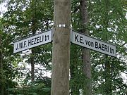
Street name sign
A street name sign is a type of traffic sign used to identify named roads, generally those that do not qualify as expressways or highways. Street name signs are most often found posted at intersections; sometimes, especially in the United States, in perpendicularly oriented pairs identifying each of the crossing streets.
Description


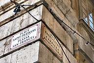
Modern street name signs may be mounted in various ways, such as attached to walls or on utility poles or smaller purpose-made sign poles posted on a streetcorner, or hung over intersections from overhead supports like wires or pylons. When attached to poles, they may be stacked onto each other in alternating directions or mounted perpendicular to each other, with each sign facing the street it represents. Until around 1900 in the USA, however, street name signs were often mounted on the corners of buildings, or even chiseled into the masonry, and many of those signs still exist in older neighborhoods. They are commonly used in France and the United Kingdom. The design and style of the sign is usually common to the district in which it appears.
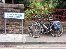
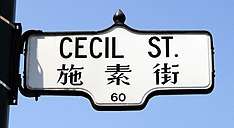
Some street name signs also indicate the range of house numbers found nearby, and/or the name or number of the local administrative or postal district. Some street name signs also indicate an alternative name for the street, such as "Fashion Avenue" for Seventh Avenue in New York City, or "Avenue of the Arts" for Huntington Avenue in Boston, Massachusetts. Multilingual signs are common and may be required by law in some areas, such as French-speaking regions of Canada. Multiingual signs are sometimes primarily used to promote local minority languages. See Bilingual sign for more information.
Occasionally some signs are a target for vandalism, for example in areas of language controversy; and signs on unusually or famously named streets (perhaps those containing a rude word) are especially liable to street sign theft.
In recent years, many US and Canadian cities have adopted the mast arm for traffic signal equipment; major intersections are marked with large signs mounted on the mast arms. This was started in the 1960s by the California Department of Transportation. Los Angeles and San Francisco started in the 1970s and recently New York City has introduced the bigger signs at its intersections. In 2013, New York City began to change street signs that have been previously used Highway Gothic font for a new one, Clearview, that include both upper and lower case letters, which is considered more readable.[1]
Color coding and typography
Usually, the color scheme used on the sign just reflects the local standard (for example, white letters on a green background are common throughout the US). However, in some cases, the color of a sign can provide information, as well. One example can be found in Minneapolis, Minnesota. Within its city limits, all roads designated as a snow emergency route use a blue sign, these are typically major arterial routes. Other roads have green signs. Other places sometimes use blue or white signs to indicate private roads.
As of 2009, the Manual on Uniform Traffic Control Devices (MUTCD) approved color schemes for street name signs including a green, blue, or brown background with white text, or a white background with black text.[2] Despite the MUTCD restriction only to the aforementioned color schemes, other color schemes are used in some cities; for example, the city of Mesa, Arizona uses ruby red colored street name signs at signalized intersections in the Fiesta District in the western part of the city. The city of Houston, Texas allows for street name signs in several of its neighborhoods (usually part of a management district, where property owners assess additional fees to themselves to pay for extra services) to be of significantly different color schemes and fonts than the citywide standard. Since the MUTCD guideline was adopted, some cities have begun transitioning from noncompliant colors, such as white on black in San Jose, California.
In 1952 in the UK, David Kindersley submitted a design, MoT Serif, to the British Ministry of Transport, which required new lettering to use on United Kingdom road signs. Although the Road Research Laboratory found Kindersley's design more legible, the all-capitals design with serifs was passed over in favour of that of Jock Kinneir and Margaret Calvert. Many of the street signs in Britain use Kindersley fonts.[3]
Gallery
- Street name signs
.jpg)
- Internally illuminated mast-mounted street sign in California
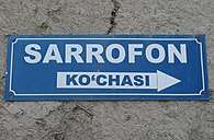 Example in Bukhara
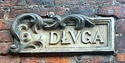 Street sign at Długa Street in Gdańsk
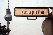 East Berlin street sign for the former Marx-Engels-Platz (1984)
.jpg) Sign in Zurich
Sign in Zurich- Historic Hungarian/German street sign in Bratislava
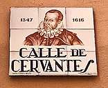
 Spanish street sign, Calle Laurel
- Haifa, Israel
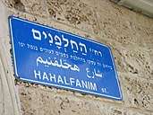 A street sign in Jaffa
- Street sign, Hong Kong
- Street sign, Macau
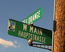 Bilingual sign in Fredericksburg, Texas
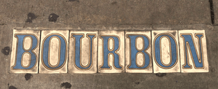 Tiles in the sidewalk mark many streets in the older neighborhoods of New Orleans
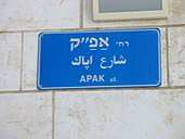 A street sign in Jaffa Israel
- A street sign in Montmartre, Paris
 Four and a half street in Berwick, Pennsylvania
.jpg) "President´s Corner" in Windhoek, Namibia
"President´s Corner" in Windhoek, Namibia- Street sign in São Paulo, Brazil
- Milwaukee
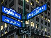 New York City
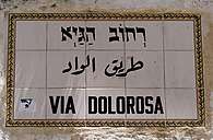
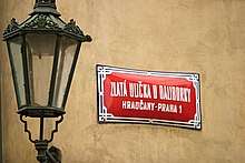 Street name sign in Prague, Czechia
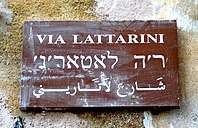
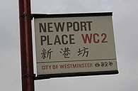 Bilingual street name sign in Chinatown in Westminster, London.
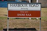 A bilingual street sign in Ulster Scots and English in Ballyhalbert, Northern Ireland, United Kingdom.
See also
- FHWA Series fonts
- List of public signage typefaces
- Street sign theft
- Traffic sign
References
- Bacho, Katia (June 24, 2013). "On the Street Clarity". The New Yorker (subscription needed). p. 30.
- "Manual on Uniform Traffic Control Devices 2009 Edition Chapter 2D. Guide Signs—Conventional Roads". Federal Highway Administration. Retrieved March 4, 2015.
- Richard Kindersley Studio official website
External links
| Wikimedia Commons has media related to Street signs. |
- Language of the Street - an analysis of street signs in Newcastle-upon-Tyne, Colchester, London and other UK cities.
- Street signs from "The ultimate street signs and house numbers site"
