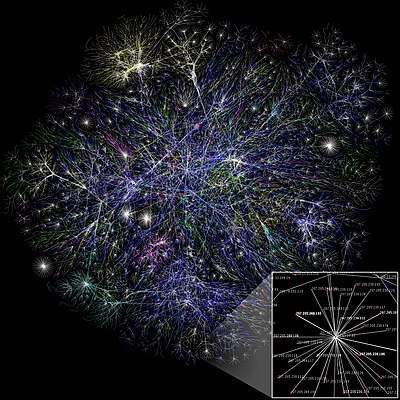
Information visualization
Information visualization or information visualisation is the study of (interactive) visual representations of abstract data to reinforce human cognition. The abstract data include both numerical and non-numerical data, such as text and geographic information. The naming of subfields is sometimes confusing. One accepted definition is that it's information visualization when the spatial representation is chosen, whereas it's scientific visualization when the spatial representation is given.[1]

Overview

The field of information visualization has emerged "from research in human-computer interaction, computer science, graphics, visual design, psychology, and business methods. It is increasingly applied as a critical component in scientific research, digital libraries, data mining, financial data analysis, market studies, manufacturing production control, and drug discovery".[2]
Information visualization presumes that "visual representations and interaction techniques take advantage of the human eye’s broad bandwidth pathway into the mind to allow users to see, explore, and understand large amounts of information at once. Information visualization focused on the creation of approaches for conveying abstract information in intuitive ways."[3]
Data analysis is an indispensable part of all applied research and problem solving in industry. The most fundamental data analysis approaches are visualization (histograms, scatter plots, surface plots, tree maps, parallel coordinate plots, etc.), statistics (hypothesis test, regression, PCA, etc.), data mining (association mining, etc.), and machine learning methods (clustering, classification, decision trees, etc.). Among these approaches, information visualization, or visual data analysis, is the most reliant on the cognitive skills of human analysts, and allows the discovery of unstructured actionable insights that are limited only by human imagination and creativity. The analyst does not have to learn any sophisticated methods to be able to interpret the visualizations of the data. Information visualization is also a hypothesis generation scheme, which can be, and is typically followed by more analytical or formal analysis, such as statistical hypothesis testing.
History
The modern study of visualization started with computer graphics, which "has from its beginning been used to study scientific problems. However, in its early days the lack of graphics power often limited its usefulness. The recent emphasis on visualization started in 1987 with the special issue of Computer Graphics on Visualization in Scientific Computing. Since then there have been several conferences and workshops, co-sponsored by the IEEE Computer Society and ACM SIGGRAPH".[4] They have been devoted to the general topics of data visualisation, information visualization and scientific visualisation, and more specific areas such as volume visualization.


In 1786, William Playfair published the first presentation graphics.
Specific methods and techniques
- Cartogram
- Cladogram (phylogeny)
- Concept Mapping
- Dendrogram (classification)
- Information visualization reference model
- Graph drawing
- Heatmap
- HyperbolicTree
- Multidimensional scaling
- Parallel coordinates
- Problem solving environment
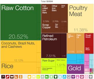
- Treemapping
Applications
Information visualization insights are being applied in areas such as:[2]
- Scientific research
- Digital libraries
- Data mining
- Information graphics
- Financial data analysis
- Health care[5]
- Market studies
- Manufacturing production control
- Crime mapping
- eGovernance and Policy Modeling
Organization
Notable academic and industry laboratories in the field are:
- Adobe Research
- IBM Research
- Google Research
- Microsoft Research
- Panopticon Software
- Scientific Computing and Imaging Institute
- Tableau Software
- University of Maryland Human-Computer Interaction Lab
- Vvi
Conferences in this field, ranked by significance in data visualization research,[6] are:
- IEEE Visualization: An annual international conference on scientific visualization, information visualization, and visual analytics. Conference is held in October.
- ACM SIGGRAPH: An annual international conference on computer graphics, convened by the ACM SIGGRAPH organization. Conference dates vary.
- EuroVis: An annual Europe-wide conference on data visualization, organized by the Eurographics Working Group on Data Visualization and supported by the IEEE Visualization and Graphics Technical Committee (IEEE VGTC). Conference is usually held in June.
- Conference on Human Factors in Computing Systems (CHI): An annual international conference on human-computer interaction, hosted by ACM SIGCHI. Conference is usually held in April or May.
- Eurographics: An annual Europe-wide computer graphics conference, held by the European Association for Computer Graphics. Conference is usually held in April or May.
- PacificVis: An annual visualization symposium held in the Asia-Pacific region, sponsored by the IEEE Visualization and Graphics Technical Committee (IEEE VGTC). Conference is usually held in March or April.
For further examples, see: Category:Computer graphics organizations
See also
- Computational visualistics
- Data art
- Data Presentation Architecture
- Data visualization
- Geovisualization
- Infographics
- Patent visualisation
- Software visualization
- Visual analytics
- List of information graphics software
- List of countries by economic complexity, example of Treemapping
References
- Tamara Munzner. "Process and Pitfalls in Writing Information Visualization Research Papers". www.cs.ubc.ca. Retrieved 9 April 2018.
- Benjamin B. Bederson and Ben Shneiderman (2003). The Craft of Information Visualization: Readings and Reflections, Morgan Kaufmann ISBN 1-55860-915-6.
- James J. Thomas and Kristin A. Cook (Ed.) (2005). Illuminating the Path: The R&D Agenda for Visual Analytics Archived 2008-09-29 at the Wayback Machine. National Visualization and Analytics Center. p.30
- G. Scott Owen (1999). History of Visualization Archived 2012-10-08 at the Wayback Machine. Accessed Jan 19, 2010.
- Faisal, Sarah; Blandford, Ann; Potts, Henry WW (2013). "Making sense of personal health information: Challenges for information visualization". Health Informatics Journal. 19: 198–217. doi:10.1177/1460458212465213.
- Kosara, Robert (11 November 2013). "A Guide to the Quality of Different Visualization Venues". eagereyes. Retrieved 7 April 2017.
Further reading
- Ben Bederson and Ben Shneiderman (2003). The Craft of Information Visualization: Readings and Reflections. Morgan Kaufmann.
- Stuart K. Card, Jock D. Mackinlay and Ben Shneiderman (1999). Readings in Information Visualization: Using Vision to Think, Morgan Kaufmann Publishers.
- Jeffrey Heer, Stuart K. Card, James Landay (2005). "Prefuse: a toolkit for interactive information visualization". In: ACM Human Factors in Computing Systems CHI 2005.
- Andreas Kerren, John T. Stasko, Jean-Daniel Fekete, and Chris North (2008). Information Visualization – Human-Centered Issues and Perspectives. Volume 4950 of LNCS State-of-the-Art Survey, Springer.
- Riccardo Mazza (2009). Introduction to Information Visualization, Springer.
- Spence, Robert Information Visualization: Design for Interaction (2nd Edition), Prentice Hall, 2007, ISBN 0-13-206550-9.
- Colin Ware (2000). Information Visualization: Perception for design. San Francisco, CA: Morgan Kaufmann.
- Kawa Nazemi (2014). Adaptive Semantics Visualization Eurographics Association.
External links

- Information Visualization at Curlie