Climate change art
Climate change art is art inspired by climate change and global warming, generally intended to overcome humans' hardwired tendency to value personal experience over data and to disengage from data-based representations[1] by making the data "vivid and accessible".[2] The intention is to "make an emotional connection...through the power of art".[3]
.jpg)
Climate change art is created both by scientists and by non-scientist artists. The field overlaps with data art.
History
The Guardian said that in response to a backlash in the 1990s against fossil fuels and nuclear plants, major energy companies stepped up their philanthropic giving, including to arts organizations, "to a point where many major national institutions were on the payroll of the fossil fuel giants," effectively silencing many environmentally-focussed artists.[5]
In 2005 Bill McKibben wrote an article, What the Warming World Needs Now Is Art, Sweet Art that argued that "An intellectual understanding of the scientific facts was not enough – if we wanted to move forward and effect meaningful change, we needed to engage the other side of our brains. We needed to approach the problem with our imagination. And the people best suited to help us do that, he believed, were the artists."[6][7] According to climate change in the arts organization The Arctic Cycle, "It took some time for artists to heed the call."[6]
In 2009 The Guardian said the art world was "waking up to climate-change art."[8] Reporting on the 2020 We Make Tomorrow conference on climate change and the arts[9] in London, Artnet News commented that "instead of being seduced by sponsorships from deep-pocketed organizations invested in the fossil-fuel industry, institutions should look for new funding models."[10]
Effects and influence
According to Artnet News, climate change can be represented meaningfully in artwork because "Art has a way of getting ahead of the general discourse because it can convey information in novel ways."[10] In 2019 research by Laura Kim Sommer and Christian Andreas Klöckner, analyzing date collected at COP21, suggested climate change art could change opinions "as long as the message is hopeful, and gives people ideas for change."[11][12]
Journalist Betsy Mason wrote in Knowable that humans are visual creatures by nature, absorbing information in graphic form that would elude them in words, adding that bad visuals can impair public understanding of science.[13] Similarly, Bang Wong, creative director of MIT’s Broad Institute, stated that visualizations can reveal patterns, trends and connections in data that are difficult or impossible to find any other way.[13]
In particular, climate change art has been used, both to make scientific data more accessible to non-scientists, and to express people’s fears.[14] Some research indicates that climate change art is not particularly effective in changing peoples views, though art with a "hopeful" message gives people ideas for change.[14] Projecting a positive message, climate scientist Ed Hawkins said that "infiltrating popular culture is a means of triggering a change of attitude that will lead to mass action".[15]
It is thought that people who engage with climate change art feel a sense of belonging, a feeling of connection to a cause, and a sense of empowerment.[14] Participatory climate change art, such as downloading warming stripes graphics for one's own locality or using a climate-related logo, provides an interactive element that gets people involved.[14]
Lucia Pietroiusti, the curator of “general ecology” at the Serpentine Galleries, suggested "a radical redefinition of what constitutes an artwork...to include environmental campaigns," saying that “By calling something an artwork, you are allowing an institution to support it.”[10]
Examples
Researchers analyzing artwork created between 2000 and 2016 found that climate change art production increased over the period.[11][16]
In 2007, artist Eve Mosher used a sports-field chalk marker to draw a blue "high-water" line around Manhattan and Brooklyn, showing the areas that would be underwater if climate change predictions are realized. Her HighWaterLine Project has since drawn high-water lines around Bristol, Philadelphia, and two coastal cities in Florida.[2]
In 2012, filmmaker Jeff Orlowski made Chasing Ice, documenting photographer James Balog's Extreme Ice Survey, which uses time-lapse photography to show the disappearance of glaciers over time.[2]
In 2013, undergraduate cellist Daniel Crawford created "Song of Our Warming Planet" in which musical notes, representing annual global average surface temperature readings since 1880, ascend to higher and higher pitches as the song progresses.[17]
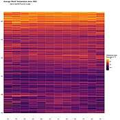
In 2015, University of Georgia marine scientist Joan Sheldon produced a scarf illustrating average yearly temperature from the 1600s to the present using one row per year.[18]
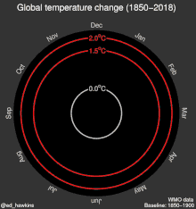
In 2016, Ed Hawkins, a scientist at the National Centre for Atmospheric Science and the University of Reading, created "climate spirals," a series of data art representations of global warming, and followed in 2018 with "warming stripes," a series of colored stripes representing chronologically ordered average annual temperature anomalies for a given location.[1][19]
Starting in 2017 The Tempestry Project encouraged fiber artists to create "tempestries", scarf-size banners showing temperature change over time. Each tempestry is knitted or crocheted, one row per day in a color representing that day's high temperature, for a year. Two or more tempestries for the same location, each representing different years, are displayed together to show daily high temperature change over time.
In 2018 artist Xavier Cortada's project Underwater Home Owner's Association placed signs in front yards throughout Miami, Florida indicating each property's height above sea level to illustrate what sea level rise would flood that property.[1][20]
In 2019, the Grantham Institute - Climate Change and the Environment, Imperial College London, launched its inaugural Grantham Art Prize, commissioning original works by six artists who collaborated with climate researchers. Each piece aimed to provoke thought and conversation about the climate crisis.
_2017_SCREENSHOT_-_Ed_Hawkins.png)
_-_Climate_Lab_Book_(Ed_Hawkins).png)
_-_global_(1900-2017)_-_Emanuele_Bevacqua.jpg)
See also
References
- Brookshire, Bethany (5 April 2019). "Using art to show the threat of climate change: These seven artists are using climate change concepts in their work". Science News for Students. Archived from the original on 8 April 2019. Retrieved 20 May 2019.
- "Art Makes Environmental Change Real: Experiencing the science of climate change rather than learning about it". Scientific American. Archived from the original on 10 October 2016. Retrieved 20 May 2019.
- "This Incredible Climate Change Art Will Leave You Floored". Climate Reality Project. 25 May 2017. Retrieved 20 May 2019.
- Windhager, Florian; Schreder, Günther; Mayr, Eva (2019). "On Inconvenient Images: Exploring the Design Space of Engaging Climate Change Visualizations for Public Audiences". Workshop on Visualisation in Environmental Sciences (EnvirVis). The Eurographics Association: 1–8. doi:10.2312/envirvis.20191098.
- Krug, Oliver (20 February 2019). "From foil-wrapped glaciers to the Alpine storm cyclist: the artists fighting climate change: After too long a silence, art is finally tackling global warming". The Guardian. Archived from the original on 21 March 2019. Retrieved 20 May 2019.
- "About". Artists & Climate Change. 2013-01-23. Retrieved 2020-03-06.
- "What the warming world needs now is art, sweet art". Grist. 2005-04-22. Retrieved 2020-03-06.
- Bunting, Madeleine (2009-12-02). "The rise of climate-change art". The Guardian. Retrieved 2019-05-20.
- "We Make Tomorrow summit". Julie's Bicycle. Retrieved 2020-03-06.
- Rea, Naomi (2020-03-03). "5 Meaningful Ways the Art World Can Help Fight Climate Change, According to Experts in the Field". artnet News. Retrieved 2020-03-06.
- Amsen, Eva. "Climate Change Art Helps People Connect With A Challenging Topic". Forbes. Retrieved 2020-03-06.
- Sommer, Laura Kim; Klöckner, Christian Andreas (2019-07-01). "Does activist art have the capacity to raise awareness in audiences?—A study on climate change art at the ArtCOP21 event in Paris". Psychology of Aesthetics, Creativity, and the Arts. doi:10.1037/aca0000247. ISSN 1931-390X.
- Mason, Betsy (November 12, 2019). "Why scientists need to be better at data visualization". Knowable. Archived from the original on November 15, 2019.
- Amsen, Eva (September 30, 2019). "Climate Change Art Helps People Connect With A Challenging Topic". Forbes. Archived from the original on October 1, 2019.
- Dussert, Margaux (23 September 2019). "Réchauffement climatique : ce graphique scientifique fait le buzz (Global warming: this scientific graph is making a buzz)". L'EDN (in French). Archived from the original on 22 October 2019.
- Galafassi, Diego; Kagan, Sacha; Milkoreit, Manjana; Heras, María; Bilodeau, Chantal; Bourke, Sadhbh Juarez; Merrie, Andrew; Guerrero, Leonie; Pétursdóttir, Guðrún; Tàbara, Joan David (April 2018). "'Raising the temperature': the arts on a warming planet". Current Opinion in Environmental Sustainability. 31: 71–79. doi:10.1016/j.cosust.2017.12.010.
- Revkin, Andrew C. (July 2, 2013). "Global Warming Trend and Variations Charted by Cello". The New York Times. Archived from the original on October 5, 2019.
- Schwab, Katharine (11 January 2019). "Crafting takes a dark turn in the age of climate crisis". Fast Company. Archived from the original on 11 January 2019. Retrieved 11 January 2019.
- "Ed Hawkins' warming stripes add colour to climate communication - National Centre for Atmospheric Science". National Centre for Atmospheric Science. Archived from the original on 2019-05-17. Retrieved 2019-05-18.
- Lescaze, Zoe (22 August 2018). "12 Artists On: Climate Change: A dozen artistic responses to one of the greatest threats of our time". New York Times. Archived from the original on 2 April 2019. Retrieved 20 May 2019.
- Hawkins, Ed (2018). "Climate spirals / Global temperature change (1805-2017)". Climate Lab Book. Archived from the original on 27 July 2019. (Direct link to image).
- Hawkins, Ed (2018). "Climate spirals / Global temperature change (1805-2017)". Climate Lab Book. Archived from the original on 27 July 2019. (Direct link to animated GIF).
- Hawkins, Ed (4 December 2018). "2018 visualisation update / Warming stripes for 1850-2018 using the WMO annual global temperature dataset". Climate Lab Book. Archived from the original on 17 April 2019. (Direct link to image)
- Rose, Steve (16 April 2019). "How the symbol for extinction became this generation's peace sign". The Guardian. Archived from the original on October 13, 2019.
- Bevacqua, Emanuele (University of Reading) (November 2018). "Climate Change Visualizations". Archived from the original on 29 July 2019. (University of Reading affiliate).
- "Average World Temperature Since 1850". Reddit, "DataIsBeautiful" subreddit. 15 June 2016. Archived from the original on 15 June 2016. ● Data source: University of East Anglia Climate Research Unit (CRU) (archive).
External links
- Windhager, Florian; Schreder, Günther; Mayr, Eva (2019). "On Inconvenient Images: Exploring the Design Space of Engaging Climate Change Visualizations for Public Audiences". Workshop on Visualisation in Environmental Sciences (EnvirVis). The Eurographics Association: 1–8. doi:10.2312/envirvis.20191098. — Survey of climate change visualizations
- Paddison, Laurie (September 23, 2018). "8 Artists Taking On The Big Global Challenge: Climate Change "We should (and may) die trying to render climate change issues accessible."". Huffington Post. Archived from the original on 10 April 2019.
| |||||||||||||
| |||||||||||||
| |||||||||||||
| |||||||||||||
| |||||||||||||
| |||||||||||||
| |||||||||||||