Apple Inc. design motifs
Apple Inc. products has had various design motifs since its inception. Recent motifs were mainly developed under the collaboration of Steve Jobs and Sir Jonathan Ive beginning in 1997, radically altering the previous Apple computer designs.
Snow White
The Snow White design language was developed by Hartmut Esslinger's Frog Design, and was used from 1984 to 1990. The Apple IIc was the first Apple product to use the design language. Snow White is characterised by its heavy use of vertical and horizontal lines for both decoration, ventilation and to create the illusion that the computer casings were smaller than they actually were. The colour palette mostly consisted of light gray (Platinum) and off-white (fog). Other motifs include minimal surface texturing and an inlaid three-dimensional Apple logo which was diamond cut to the exact shape. The last Apple product to use the Snow White design language was the Macintosh IIfx which was released in 1990.
The Snow White design language established Apple as a design leader in the consumer electronics industry, set trends for the computer industry as well as changing the industry's perception of how computers are designed and manufactured.
Translucency
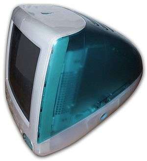
This first phase appeared in 1997 with the eMate, followed in 1998 with the release of the original Bondi-blue iMac (see below). This motif was later applied to the first iBook models released in 1999, and the Blue and White Power Mac G3 and their accompanying Studio Displays. The design was characterised by translucent surfaces with either a candy-like or milky-white coloring and soft, bulging contours. Subdued vertical pinstripes were made to show through the translucent faces of these products. Printed on the back panel for ports and agency approval marks was a lenticular plaque that contains a wavy 3D pattern. AC power cords were also translucent, with the twisted wires visible within them.
The translucency and colors in this style appear to have been inspired by gumdrop candies, and Ive reportedly visited confectionery plants to learn to replicate the gumdrop's visual effect. Ive and his team went on to develop novel manufacturing techniques in order to build products based on this design motif.[1]
Only the PowerBook G3 was uninfluenced by the translucent style (with the exception of a translucent, bronze-colored keyboard on the Lombard and Pismo models, and retained its opaque black casing until it was replaced by the Titanium PowerBook G4 in 2001.
In 2013, iOS went through a major redesign with the release of iOS 7 in September. Much of the refreshed UI had a translucent effect, noticeable in places like the Notification Center, Control Center, the multitasking screen, and Apple's Remote app for iOS.
OS X went through a major redesign in 2014 which was similar to iOS 7, with the release of OS X Yosemite. Yosemite's refreshed UI had translucent effects seen in the Dock, the user login window, Notification Center, and in the Safari web browser.
Colors
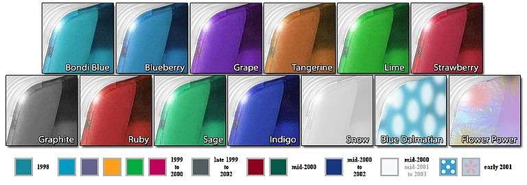
The candy color on the first iMac model is called "Bondi blue", a reference to the color of the water at Sydney's Bondi Beach.

The "Bondi blue" iMac was replaced with five fruit colors in January 1999, "Blueberry" (a bright blue); "Grape" (purple); "Tangerine" (orange); "Lime" (green); and "Strawberry" (pinkish red). Two of these, "Tangerine" and "Blueberry", became the first colors for the iBook. Blueberry was also the color for the Blue and White Power Mac G3 and its displays. These candy colors heralded a trend in consumer goods where everything from clock radios to hamburger grillers sported bright plastic translucent enclosures.
In late 1999, the iMac's fruit colors were joined by a quieter color scheme called "Graphite", in which the colored elements were replaced with a smoky grey and some of the white elements were made transparent. Graphite was the color of the iMac Special Edition models, and the first Power Mac G4. Next came "Ruby" (dark red), "Sage" (forest green), "Indigo" (deep blue) and "Snow" (milky white) in 2000. The iBooks' colors were also updated: Blueberry was replaced with Indigo, Tangerine was replaced with Key Lime (an eye-popping neon green), and Graphite was added at the high end.
In 2001, two new color schemes were introduced: "Flower Power" and "Blue Dalmatian." "Flower Power" was white with flowers, and "Blue Dalmatian" was a blue similar to the original "Bondi blue", but with white spots. The "Snow" color scheme was also used on the second generation iBook.

Minimalism
In 2001, Apple designs shifted away from multicolored translucency and began two new design branches. The professional motif appeared with the PowerBook G4, and featured industrial grade metal: first titanium, then aluminum. The minimalist consumer design debuted with the iBook G3, and featured glossy white coloring and opaque finishes. Both lines did away with soft, bulging shapes and moved toward streamlined, orthogonal, minimalist shapes. The designs appear to have been heavily influenced by German industrial designer Dieter Rams,[2] with a clear example being the iPhone calculator application, which appears to have been directly influenced by Dieter Rams' 1978 Braun Control ET44 calculator.[3]
The iPod continued the look of the consumer line, featuring an opaque, white front. The success and wide embrace of Apple's iPod appeared to have had an effect on Ive and his design team, and some noted the striking similarity of the iPod's design with the subsequent iMac G5 and Mac mini designs. Apple even promoted the release of the iMac G5 as coming "from the creators of iPod," and, in the accompanying promotional photographs, both products were shown next to each other in profile, highlighting the similarities in their design.[4] The newer generations of AirPort Extreme, 2012 model of AirPort Express, Apple TV, and iPhone designs have continued this trend toward a simple rounded-rectangle styling across product lines.
Dark aluminium
The more recent designs move away from white plastics, replacing them with glass and aluminium.

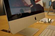
This new design phase showed Apple's strive towards extreme minimalism: aluminium "unibody" products possess cleaner, yet softer and more tapered edges than those of their predecessors, and remove anything that "does not need to be there," creating an extremely clean surface. The first generation iPhone debuted this new style, showing off darker aluminium on its back and a glass front. The design was then carried over to the iMac line, which now consists mostly of aluminium face, except for a black rim around the screen, and a glass covered screen. The iPod Classic brought this motif to the iPod line, and featured a dark, aluminium face. The MacBook Air blends the aluminium styling of the Macbook Pro line with the new style pattern through its keyboard and glossy display. On October 14, 2008 Apple released a redesigned MacBook Pro in line with this style direction. Like the MacBook Air before them, the chassis of the new MacBook Pro is milled from a single piece of aluminium, this 'unibody' construction is aimed to reduce chassis size and the number of chassis parts required, along with increasing chassis rigidity. In early 2010, Apple's new iPad continued this trend, enforcing a minimalist device to give a focus on content, not hardware.
Slate
Even more recently in late 2012, Apple has been shown to be moving towards a more brushed slate texture, with diamond-cut chamfered edges. This was evidenced by the iPhone 5 and iPad mini respectively. The benefits of this new slate style are that the devices are more easily gripped and they cannot be scratched as easily. Analysts speculated that Apple might release a full sized iPad with this same slate style in 2013, and this was confirmed with the release of the iPad Air on November 1, 2013. The slate design continued with the introduction of the MacBook in 2015, and reinforced with the redesigned MacBook Pro and MacBook Air lineups, in 2016 and 2018 respectively.
See also
References
- iMac 1998 - Johnathan Ive on Apple - Design, Architecture and Fashion - Design Museum London Archived June 12, 2010, at the Wayback Machine
- Flankenlauf | Journal |Dieter Rams und Apple Archived May 17, 2009, at the Wayback Machine
- Great Artists Steal: Is that a Braun ET44 in Your iPhone?
- Apple - Photos - iMac G5 Archived August 20, 2014, at the Wayback Machine
