Skeuomorph
A skeuomorph (/ˈskjuːəˌmɔːrf, ˈskjuːoʊ-/)[1][2] is a derivative object that retains ornamental design cues (attributes) from structures that were inherent to the original.[3] Examples include pottery embellished with imitation rivets reminiscent of similar pots made of metal[4] and a software calendar that imitates the appearance of binding on a paper desk calendar.[5]
Definition and purpose
The term skeuomorph is compounded from skeuos (σκεῦος), meaning "container or tool", and morphḗ (μορφή), meaning "shape". It has been applied to material objects since 1890[6] and is now also used to describe computer and mobile interfaces.[7]
A similar alternative definition of skeuomorph is "a physical ornament or design on an object made to resemble another material or technique". This definition is broader in scope, as it can be applied to design elements that still serve the same function as they did in a previous design.
Skeuomorphs may be deliberately employed to make a new look more familiar and comfortable, or may be the result of cultural influences and norms on the designer. They may be artistic expression on the part of the designer.[7] The usability researcher and academic Don Norman describes skeuomorphism in terms of cultural constraints: interactions with a system that are learned only through culture. Norman also popularized perceived affordances, where the user can tell what an object provides or does based on its appearance, which skeuomorphism can make easy.[8]
The concept of skeuomorphism overlaps with other design concepts. Mimesis is an imitation, coming directly from the Greek word.[9] Archetype is the original idea or model that is emulated, where the emulations can be skeuomorphic.[10] Skeuomorphism is parallel to, but different from, path dependence in technology, where an element's functional behavior is maintained even when the original reasons for its design no longer exist.
Physical examples
.jpg)
Many features of wooden buildings were repeated in stone by the Ancient Greeks when they transitioned from wood to masonry construction. Decorative stone features in the Doric order of classical architecture in Greek temples such as triglyphs, mutules, guttae, and modillions are supposed to be derived from true structural and functional features of the early wooden temples. The triglyph and guttae are seen as recreating in stone functional features of the wooden temples that preceded them, respectively the carved beam-ends and six wooden pegs driven in to secure the beam in place.[11][12][13]
Historically, high-status items such as the Minoans' elaborate and expensive silver cups were recreated for a wider market using pottery, a cheaper material. The exchange of shapes between metalwork and ceramics, often from the former to the latter, is near-constant in the history of the decorative arts. Sometimes pellets of clay are used to evoke the rivets of the metal originals.[14]
There is also evidence of skeuomorphism in material transitions. Leather and pottery often carry over features from the wooden counterparts of previous generations. Clay pottery has also been found bearing rope-shaped protrusions, pointing to craftsmen seeking familiar shapes and processes while working with new materials.[12] In this context, skeuomorphs exist as traits sought in other objects, either for their social desirability or psychological comforts.[7]
In the modern era, cheaper plastic items often attempt to mimic more expensive wooden and metal products, though they are only skeuomorphic if new ornamentation references the original functionality,[15] such as molded screw heads in molded plastic items. Another well-known skeuomorph is the plastic Adirondack chair.[16] The lever on a mechanical slot machine, or "one-armed bandit," is a skeuomorphic throwback feature when it appears on a modern video slot machine, since it is no longer required to set physical mechanisms and gears into motion. Articles of clothing are also given skeuomorphic treatment; for example, faux buckles on certain strap shoes, such as Mary Janes for small children, which permit the retention of the original aesthetic.
Automotive design has historically been full of physical skeuomorphisms, such as thinly chrome-plated plastic components and imitation leather, gold, wood, pearl, or crystal jeweled elements. In the 1970s, opera windows and vinyl roofs on many luxury sedan cars imitated carriage work from the horse and buggy era. As of 2019, most electric cars feature prominent front grilles, even though there is little need for intake of air to cool an absent internal combustion engine.[17]
Virtual examples

Many computer programs have a skeuomorphic graphical user interface that emulates the aesthetics of physical objects. Examples include a digital contact list resembling a Rolodex,[18] and IBM's 1998 RealThings package.[19] A more extreme example is found in some music synthesis and audio processing software packages, which closely emulate physical musical instruments and audio equipment complete with buttons and dials.[20] On a smaller scale, the icons of GUIs may remain skeuomorphic representations of physical objects that are not longer directly applicable to the task they represent (such as a drawing of a floppy disk to represent "save").
Apple Inc., while under the direction of Steve Jobs, was known for its wide usage of skeuomorphic designs in various applications. This changed after Jobs' death when Scott Forstall, described as "the most vocal and high-ranking proponent of the visual design style favored by Mr. Jobs," resigned. Apple designer Jonathan Ive took over some of Forstall's responsibilities and had "made his distaste for the visual ornamentation in Apple's mobile software known within the company."[21] With the announcement of iOS 7 at WWDC in 2013, Apple officially shifted from skeuomorphism to a more simplified design, thus beginning the so-called "death of skeuomorphism" at Apple.[22]
Other virtual skeuomorphs do not employ literal images of some physical object; but rather allude to ritual human heuristics or heuristic motifs, such as slider bars that emulate linear potentiometers[20] and visual tabs that behave like physical tabbed file folders. Another example is the swiping hand gesture for turning the "pages" or screens of a tablet display.[23][24]
Virtual skeuomorphs can also be auditory. The shutter-click sound emitted by most camera phones when taking a picture is an auditory skeuomorph,[25] though it has also been deemed necessary for legal reasons especially due to voyeurism and child predator concerns.[26]
In design
Retrofuturism incorporates spatial motifs from previous iterations of the future; especially visions of electro-industrialism.[27] This is frequently incorporated in retrowave or synthwave illustrations. Skeumorphic time is closely linked with metamodernism.
Skeuomorphic design seems to be preferred by older recipient groups often referred to as digital immigrants while digital natives tend to favor flat design over skeuomorphisms. However, younger people are still able to understand the signifiers that skeuomorphic design employs. A better user experience could be measured for each respective design philosophy among digital natives and immigrants.[28]
Although it is often proven that digital immigrants are more likely able to perceive and understand all available functions in an application, it has been found out that some affordances that do not have direct signifiers e.g. the function to flip pages in an ebook by simple swiping from right to left are less likely to be found by older users. However, all associated Functions should be included when a certain metaphor is used. For example users are likely to feel frustrated when trying to pull a file into the trash bin only to find out that this gesture does not delete the file.[29]
Arguments in favor
An argument in favor of skeuomorphic design is that it makes it easier for those familiar with the original device to use the digital emulation by making certain signifiers to affordances stronger. Interactions with computer devices are mostly cultural and learned. Once a process is learned and adopted in a society, it develops persistence. Proposals for change, especially radical change, often result in debate between proponents and opponents. Don Norman describes this process as a form of cultural heritage.[8]
Compared to flat design, skeuomorphic design seems to facilitate a fast navigation through graphic user interfaces, supposedly because icons are more easily recognized and less abstract than their minimalistic counterparts found in flat design.[28]
Arguments against
The arguments against virtual skeuomorphic design are that skeuomorphic interface elements use metaphors that are more difficult to operate and take up more screen space than standard interface elements, that this breaks operating system interface design standards, that it causes an inconsistent look and feel between applications,[30] that skeuomorphic interface elements rarely incorporate numeric input or feedback for accurately setting a value, that many users may have no experience with the original device being emulated, that skeuomorphic design can increase cognitive load with visual noise that after a few uses gives little or no value to the user, that skeuomorphic design limits creativity by grounding the experience to physical counterparts,[31] and that skeuomorphic designs often do not accurately represent underlying system state or data types due to inappropriate mimesis, such as analog gauges in a digital interface.
In the case of an electric tea kettle, such designs can be dangerous. If it is used in the manner of the original tea kettles, catastrophe can ensue if user places it on active fire, resulting in property damage or injury.
Gallery
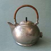 Electric kettle in the form of a traditional stovetop kettle
- Incandescent bulbs imitating the shape of candle flames
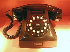 Pushbutton phone with imitation rotary dial
 1970s opera window and vinyl roof imitating horse and buggy design
 Digital keypad of an electronic safe, on a circular escutcheon mimicking a mechanical combination dial
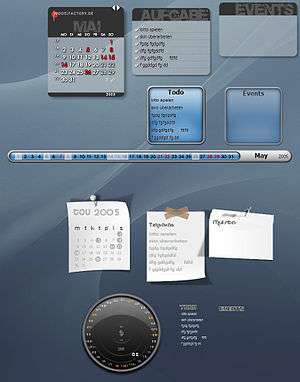 Virtual skeuomorphic imitations of pieces of paper
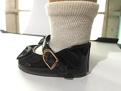 Velcro straps on a pair of Mary Jane shoes worn by an American Girl doll; the buckles used on the straps are purely for aesthetic purposes.
See also
- Anachronism
- Trompe-l'œil, 2D artwork using realistic optical illusions to simulate three dimensions
- Flat design
- Human interface guidelines
Notes
- "Skeuomorph". Oxford Dictionaries UK Dictionary. Oxford University Press. Retrieved 2016-01-22.
- "Skeuomorph". Dictionary.com Unabridged. Random House. Retrieved 2016-01-22.
- Basalla, George (1988). The Evolution of Technology. Cambridge, UK: Cambridge University Press. p. 107. ISBN 0-521-29681-1.
- "Skeuomorph". dictionary.com. Archived from the original on 15 October 2013. Retrieved 7 December 2012.
- Thompson, Clive (2012-01-31). "Clive Thompson on Analog Designs in the Digital Age". Wired. Wired Magazine. 20 (2). Archived from the original on 22 December 2012. Retrieved 7 December 2012.
- March, H. Colley (1890). Transactions of the Lancashire and Cheshire Antiquarian Society. The Lancashire and Cheshire Antiquarian Society. p. 187. Archived from the original on 2018-02-02.
- Gessler, Nicholas. "Skeuomorphs and Cultural Algorithms". Archived from the original on 24 June 2012. Retrieved 7 December 2012.
- Norman, Donald. "Affordances and Design". Archived from the original on 2012-11-20. Retrieved 2012-12-03.
- Janusheske, Jeffrey. "Thesis: Mimesis to Skeuomorph?". Archived from the original on 2013-02-15. Retrieved 2012-12-03.
- Sen, Rahul. "Archetypes and Their Use in Mobile UX". Archived from the original on 2012-12-26. Retrieved 2012-12-03.
- Vickers, Michael; Gill, David (1996). Artful Crafts: Ancient Greek Silverware and Pottery. Oxford: Oxford University Press. ISBN 0-198-15070-9.
- Manby, T.G. (1995). Unbaked Urns of Rudely Shape: essays on British and Irish pottery for Ian Longworth. Oxford: Oxbow Books and others. pp. 81–84. ISBN 0946897948.
- Summerson, John, The Classical Language of Architecture, pp. 128, 133, 1980 edition, Thames and Hudson World of Art series, ISBN 0500201773
- Knappet, Carl. "Photographs, Skeuomorphs and Marionettes". Archived from the original on 2013-02-01.
- Bullock, Alan (1999), The Norton Dictionary of Modern Thought, W. W. Norton & Company, pp. 795–796, ISBN 978-0-393-04696-0
- Winchester, Simon; Lederer, Richard (2006). "Foreword". In McKean, Erin (ed.). Totally weird and wonderful words. Oxford: Oxford University Press. ISBN 0195312120. OCLC 70060979.
- Torchinsky, Jason. "Why Do All These Electric Cars Have Grilles?". Jalopnik. Vox Media. Retrieved 2019-04-05.
- Worstall, Tim. "The Real Problem With Apple: Skeuomorphism In iOS". Forbes. Archived from the original on 4 December 2012. Retrieved 8 December 2012.
- Mullay (April 1998). "IBM RealThings". CHI 98 conference summary on Human factors in computing systems. ACM Press. pp. 13–14. doi:10.1145/286498.286505. ISBN 1-58113-028-7.
- G.F. (2012-11-08). "User interfaces: Skeu you". The Economist. Archived from the original on 8 March 2016. Retrieved 3 March 2016.
- Wingfield, Nick; Bilton, Nick (2012-10-31). "Apple Shake-Up Could Lead to Design Shift". The New York Times. CLXII (55, 941). Archived from the original on 2012-11-04. Retrieved 2012-11-05.
- Evans, Claire (2013-06-11). "A Eulogy for Skeuomorphism". Motherboard. Archived from the original on 2013-06-13. Retrieved 2013-06-11.
- "An E-Book UI That Lets You Flip Digital Pages, Just Like A Real Book". Co.Design. Archived from the original on 22 March 2016. Retrieved 3 March 2016.
- Baker, Justin (20 November 2017). "Skeuomorphic Design — A controversial UX approach that is making a comeback". Muzli - Design Inspiration. Medium. Retrieved 2019-04-05.
- McNeil, Joanne. "Skeuomorphic Sounds: Digital Camera Shutter Clicks and Car Door Clunks". Rhizome. Archived from the original on 7 March 2016. Retrieved 3 March 2016.
- Masnick, Mike. "Latest Pointless Law: Requiring Cameraphones To Click When Taking Photos". Techdirt. Retrieved 14 July 2020.
- "21 examples of skeuomorphism". Popicon. Retrieved 2019-04-05.
- Spiliotopoulos, Konstantinos; Rigou, Maria; Sirmakessis, Spiros (2018-06-04). "A Comparative Study of Skeuomorphic and Flat Design from a UX Perspective". Multimodal Technologies and Interaction. 2 (2): 31. doi:10.3390/mti2020031. ISSN 2414-4088.
- Oswald, David (2018-07-01). "Affordances and Metaphors Revisited: Testing Flat vs. Skeuomorph Design with Digital Natives and Digital Immigrants". Electronic Workshops in Computing. doi:10.14236/ewic/HCI2018.57. Cite journal requires
|journal=(help) - Carr, Austin. "Will Apple's Tacky Software-Design Philosophy Cause A Revolt?". Fast Company. Archived from the original on 15 December 2012. Retrieved 11 December 2012.
The issue is two-fold: first, that traditional visual metaphors no longer translate to modern users; and second, that excessive digital imitation of real-world objects creates confusion among users.
- Sharp, Helen; Rogers, Yvonne; Preece, Jenny (2007). Interaction Design: Beyond Human–Computer Interaction (2nd ed.). John Wiley & Sons. p. 62.
References
| Wikimedia Commons has media related to Skeuomorphism. |
- Freeth, C. M., & Taylor, T. F. (2001). Skeuomorphism in Scythia: Deference and Emulation, Olbia ta antichnii svit. Kiev, British Academy / Ukrainian Academy of Sciences. P. 150.
External links
| Look up skeuomorph in Wiktionary, the free dictionary. |
- Moon, Jessica. "A Showcase of 50 Skeuomorphic Designs". Telepathy. Retrieved 2019-04-05.
- flatisbad.com a selection of user experience studies on skeuomorphism maintained by Lomonosov Moscow State University, Laboratory of Work Psychology