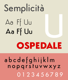
Semplicità
Semplicità is a sans-serif typeface of the geometric style. It was published by the Nebiolo type foundry of Turin, Italy from around 1928.[1][2][lower-alpha 1]
 | |
| Category | Sans-serif |
|---|---|
| Classification | Geometric |
| Foundry | Nebiolo |
| Date created | c. 1928 |
Semplicità, named for the Italian for "simplicity", is an example of the new wave of "geometric" sans-serifs such as Erbar and Futura appearing in the late 1920s and early 1930s.[5][6][7] These designs were based on the proportions of the circle and the square and the influence of Roman square capitals, breaking from traditional "grotesque" designs of the nineteenth century.[6][5] Semplicità, however, has a number of unusual features, including a 'U' with an angle, following the classical model, and an 'f' which descends below the baseline.[8][lower-alpha 2] It is also a "spurless" design, similar to the contemporary Bernhard Gothic and more recently FF Dax, in which most strokes end without terminals.[8][3] These features give Semplicità an appearance similar to some of the flamboyant, modernist Art Deco lettering of the period.[4][8]
The design of Semplicità has sometimes been credited to type designer Alessandro Butti,[3] but Colizzi and Olocco do not credit it to a single designer, although Butti may have been the final draughtsman.[10][11][12][13][1]
Digitisations are available in commercial releases from Durotype and Canada Type, and an open-source version (shown) from Studio Di Lena, who require attribution as a condition of its use.[14][15][16] A proprietary digitisation has also been used by the French clothing company Céline.[17]
Styles
Semplicità was sold in a wide range of weights. Leonardo Di Lena lists the following styles in a Nebiolo catalogue:[16]
- 501-00 serie tonda chiara normale (light regular)
- 501-01 serie tonda chiara stretta (light condensed)
- 501-05 serie corsiva chiara normale (light italic)
- 501-06 serie corsiva chiara stretta (light italic condensed)
- 501-10 serie tonda neretta normale (medium)
- 501-11 serie tonda neretta stretta (medium condensed)
- 501-15 serie corsiva neretta normale (medium italic)
- 501-16 serie corsiva neretta stretta (medium italic condensed)
- 501-20 serie tonda nera normale (bold)
- 501-21 serie tonda nera stretta (bold condensed)
- 501-25 serie corsiva nera normale (bold italic)
- 501-26 serie corsiva nera stretta (bold italic condensed)
In addition, some swash capitals were offered and a shadowed capital face, Ombra, not to be confused with the similar Umbra font offered by Ludlow.
References
- Colizzi, Alessandro; Olocco, Riccardo. "Novarese and Butti, a story to be (re)written". CAST. Retrieved 18 April 2017.
- "Semplicità. Geometria semplice e razionale". Tipoteca. Retrieved 18 April 2017.
- Kupferschmid, Indra. "The story of Nebiolo". TypeNetwork. Retrieved 18 April 2017.
- Shaw, Paul (2004). "Fascism on the Facade" (PDF). Print: 78–81. Retrieved 20 April 2017.
- Kupferschmid, Indra. "On Erbar and Early Geometric Sans Serifs". CJ Type. Retrieved 20 October 2016.
- Ulrich, Ferdinand. "A short intro to the geometric sans". FontShop. Retrieved 17 December 2016.
- Ulrich, Ferdinand. "Why we need a new Kabel". FontShop. Retrieved 19 December 2016.
- Shaw, Paul. "Overlooked Typefaces". Print magazine. Retrieved 2 July 2015.
- Biľak, Peter. "Universal Grotesk". i love typography. Retrieved 19 April 2017.
- Victor Margolin (2015). World History of Design. Bloomsbury Publishing. p. 331. ISBN 978-1-4725-6928-8.
- Neil Macmillan (2006). An A-Z of Type Designers. Yale University Press. p. 59. ISBN 0-300-11151-7.
- "Società Nebiolo" (PDF). Klingspor Museum. Retrieved 18 April 2017.
- "Alessandro Butti". Gio Fuga Type. Retrieved 18 April 2017.
- "Semplicita Pro". MyFonts. Canada Type. Retrieved 18 April 2017.
- "Simplo". MyFonts. Durotype. Retrieved 18 April 2017.
- Di Lena, Leonardo. "Semplicità". Studio Di Lena. Retrieved 18 April 2017.
- Famira, Hannes. "Céline Sans". Hannes Famira. Retrieved 18 April 2017.
- Sources differ with dates from 1928 to 31 printed in various sources.[3][4] If not a mistake, this may reflect the long production process common with metal type, in which the journey from design to commercial release could often take several years, or the production of various weights.
- Both features, although the 'u' only in lowercase and the 'f' not in all versions, are also seen in Wagner & Schmidt's Kristall-Grotesk, dated by Biľak to 1936–37 and later offered in Czechoslovakia as Universal Grotesk.[9]