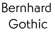
Bernhard Gothic
Bernhard Gothic is a family of geometric sans serif typeface designed by Lucian Bernhard in 1929 for the American Type Founders (ATF). Five variations by Bernhard were introduced over two years:
- Bernhard Gothic Light (1929)
- Bernhard Gothic Medium (1929)
- Bernhard Gothic Light Italic (1930)
- Bernhard Gothic Heavy (1930)
- Bernhard Gothic Extra Heavy (1930)
 | |
| Category | Sans-serif |
|---|---|
| Classification | Geometric |
| Designer(s) | Lucian Bernhard |
| Foundry | American Type Founders |
| Date released | 1929 - 30 |
| Re-issuing foundries | Intertype |
| Design based on | Futura, Kabel |
| Also known as | Greeting Gothic |
 | |
| Sample | |
A final member of the family, Bernhard Gothic Medium Condensed, was introduced by ATF in 1936, but it is unclear as to who the designer was.[1]
Bernhard Gothic is more organic and less regular than other geometric sans-serif typefaces, including Futura, Kabel, Vogue, and Twentieth Century, showing influence of Bernhard's earlier more expressionistic faces. It is a "spurless" design, similar to the contemporary Semplicità and Universal Grotesk and more recently FF Dax, in which strokes end without terminals.[2][3] This gives an effect of modernism, detached from handwriting conventions.[2]
Hot metal copies
Intertype's 1936 copy was called Greeting Gothic.[4]
Digital copies
Digital copies are available from Elsner+Flake, Font Company, URW++, Berthold, Spiece Graphics, Monotype Imaging and FontHaus.
References
- MacGrew, Mac, "American Metal Typefaces of the Twentieth Century," Oak Knoll Books, New Castle Delaware, 1993, ISBN 0-938768-34-4, pp. 32 - 33.
- Shaw, Paul. "Overlooked Typefaces". Print magazine. Retrieved 2 July 2015.
- Biľak, Peter. "Universal Grotesk". i love typography. Retrieved 19 April 2017.
- MacGrew, "American Metal Typefaces of the Twentieth Century," p. 33.