Normal probability plot
The normal probability plot is a graphical technique to identify substantive departures from normality. This includes identifying outliers, skewness, kurtosis, a need for transformations, and mixtures. Normal probability plots are made of raw data, residuals from model fits, and estimated parameters.
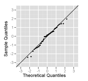
In a normal probability plot (also called a "normal plot"), the sorted data are plotted vs. values selected to make the resulting image look close to a straight line if the data are approximately normally distributed. Deviations from a straight line suggest departures from normality. The plotting can be manually performed by using a special graph paper, called normal probability paper. With modern computers normal plots are commonly made with software.
The normal probability plot is a special case of the Q–Q probability plot for a normal distribution. The theoretical quantiles are generally chosen to approximate either the mean or the median of the corresponding order statistics.
Definition
The normal probability plot is formed by plotting the sorted data vs. an approximation to the means or medians of the corresponding order statistics; see rankit. Some users plot the data on the vertical axis;[1] others plot the data on the horizontal axis.[2][3]
Different sources use slightly different approximations for rankits. The formula used by the "qqnorm" function in the basic "stats" package in R (programming language) is as follows:
for i = 1, 2, ..., n, where
- a = 3/8 if n ≤ 10 and
- 0.5 for n > 10,
and Φ−1 is the standard normal quantile function.
If the data are consistent with a sample from a normal distribution, the points should lie close to a straight line. As a reference, a straight line can be fit to the points. The further the points vary from this line, the greater the indication of departure from normality. If the sample has mean 0, standard deviation 1 then a line through 0 with slope 1 could be used.
With more points, random deviations from a line will be less pronounced. Normal plots are often used with as few as 7 points, e.g., with plotting the effects in a saturated model from a 2-level fractional factorial experiment. With fewer points, it becomes harder to distinguish between random variability and a substantive deviation from normality.
Other distributions
Probability plots for distributions other than the normal are computed in exactly the same way. The normal quantile function Φ−1 is simply replaced by the quantile function of the desired distribution. In this way, a probability plot can easily be generated for any distribution for which one has the quantile function.
With a location-scale family of distributions, the location and scale parameters of the distribution can be estimated from the intercept and the slope of the line. For other distributions the parameters must first be estimated before a probability plot can be made.
Plot types
This is a sample of size 50 from a normal distribution, plotted as both a histogram, and a normal probability plot.
 Normal probability plot of a sample from a normal distribution – it looks fairly straight, at least when the few large and small values are ignored.
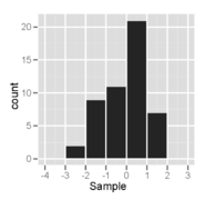 Histogram of a sample from a normal distribution – it looks fairly symmetric and unimodal
This is a sample of size 50 from a right-skewed distribution, plotted as both a histogram, and a normal probability plot.
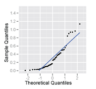 Normal probability plot of a sample from a right-skewed distribution – it has an inverted C shape.
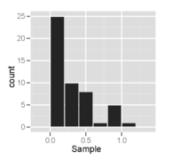 Histogram of a sample from a right-skewed distribution – it looks unimodal and skewed right.
This is a sample of size 50 from a uniform distribution, plotted as both a histogram, and a normal probability plot.
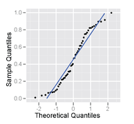 Normal probability plot of a sample from a uniform distribution – it has an S shape.
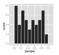 Histogram of a sample from a uniform distribution – it looks multimodal and supposedly roughly symmetric.
References
![]()
- e.g., Chambers et al. (1983, ch. 6. Assessing distributional assumptions about data, p. 194)
- Box, George E. P.; Draper, Norman (2007), Response Surfaces, Mixtures, and Ridge Analysis (2nd ed.), Wiley, ISBN 978-0-470-05357-7
- Titterington, D. M.; Smith, A. F. M.; Makov, U. E. (1985), "4. Learning about the parameters of a mixture", Statistical Analysis of Finite Mixture Distributions, Wiley, ISBN 0-471-90763-4
Further reading
- Chambers, John; William Cleveland; Beat Kleiner; Paul Tukey (1983). Graphical Methods for Data Analysis. Wadsworth.
External links
| Wikimedia Commons has media related to Normal probability plots. |
- Engineering Statistics Handbook: Normal Probability Plot
- Statit Support: Testing for "Near-Normality": The Probability Plot