Rankit
In statistics, rankits of a set of data are the expected values of the order statistics of a sample from the standard normal distribution the same size as the data. They are primarily used in the normal probability plot, a graphical technique for normality testing.
Example
This is perhaps most readily understood by means of an example. If an i.i.d. sample of six items is taken from a normally distributed population with expected value 0 and variance 1 (the standard normal distribution) and then sorted into increasing order, the expected values of the resulting order statistics are:
- −1.2672, −0.6418, −0.2016, 0.2016, 0.6418, 1.2672.
Suppose the numbers in a data set are
- 65, 75, 16, 22, 43, 40.
Then one may sort these and line them up with the corresponding rankits; in order they are
- 16, 22, 40, 43, 65, 75,
which yields the points:
| data point | rankit |
|---|---|
| 16 | −1.2672 |
| 22 | −0.6418 |
| 40 | −0.2016 |
| 43 | 0.2016 |
| 65 | 0.6418 |
| 75 | 1.2672 |
These points are then plotted as the vertical and horizontal coordinates of a scatter plot.
Alternative method
Alternatively, rather than sort the data points, one may rank them, and rearrange the rankits accordingly. This yields the same pairs of numbers, but in a different order.
For:
- 65, 75, 16, 22, 43, 40,
the corresponding ranks are:
- 5, 6, 1, 2, 4, 3,
i.e., the number appearing first is the 5th-smallest, the number appearing second is 6th-smallest, the number appearing third is smallest, the number appearing fourth is 2nd-smallest, etc. One rearranges the expected normal order statistics accordingly, getting the rankits of this data set:
| data point | rank | rankit |
|---|---|---|
| 65 | 5 | 0.6418 |
| 75 | 6 | 1.2672 |
| 16 | 1 | −1.2672 |
| 22 | 2 | −0.6418 |
| 43 | 4 | 0.2016 |
| 40 | 3 | −0.2016 |
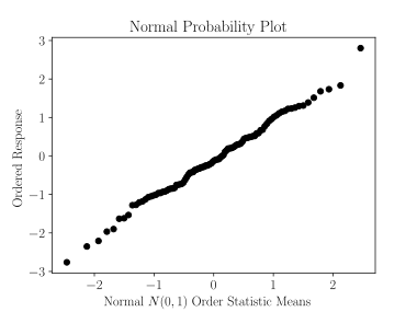
Rankit plot
A graph plotting the rankits on the horizontal axis and the data points on the vertical axis is called a rankit plot or a normal probability plot. Such a plot is necessarily nondecreasing. In large samples from a normally distributed population, such a plot will approximate a straight line. Substantial deviations from straightness are considered evidence against normality of the distribution.
Rankit plots are usually used to visually demonstrate whether data are from a specified probability distribution.
A rankit plot is a kind of Q-Q plot – it plots the order statistics (quantiles) of the sample against certain quantiles (the rankits) of the assumed normal distribution. Q-Q plots may use other quantiles for the normal distribution, however.
History
The rankit plot and the word rankit was introduced by the biologist and statistician Chester Ittner Bliss (1899–1979).
See also
- Probit analysis developed by C. I. Bliss in 1934.