Hendrik van den Keere
Hendrik van den Keere (c. 1540–2 – 1580) was a punchcutter, or engraver of punches to make metal type, from Ghent in modern Belgium.[1][2][3][4]

Career

Van den Keere was the son of Ghent printer and schoolmaster Hendrik van den Keere the Elder,[5] and his career has sometimes been confused with that of his father.[6] Both he and his father used the name "Henri du Tour" in French.[1][7][lower-alpha 1] Van den Keere's grandfather had taken over the type foundry of Joos Lambrecht.[10] In 1566 he took over his father's printing firm, but soon gave up printing and began to specialise in punchcutting.[11] From 1568 he worked particularly for Christophe Plantin of Antwerp, down the River Scheldt from Ghent, where he remained living.[12][4] He was Plantin's sole typecaster from 1569 onwards, and so would have had the opportunity to closely examine types by other prominent engravers.[13] Over the course of his career he cut around 30 typefaces.[10]
Types
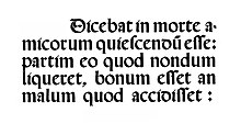
Van den Keere primarily cut type in the textura style of blackletter,[8] roman type and music type.[14][15]
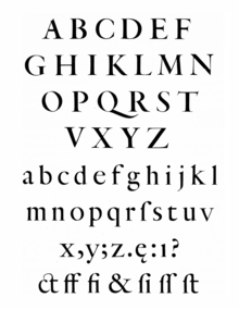
The largest roman types cut by van den Keere had very bold proportions, a high x-height and a dense type colour on the page, a style that remained popular in the Netherlands after his death and became called the "Dutch taste".[16][17][18][3][19][20] Hendrik Vervliet has suggested that the goal was to create roman type "comparable for weight with Gothic letters"[21] at a time when blackletter was still very popular for continuous reading.[22] His Gros canon was used by Plantin in his 1574 Commune sanctorum, a church liturgy song-book intended to be readable at a distance by an entire choir.[23] Lane comments that his roman types "must be accepted as a major innovation...[they] influenced the seventeenth-century Dutch types that in turn influenced types in England and elsewhere"[24] and Vervliet describes him as "the greatest name of this period, perhaps of the whole century in the Netherlands".[25] As influences on his types, Vervliet suggests an earlier type cut by Maarten de Keyser,[25] and Lane some more recent types by Ameet Tavernier, Granjon and Pierre Haultin, whose types he would have known through his work for Plantin.[24][26] His body text type in contrast is very similar to earlier types by engravers such as Claude Garamond and Robert Granjon, who also worked for Plantin.[27][28]

Van den Keere also cut a rotunda gothic type, apparently based on Spanish lettering and intended for a book to be sent to Spain,[29][30] a Civilité and in Lane's view probably a set of Gothic capitals used as initials with an interlaced (Dutch: gestricte) design.[24][31] He is not known to have cut any italic types, which were not popular in the Netherlands during the 1570s.[32]
Besides his own types, he justified matrices (setting their spacing) from other engravers,[33] cut replacement characters for some of Plantin's types with shorter ascenders and descenders to allow tighter linespacing,[34] and in 1572 compiled an inventory for Plantin of the types Plantin owned.[35]
Legacy
Van den Keere died young between 11 July and October 1580,[36] giving him a mature career of only about 12 years, likely as a result of a leg injury he mentioned in his final letter to Plantin.[10][37] Van den Keere's family were Protestants, and with the capture of Ghent in 1584 by Spanish royal forces van den Keere's daughter Colette (or Coletta) and his son Pieter, who became an engraver and mapmaker, lived in London around the period 1584 – 1593.[38] There in 1587 at the Dutch Church, Austin Friars Collette married Jodocus Hondius,[39][40] a mapmaker who was probably also a punchcutter.[41] Pieter sometimes collaborated with him.[42][41] All three later returned to the Netherlands; following Hondius's death Collette took over his publishing business.[38]
In 1581, van den Keere's widow sold many of his punches and matrices to Plantin.[10] Plantin's successors scrupulously preserved the sixteenth-century materials and records of his printing office, which became the Plantin-Moretus Museum, and a large amount of van den Keere's work survives intact there.[43][12]

Thomas de Vechter, van den Keere's foreman, also acquired many of his materials from his widow, documented in a surviving inventory.[31] He moved to Antwerp and then Leiden, establishing a type foundry casting many van den Keere types.[10] De Vechter's foundry was later taken over by Arent Corsz Hogenacker in stages from 1619 – 1623, and on the closure of his type foundry in 1672 his types reached other Dutch foundries.[41][31] Matrices for the interlaced capitals ended up owned by the type foundry of Koninklijke Joh. Enschedé although Enschedé's records do not clearly confirm where they came from or when Enschedé acquired them.[31]
Digital fonts
Digital font designers who have designed interpretations of van den Keere's roman type include Kris Sowersby, who describes his work as "dense, sharp and powerful...I love van den Keere’s texturas. I can feel the influence of them within his roman forms: they’re both narrow, dense and sharp".[22] Hoefler & Co.'s release notes for its Quarto typeface, by Sara Soskolne, describe van den Keere's Two-Line Double Pica display-sized roman (around 42pt)[44] as "an arresting design marked by striking dramatic tensions".[45][19][20][3] Dutch Type Library (DTL) have published Flamande by Matthew Carter,[46][47] a revival of his textura, as well as revivals of his roman types under the names DTL Van den Keere and DTL Gros Canon for a display size.[48][49] Fred Smeijers, whose TEFF Renard typeface is based on his work, felt that basing a typeface on his work produced a "solid and sturdy variant of the Garamond style"[50] and that he was "one of the first to make roman display types that were explicitly conceived as such."[51][52][53] DTL's founder Frank E. Blokland received a doctorate on the spacing and proportions of early metal type, including van den Keere's, from Leiden University in 2016.[54][55]
Notes
References
- Devroye, Luc. "Hendrik van den Keere". Type Design Information. Retrieved 29 July 2020.
- Neil Macmillan (2006). An A-Z of Type Designers. Yale University Press. p. 124. ISBN 0-300-11151-7.
- Shaw, Paul (2017). Revival Type: Digital Typefaces Inspired by the Past. Yale University Press. pp. 36, 70–74. ISBN 978-0-300-21929-6.
- Middendorp 2004, p. 18.
- Briels, J. G. C. A. Zuidnederlandse boekdrukkers en boekverkopers in de Republiek der Verenigde Nederlanden omstreeks 1570-1630 : een bijdrage tot de kennis van de geschiedenis van get boek. B. de Graaf. p. 336. ISBN 9789060043233.
- Laveant, Katell. "Imprimeur, libraire, éditeur, traducteur, auteur : Hendrik van den Keere, polymathe du livre à la Renaissance". Société bibliographique de France. Retrieved 30 July 2020.
- Keuning, Johannes (1960). "Pieter van den Keere (Petrus Kaerius), 1571–1646 (?)". Imago Mundi. 15 (1): 66–72. doi:10.1080/03085696008592179.
- Enschedé, Johannes; Lane, John A. (1993). The Enschedé type specimens of 1768 and 1773: a facsimile ([Nachdr. d. Ausg.] 1768. ed.). Stichting Museum Enschedé, the Enschedé Font Foundry, Uitgeverij De Buitenkant. pp. 29–30 etc. ISBN 9070386585.
- Hoefler, Jonathan. "His Name Was Almost Legion". Hoefler & Co. Retrieved 13 August 2020.
- Lane 2004, p. 41.
- Blouw, Paul Valkema (7 June 2013). Dutch Typography in the Sixteenth Century: The Collected Works of Paul Valkema Blouw. BRILL. p. 899. ISBN 90-04-25655-5.
- Carter 2002, p. 97.
- Carter 2002, p. 12.
- "Hendrik van den Keere (1540-1580), Grande musicque". Museum Plantin-Moretus. Retrieved 29 July 2020.
- Vervliet 2008, p. 466.
- Carter 2002, p. 32.
- Mosley, James. "Type and its Uses, 1455-1830" (PDF). Institute of English Studies. Archived from the original (PDF) on 9 October 2016. Retrieved 7 October 2016.
- Baines, Phil; Haslam, Andrew (2005). Type & Typography. Laurence King Publishing. p. 67. ISBN 978-1-85669-437-7.
- "Introducing Quarto". Hoefler & Co. Retrieved 29 July 2020.
- "Quarto Fonts - Design Notes". Hoefler & Co. Retrieved 29 July 2020.
- Vervliet 1968, p. 230.
- Sowersby, Kris. "Heldane design information". Klim Type Foundry. Retrieved 29 July 2020.
- Smeijers 1999, p. 54.
- Lane 2004, p. 42.
- Vervliet 1968, p. 64.
- Carter 2002.
- Vervliet 1968, pp. 65–66.
- Smeijers 1999, pp. 54–57.
- Vervliet, Hendrik D. L.; Carter, Harry, eds. (1972). Type Specimen Facsimiles II. University of Toronto Press. pp. 7–11.
- Vervliet 1968, pp. 178–179.
- Lane, John A. (1995). "Arent Corsz Hogenacker (ca. 1579-1636): an account of his typefoundry and a note on his types Part two: the types". Quaerendo. 25 (3): 163–191. doi:10.1163/157006995X00017.
- Vervliet 1968, p. 74.
- Vervliet 2008, p. 230.
- Smeijers 1999, p. 57.
- Vervliet 2008, p. 346.
- Middendorp 2004, p. 19.
- Rooses, Max (1878). "Une lettre de Henri du Tour, le Jeune". Messager des sciences historiques, ou, Archives des arts et de la bibliographie de Belgique: 449–462. Retrieved 1 August 2020.
- Sutton, Elizabeth. Early Modern Dutch Prints of Africa. pp. 29–30. ISBN 9781409439707.
- Leslie Stephen; Sir Sidney Lee (1891). DNB. Smith, Elder, & Company. p. 242.
- Cust, Lionel (1905). "Foreign Artists of the Reformed Religion Working in London from about 1560 to 1660". Proceedings of the Huguenot Society of London: 52. Retrieved 30 July 2020.
- Lane, John A. (1995). "Arent Corsz Hogenacker (ca. 1579-1636): an account of his typefoundry and a note on his types Part one: the family and the foundry". Quaerendo. 25 (2): 83–114. doi:10.1163/157006995X00053.
- Hind, Arthur (1952). Engraving in England in the Sixteenth and Seventeenth Centuries: Part I. Cambridge University Press. pp. 203–204.
- Vervliet 1968, p. 67.
- Vervliet 2008, p. 6.
- Buchanan, Matthew. "Quarto". Typographica. Retrieved 29 July 2020.
- "DTL Flamande". Dutch Type Library. Retrieved 29 July 2020.
- Twardoch, Adam; Carter, Matthew (2005). "Typo Interview: Matthew Carter" (PDF). Typo (18): 27, 31.
- "DTL Van den Keere". Dutch Type Library. Retrieved 29 July 2020.
- "DTL Gros Canon". Dutch Type Library. Retrieved 29 July 2020.
- Smeijers 1999, p. 59.
- Smeijers 1999, p. 56.
- "TEFF Renard". The Enschede Font Foundry. Retrieved 30 July 2020.
- Burke, Christopher. "Typeface Review: TEFF Renard". Bulletin of the Printing Historical Society: 8–9.
- Blokland, F. E. "On the origin of patterning in movable Latin type: Renaissance standardisation, systematisation, and unitisation of textura and roman type". Leiden University. Retrieved 6 October 2019.
- Blokland, F. E. "On the Origin of Patterning in Movable Latin Type (blog)". Dutch Type Library. Retrieved 6 October 2019.
Cited literature
- Carter, Harry (2002). Mosley, James (ed.). A View of Early Typography Up to About 1600 (Reprinted ed.). London: Hyphen. ISBN 978-0-907259-21-3.
- Lane, John A. (2004). Early Type Specimens in the Plantin-Moretus Museum: annotated descriptions of the specimens to ca. 1850 (mostly from the Low Countries and France) with preliminary notes on the typefoundries and printing offices (1. ed.). New Castle, Del.: Oak Knoll Press. pp. 41–42. ISBN 9781584561392.
- Middendorp, Jan (2004). Dutch Type. 010 Publishers. pp. 18–19, 243. ISBN 978-90-6450-460-0.
- Smeijers, Fred (1999). "Renard: an idiosyncratic type revival". Quaerendo. 29 (1): 52–60. doi:10.1163/157006999X00077.
- Vervliet, Hendrik D. L. (1968). Sixteenth-Century printing types of the Low Countries. Houten: Hes & De Graaf. pp. 30–32, 64–67, 178. ISBN 9789061948599.
- Vervliet, Hendrik D. L. (2008). The Palaeotypography of the French Renaissance: Selected Papers on Sixteenth-century Typefaces. BRILL. pp. 230, 352. ISBN 978-90-04-16982-1.