Claude Garamond
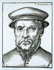
Claude Garamont (c. 1510–1561),[1] known commonly as Claude Garamond, was a French type designer, publisher and punch-cutter based in Paris.[2][3] Garamond worked as an engraver of punches, the masters used to stamp matrices, the moulds used to cast metal type. He worked in the tradition now called old-style serif design, which produced letters with a relatively organic structure resembling handwriting with a pen but with a slightly more structured and upright design. Considered one of the leading type designers of all time, he is recognised to this day for the elegance of his typefaces.[4] Many old-style serif typefaces are collectively known as Garamond, named after the designer.

Garamond was one of the first independent punchcutters, specialising in type design and punch-cutting as a service to others rather than working in house for a specific printer.[5] His career therefore helped to define the future of commercial printing with typefounding as a distinct industry to printing books.[6]
Early life and background


Garamond's early life has been the subject of some research and considerable uncertainty . Dates as early as 1480 and as late as c. 1510 have been proposed for his birth, the latter being preferred by the French ministry of culture.[10] In favour of a later date, his will of 1561 states that his mother was then still alive.[11][12] He married twice, to Guillemette Gaultier and, after her death, to Ysabeau Le Fevre.[13][lower-alpha 1] Garamond may have apprenticed with Antoine Augereau and was perhaps also trained by Simon de Colines.[24] He later worked with Geoffroy Tory,[25] whose interests in humanist typography and the ancient Greek capital letterforms, or majuscules, may have informed Garamond's work.
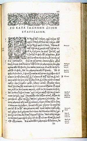
Garamond came to prominence around 1540, when three of his Greek typefaces (now called the Grecs du roi (1541)) were requested for a royally-ordered book series by Robert Estienne. Garamond based these types, now known as the Grecs du roi, on the handwriting of Angelo Vergecio, the King's Librarian at Fontainebleau.[26][27] The result is an immensely complicated set of type, including a vast variety of alternate letters and ligatures to simulate the flexibility of handwriting.[16][28][29][30]
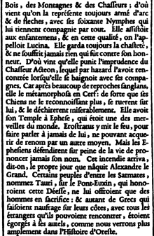
Garamond worked for a variety of employers on commission, creating punches for publishers and the government.[31] Garamond's typefaces were popular abroad, and replaced Griffo's original roman type at the Aldine Press in Venice.[32] He also worked as a publisher and bookseller.[17][33][34] While his italics have been considered less impressive than his roman typefaces, he was one of the early printers to establish the modern tradition that the italic capitals should slope as the lower case does, rather than remain upright as Roman square capitals do.[lower-alpha 2][36]
Although Garamond himself remains an eminent figure in French printing of the sixteenth century, historical research over the last century has increasingly placed his work in context. Garamond was one figure among many at a time when new typefaces were rapidly produced in sixteenth-century France, and these type designers operated within a pre-existing tradition defined by the work of figures such as Aldus Manutius who were active over the preceding half-century. The period from 1520 to around 1560, encompassing Garamond's career as an artisan, was an extremely busy period for typeface creation, with a wide range of fonts created, some apparently for exclusive use by a specific printer, others sold or traded between them. Many engravers were active over this time, including Garamond himself, Granjon, Guillaume Le Bé, Antoine Augereau, Simon de Colines, Pierre Hautin and others, creating typefaces not just in the Latin alphabet, but also in Greek and Hebrew for scholarly use.[37] This period saw the creation of a pool of high-quality punches and matrices that would supply the French printing industry, to a large extent, for the next two centuries.[23][37]
Despite Garamond's eminence, he was never particularly financially successful, perhaps due to a surfeit of competition and piracy in the Parisian book industry of the time. In 1545, Garamond entered the publishing trade in a partnership with Jean Barbé, a Parisian bookseller.[38] The first book Garamond published was called, "Pia et Religiosa Meditatio" by David Chambellan.[39]
After Garamond's death
In November 1561, following his death, his equipment, punches, and matrices were inventoried and sold off to purchasers including Guillaume Le Bé, Christophe Plantin, and André Wechel.[40] His wife was forced to sell his punches, which caused the typefaces of Garamond to become widely used for two centuries, but often with attributions becoming highly confused.[41] The chaotic sales caused problems, and Le Bé's son wrote to Plantin's successor Moretus offering to trade matrices so they could both have complementary type in a range of sizes.[35][42] Egelhoff-Berner brought out a specimen in 1592 of types by Garamond and others, which would later be a source for many Garamond revivals.[43]
The only major collection of original Garamond material in the Latin alphabet is that collected soon after his death by Christophe Plantin, based in Antwerp.[44][45] This collection of punches matrices now forms a major part of the collection of the Plantin-Moretus Museum in Antwerp, together with many other typefaces collected by Plantin from other typefounders of the period.[46] The collection has been used extensively for research, for example by historians Harry Carter and H. D. L. Vervliet.[47]
See also
- Garamond
- History of Western typography
- Movable type
- Printing Press
- Punchcutting
- Typesetting
Notes
- A document called the Le Bé Memorandum (based on the memories of Garamond's contemporary Guillaume Le Bé, but collated by one of his sons around 1643) suggests that Garamond finished his apprenticeship around 1510.[14][15] This is considered unlikely by modern historians, especially since several other dates in the document also seem to be about twenty or thirty years too early.[16][17][18] It has been suggested that the first Roman typefaces designed by Claude Garamond were a set created for Robert Estienne and first used by him around 1530-3. However, Vervliet, Mosley and the French ministry of culture's history of Garamond's career suggest that these 'Estienne typefaces' were not designed by Garamond and that his career began somewhat later.[19][20][21][22] Vervliet suggests that the creator of this set of typefaces to a unified design may have been a 'Master Constantin', recorded in the Le Bé Memorandum as a master type designer of the period before Garamond but about whom nothing is otherwise known and to whom no obvious other body of work can be ascribed. (Nicolas Barker suggests very tentatively that his name may suggest a connection to a known family of printers from Lyon.[23]) If so, his disappearance from history (perhaps due to an early death, since all his presumed work appeared in just three years from 1530–1533) may have allowed Garamond's reputation to develop in the following decade.[21] Vervliet does however note that attributions of the Estienne type to Garamond do begin quite early.[18]
- A famous example of this style of italic with upright capitals is the work of Arrighi in Rome, which also inspired French printers of the sixteenth century. Early italic typefaces were not intended as complements to roman type, but as a more condensed alternative.[35]
References
Footnotes
- Lane, John A. (2005). "Claude Garamont and his Roman Types". Garamond Premier Pro: a contemporary adaptation; modelled on the roman types of Claude Garamond and the italic types of Robert Granjon. San Jose: Adobe Systems. pp. 5–13.
- Bringhurst, Robert (2008). The Elements of Typographic Style. Vancouver, Canada: Hartley & Maks. p. 337. ISBN 978-0-88179-205-8.
- Encyclopædia Britannica. 2014. Retrieved 20 August 2015.
- Haley, Allan (2 December 1986). "Claude Garamond". tipometar.org. Retrieved 9 March 2016.
- Schlager, Neil (2000). Science and Its Times: Understanding the Social Significance and Scientific Discovery. Detroit: Gale Group.
- Steinberg, S.H. (1996). Five Hundred Years of Printing. The British Library and Oak Knoll Press. pp. 16, 75.
- Hendrik D. L. Vervliet (2008). The Palaeotypography of the French Renaissance: Selected Papers on Sixteenth-century Typefaces. BRILL. p. 223. ISBN 978-90-04-16982-1.
- Lamesle, Claude (1742). Épreuves générales des caracteres qui se trouvent chez Claude Lamesle. Rue Galande, Paris: Claude Lamesle. Retrieved 2 February 2016.
- Valerie R. Hotchkiss, Charles C. Ryrie (1998). "Formatting the Word of God: An Exhibition at Bridwell Library". Archived from the original on January 9, 2009.
- "The Garamont family". French Ministry of Culture. Retrieved 27 September 2015.
- "Garamont's Will". Culture.fr. French Ministry of Culture. Retrieved 27 September 2015.
- "The career of a punch-cutter". French Ministry of Culture. Retrieved 27 September 2015.
- "Garamond Family Tree". French Ministry of Culture. Retrieved 27 September 2015.
- Carter, Harry (2002). A view of early typography up to about 1600 (Reprinted ed.). London: Hyphen. ISBN 978-0-907259-21-3.
- Carter, Harry; Morison, Stanley (1967). Sixteenth-century French Typefounders: The Le Bé memorandum. Private printing for A. Jammes.
- Mosley, James (2006). "Garamond, Griffo and Others: The Price of Celebrity". Bibiologia: 17–41. Retrieved 3 December 2015.
- "The Career of a Punch-Cutter". French Ministry of Culture. Retrieved 3 December 2015.
- Hendrik D. L. Vervliet (2008). The Palaeotypography of the French Renaissance: Selected Papers on Sixteenth-century Typefaces. BRILL. pp. 167–171. ISBN 978-90-04-16982-1.
- "Who invented Garamond?". French Ministry of Culture. Retrieved 3 December 2015.
- "The Roman typefaces". French Ministry of Culture. Retrieved 3 December 2015.
- Vervliet, Hendrik D.L. (2008). The palaeotypography of the French Renaissance. Selected papers on sixteenth-century typefaces. 2 vols. Leiden: Koninklijke Brill NV. pp. 164–5. ISBN 978-90-04-16982-1.
- Elizabeth Armstrong (28 April 2011). Robert Estienne, Royal Printer: An Historical Study of the Elder Stephanus. Cambridge University Press. pp. 48–9. ISBN 978-0-521-17066-6.
- Barker, Nicolas (2003). "The Aldine Roman in Paris: 1530-1534". Form and Meaning in the History of the Book : selected essays. London: British Library. pp. 186–214. ISBN 0-7123-4777-1.
- "Garamond".
- "Garamond".
- Schlager, Neil (2000). Science and Its Times: Understanding the Social Significance and Scientific Discovery. Detroit: Gale Group.
- "Garamont's early career: the grecs du roi". French Ministry of Culture. Retrieved 3 December 2015.
- "The Greek Typefaces". French Ministry of Culture. Retrieved 3 December 2015.
- Mosley, James. "Porson's Greek type design". Type Foundry. Retrieved 30 January 2016.
- Elizabeth Armstrong (28 April 2011). Robert Estienne, Royal Printer: An Historical Study of the Elder Stephanus. Cambridge University Press. p. 52. ISBN 978-0-521-17066-6.
- "The spread of Garamond". French Ministry of Culture. Retrieved 3 December 2015.
- The Aldine Press: catalogue of the Ahmanson-Murphy collection of books by or relating to the press in the Library of the University of California, LosAngeles : incorporating works recorded elsewhere. Berkeley [u.a.]: Univ. of California Press. 2001. p. 23. ISBN 978-0-520-22993-8.
- "Garamont the bookseller". French Ministry of Culture. Retrieved 3 December 2015.
- "Garamont's will". French Ministry of Culture. Retrieved 3 December 2015.
- Warde, Beatrice (1926). "The 'Garamond' Types". The Fleuron: 131–179.
- Dearden, James (1973). Encyclopedia of Library and Information Science: Claude Garamond. New York u.a.: Dekker. pp. 196–199. ISBN 978-0-8247-2109-1. Retrieved 11 December 2015.
- Vervliet, Hendrik D.L. (2010). French Renaissance Printing Types: a Conspectus. New Castle, Del.: Oak Knoll Press. pp. 23–32. ISBN 978-1584562719.
- Garamond French Ministry of Culture and Communication.
- "Claude Garamond". Linotype. Retrieved 5 November 2013.
- Garamond French Ministry of Culture and Communication.
- Tselentis, Jason (2012). Typography, Referenced: A Comprehensive Visual Guide to the Language, History, and Practice of Typography. Gloucester, Mass: Rockport Publishers. p. 74.
- Updike, Daniel Berkeley (1922). "Chapter 15: Types of the Netherlands, 1500–1800". Printing Types: Their History, Forms and Uses: Volume 2. Harvard University Press. pp. 6–7. Retrieved 18 December 2015.
- "Just what makes a Garamond a Garamond?". Linotype. Retrieved 11 December 2015.
- Mosley, James. "Garamond or Garamont". Type Foundry blog. Retrieved 3 December 2015.
- Mosley, James. "Caractères de l'Université". Type Foundry. Retrieved 3 December 2015.
- Mosley, James. "The materials of typefounding". Type Foundry. Retrieved 14 August 2015.
- Carter, Harry (2002). A view of early typography up to about 1600 (Reprinted ed.). London: Hyphen. ISBN 978-0-907259-21-3.
Bibliography
- Tilley, Arthur (1900). "Humanism under Francis I" (PDF). The English Historical Review. 15 (59): 456–478. doi:10.1093/ehr/xv.lix.456.
- Lane, John A. (August 2005). "Claude Garamont and his Roman Type". Garamond Premier Pro: A Contemporary Adaptation. Adobe Systems. pp. 5–13. A survey of Claude Garamond's career and typefaces, of Robert Granjon's italic types which were combined with Garamond roman types, and a brief summary of subsequent revivals through Garamond Premier Pro.
- Kapr, Albert (1983). Schriftkunst. Geschichte, Anatomie und Schönheit der lateinischen Buchstaben (in German). Munich.