Contour line
A contour line (also isoline, isopleth, or isarithm) of a function of two variables is a curve along which the function has a constant value, so that the curve joins points of equal value.[1][2] It is a plane section of the three-dimensional graph of the function f(x, y) parallel to the (x, y)-plane. In cartography, a contour line (often just called a "contour") joins points of equal elevation (height) above a given level, such as mean sea level.[3] A contour map is a map illustrated with contour lines, for example a topographic map, which thus shows valleys and hills, and the steepness or gentleness of slopes.[4] The contour interval of a contour map is the difference in elevation between successive contour lines.[5]
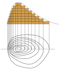
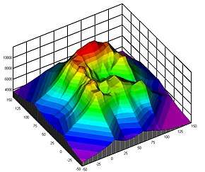
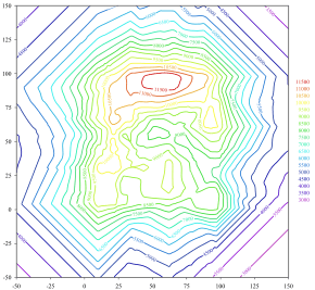
More generally, a contour line for a function of two variables is a curve connecting points where the function has the same particular value.[2]
The gradient of the function is always perpendicular to the contour lines. When the lines are close together the magnitude of the gradient is large: the variation is steep. A level set is a generalization of a contour line for functions of any number of variables.
Contour lines are curved, straight or a mixture of both lines on a map describing the intersection of a real or hypothetical surface with one or more horizontal planes. The configuration of these contours allows map readers to infer the relative gradient of a parameter and estimate that parameter at specific places. Contour lines may be either traced on a visible three-dimensional model of the surface, as when a photogrammetrist viewing a stereo-model plots elevation contours, or interpolated from the estimated surface elevations, as when a computer program threads contours through a network of observation points of area centroids. In the latter case, the method of interpolation affects the reliability of individual isolines and their portrayal of slope, pits and peaks.[6]
Types
Contour lines are often given specific names beginning "iso-" (Ancient Greek: ἴσος, romanized: isos, lit. 'equal') according to the nature of the variable being mapped, although in many usages the phrase "contour line" is most commonly used. Specific names are most common in meteorology, where multiple maps with different variables may be viewed simultaneously. The prefix "iso-" can be replaced with "isallo-" to specify a contour line connecting points where a variable changes at the same rate during a given time period.
The words isoline and isarithm (ἀριθμός arithmos "number") are general terms covering all types of contour line. The word isogram (γράμμα gramma "writing or drawing") was proposed by Francis Galton in 1889 as a convenient generic designation for lines indicating equality of some physical condition or quantity,[7] though isogram can also refer to a word without a repeated letter.
An isogon (from γωνία or gonia, meaning 'angle') is a contour line for a variable which measures direction. In meteorology and in geomagnetics, the term isogon has specific meanings which are described below. An isocline (from κλίνειν or klinein, meaning 'to lean or slope') is a line joining points with equal slope. In population dynamics and in geomagnetics, the terms isocline and isoclinic line have specific meanings which are described below.
Equidistant points
A curve of equidistant points is a set of points all at the same distance from a given point, line, or polyline. In this case the function whose value is being held constant along a contour line is a distance function.
Isopleths
In geography, the word isopleth (from πλῆθος or plethos, meaning 'quantity') is used for contour lines that depict a variable which cannot be measured at a point, but which instead must be calculated from data collected over an area. An example is population density, which can be calculated by dividing the population of a census district by the surface area of that district. Each calculated value is presumed to be the value of the variable at the centre of the area, and isopleths can then be drawn by a process of interpolation. The idea of an isopleth map can be compared with that of a choropleth map.[8][9][10]
In meteorology, the word isopleth is used for any type of contour line.[11]
Meteorology
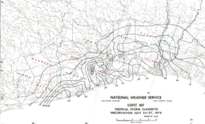
Meteorological contour lines are based on interpolation of the point data received from weather stations and weather satellites. Weather stations are seldom exactly positioned at a contour line (when they are, this indicates a measurement precisely equal to the value of the contour). Instead, lines are drawn to best approximate the locations of exact values, based on the scattered information points available.
Meteorological contour maps may present collected data such as actual air pressure at a given time, or generalized data such as average pressure over a period of time, or forecast data such as predicted air pressure at some point in the future
Thermodynamic diagrams use multiple overlapping contour sets (including isobars and isotherms) to present a picture of the major thermodynamic factors in a weather system.
Barometric pressure
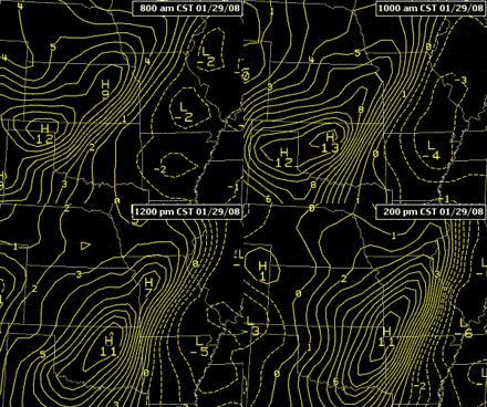
An isobar (from βάρος or baros, meaning 'weight') is a line of equal or constant pressure on a graph, plot, or map; an isopleth or contour line of pressure. More accurately, isobars are lines drawn on a map joining places of equal average atmospheric pressure reduced to sea level for a specified period of time. In meteorology, the barometric pressures shown are reduced to sea level, not the surface pressures at the map locations.[12] The distribution of isobars is closely related to the magnitude and direction of the wind field, and can be used to predict future weather patterns. Isobars are commonly used in television weather reporting.
Isallobars are lines joining points of equal pressure change during a specific time interval.[13] These can be divided into anallobars, lines joining points of equal pressure increase during a specific time interval,[14] and katallobars, lines joining points of equal pressure decrease.[15] In general, weather systems move along an axis joining high and low isallobaric centers.[16] Isallobaric gradients are important components of the wind as they increase or decrease the geostrophic wind.
An isopycnal is a line of constant density. An isoheight or isohypse is a line of constant geopotential height on a constant pressure surface chart. Isohypse and isoheight are simply known as lines showing equal pressure on a map.
Temperature and related subjects
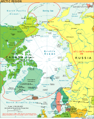
An isotherm (from θέρμη or thermē, meaning 'heat') is a line that connects points on a map that have the same temperature. Therefore, all points through which an isotherm passes have the same or equal temperatures at the time indicated.[17][2] An isotherm at 0 °C is called the freezing level. The term was coined by the Prussian geographer and naturalist Alexander von Humboldt, who as part of his research into the geographical distribution of plants published the first map of isotherms in Paris, in 1817.[18]
An isogeotherm is a line of equal mean annual temperature. An isocheim is a line of equal mean winter temperature, and an isothere is a line of equal mean summer temperature.
An isohel (from ἥλιος or helios, meaning 'Sun') is a line of equal or constant solar radiation.
Rainfall and air moisture
An isohyet or isohyetal line (from ὕετος or huetos, meaning 'rain') is a line joining points of equal rainfall on a map in a given period. A map with isohyets is called an isohyetal map.
An isohume is a line of constant relative humidity, while an isodrosotherm (from δρόσος or drosos, meaning 'dew', and θέρμη or therme, meaning 'heat') is a line of equal or constant dew point.
An isoneph is a line indicating equal cloud cover.
An isochalaz is a line of constant frequency of hail storms, and an isobront is a line drawn through geographical points at which a given phase of thunderstorm activity occurred simultaneously.
Snow cover is frequently shown as a contour-line map.
Wind
An isotach (from ταχύς or tachus, meaning 'fast') is a line joining points with constant wind speed. In meteorology, the term isogon refers to a line of constant wind direction.
Freeze and thaw
An isopectic line denotes equal dates of ice formation each winter, and an isotac denotes equal dates of thawing.
Physical geography and oceanography
Elevation and depth
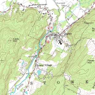
Contours are one of several common methods used to denote elevation or altitude and depth on maps. From these contours, a sense of the general terrain can be determined. They are used at a variety of scales, from large-scale engineering drawings and architectural plans, through topographic maps and bathymetric charts, up to continental-scale maps.
"Contour line" is the most common usage in cartography, but isobath for underwater depths on bathymetric maps and isohypse for elevations are also used.
In cartography, the contour interval is the elevation difference between adjacent contour lines. The contour interval should be the same over a single map. When calculated as a ratio against the map scale, a sense of the hilliness of the terrain can be derived.
Interpretation
There are several rules to note when interpreting terrain contour lines:
- The rule of Vs: sharp-pointed vees usually are in stream valleys, with the drainage channel passing through the point of the vee, with the vee pointing upstream. This is a consequence of erosion.
- The rule of Os: closed loops are normally uphill on the inside and downhill on the outside, and the innermost loop is the highest area. If a loop instead represents a depression, some maps note this by short lines called hachures which are perpendicular to the contour and point in the direction of the low.[19] (The concept is similar to but distinct from hachures used in hachure maps.)
- Spacing of contours: close contours indicate a steep slope; distant contours a shallow slope. Two or more contour lines merging indicates a cliff. By counting the number of contours that cross a segment of a stream, the stream gradient can be approximated.
Of course, to determine differences in elevation between two points, the contour interval, or distance in altitude between two adjacent contour lines, must be known, and this is normally stated in the map key. Usually contour intervals are consistent throughout a map, but there are exceptions. Sometimes intermediate contours are present in flatter areas; these can be dashed or dotted lines at half the noted contour interval. When contours are used with hypsometric tints on a small-scale map that includes mountains and flatter low-lying areas, it is common to have smaller intervals at lower elevations so that detail is shown in all areas. Conversely, for an island which consists of a plateau surrounded by steep cliffs, it is possible to use smaller intervals as the height increases.[20]
Electrostatics
An isopotential map is a measure of electrostatic potential in space, often depicted in two dimensions with the electostatic charges inducing that electric potential. The term equipotential line or isopotential line refers to a curve of constant electric potential. Whether crossing an equipotential line represents ascending or descending the potential is inferred from the labels on the charges. In three dimensions, equipotential surfaces may be depicted with a two dimensional cross-section, showing equipotential lines at the intersection of the surfaces and the cross-section.
The general mathematical term level set is often used to describe the full collection of points having a particular potential, especially in higher dimensional space.
Magnetism
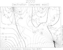
In the study of the Earth's magnetic field, the term isogon or isogonic line refers to a line of constant magnetic declination, the variation of magnetic north from geographic north. An agonic line is drawn through points of zero magnetic declination. An isoporic line refers to a line of constant annual variation of magnetic declination .[21]
An isoclinic line connects points of equal magnetic dip, and an aclinic line is the isoclinic line of magnetic dip zero.
An isodynamic line (from δύναμις or dynamis meaning 'power') connects points with the same intensity of magnetic force.
Oceanography
Besides ocean depth, oceanographers use contour to describe diffuse variable phenomena much as meteorologists do with atmospheric phenomena. In particular, isobathytherms are lines showing depths of water with equal temperature, isohalines show lines of equal ocean salinity, and Isopycnals are surfaces of equal water density.
Geology
Various geological data are rendered as contour maps in structural geology, sedimentology, stratigraphy and economic geology. Contour maps are used to show the below ground surface of geologic strata, fault surfaces (especially low angle thrust faults) and unconformities. Isopach maps use isopachs (lines of equal thickness) to illustrate variations in thickness of geologic units.
Environmental science
In discussing pollution, density maps can be very useful in indicating sources and areas of greatest contamination. Contour maps are especially useful for diffuse forms or scales of pollution. Acid precipitation is indicated on maps with isoplats. Some of the most widespread applications of environmental science contour maps involve mapping of environmental noise (where lines of equal sound pressure level are denoted isobels[22]), air pollution, soil contamination, thermal pollution and groundwater contamination. By contour planting and contour ploughing, the rate of water runoff and thus soil erosion can be substantially reduced; this is especially important in riparian zones.
Ecology
An isoflor is an isopleth contour connecting areas of comparable biological diversity. Usually, the variable is the number of species of a given genus or family that occurs in a region. Isoflor maps are thus used to show distribution patterns and trends such as centres of diversity.[23]
Social sciences
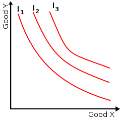
In economics, contour lines can be used to describe features which vary quantitatively over space. An isochrone shows lines of equivalent drive time or travel time to a given location and is used in the generation of isochrone maps. An isotim shows equivalent transport costs from the source of a raw material, and an isodapane shows equivalent cost of travel time.
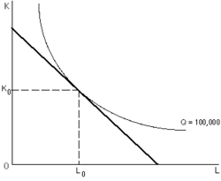
Contour lines are also used to display non-geographic information in economics. Indifference curves (as shown at left) are used to show bundles of goods to which a person would assign equal utility. An isoquant (in the image at right) is a curve of equal production quantity for alternative combinations of input usages, and an isocost curve (also in the image at right) shows alternative usages having equal production costs.
In political science an analogous method is used in understanding coalitions (for example the diagram in Laver and Shepsle's work[24]).
In population dynamics, an isocline shows the set of population sizes at which the rate of change, or partial derivative, for one population in a pair of interacting populations is zero.
Statistics
In statistics, isodensity lines [25] or isodensanes are lines that join points with the same value of a probability density. Isodensanes are used to display bivariate distributions. For example, for a bivariate elliptical distribution the isodensity lines are ellipses.
Thermodynamics, engineering, and other sciences
Various types of graphs in thermodynamics, engineering, and other sciences use isobars (constant pressure), isotherms (constant temperature), isochors (constant specific volume), or other types of isolines, even though these graphs are usually not related to maps. Such isolines are useful for representing more than two dimensions (or quantities) on two-dimensional graphs. Common examples in thermodynamics are some types of phase diagrams.
Isoclines are used to solve ordinary differential equations.
In interpreting radar images, an isodop is a line of equal Doppler velocity, and an isoecho is a line of equal radar reflectivity.
In the case of hybrid contours, energies of hybrid orbitals and the energies of pure atomic orbitals are plotted. The graph obtained is called hybrid contour.
Other phenomena
- isochasm: aurora equal occurrence
- isochor: volume
- isodose: absorbed dose of radiation
- isophene: biological events occurring with coincidence such as plants flowering
- isophote: illuminance
- mobile telephony: mobile received power and cell coverage area
Algorithms
- finding boundaries of level sets after image segmentation
- Active contour model
History
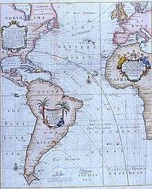
The idea of lines that join points of equal value was rediscovered several times. The oldest known isobath (contour line of constant depth) is found on a map dated 1584 of the river Spaarne, near Haarlem, by Dutchman Pieter Bruinsz.[26] In 1701, Edmond Halley used such lines (isogons) on a chart of magnetic variation.[27] The Dutch engineer Nicholas Cruquius drew the bed of the river Merwede with lines of equal depth (isobaths) at intervals of 1 fathom in 1727, and Philippe Buache used them at 10-fathom intervals on a chart of the English Channel that was prepared in 1737 and published in 1752. Such lines were used to describe a land surface (contour lines) in a map of the Duchy of Modena and Reggio by Domenico Vandelli in 1746, and they were studied theoretically by Ducarla in 1771, and Charles Hutton used them in the Schiehallion experiment. In 1791, a map of France by J. L. Dupain-Triel used contour lines at 20-metre intervals, hachures, spot-heights and a vertical section. In 1801, the chief of the French Corps of Engineers, Haxo, used contour lines at the larger scale of 1:500 on a plan of his projects for Rocca d'Aufo.[28][29][30]
By around 1843, when the Ordnance Survey started to regularly record contour lines in Great Britain and Ireland, they were already in general use in European countries. Isobaths were not routinely used on nautical charts until those of Russia from 1834, and those of Britain from 1838.[28][31][32]
When maps with contour lines became common, the idea spread to other applications. Perhaps the latest to develop are air quality and noise pollution contour maps, which first appeared in the United States in approximately 1970, largely as a result of national legislation requiring spatial delineation of these parameters. In 2007, Pictometry International was the first to allow users to dynamically generate elevation contour lines to be laid over oblique images.
Graphical design
To maximize readability of contour maps, there are several design choices available to the map creator, principally line weight, line color, line type and method of numerical marking.
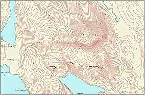
Line weight is simply the darkness or thickness of the line used. This choice is made based upon the least intrusive form of contours that enable the reader to decipher the background information in the map itself. If there is little or no content on the base map, the contour lines may be drawn with relatively heavy thickness. Also, for many forms of contours such as topographic maps, it is common to vary the line weight and/or color, so that a different line characteristic occurs for certain numerical values. For example, in the topographic map above, the even hundred foot elevations are shown in a different weight from the twenty foot intervals.
Line color is the choice of any number of pigments that suit the display. Sometimes a sheen or gloss is used as well as color to set the contour lines apart from the base map. Line colour can be varied to show other information.
Line type refers to whether the basic contour line is solid, dashed, dotted or broken in some other pattern to create the desired effect. Dotted or dashed lines are often used when the underlying base map conveys very important (or difficult to read) information. Broken line types are used when the location of the contour line is inferred.
Numerical marking is the manner of denoting the arithmetical values of contour lines. This can be done by placing numbers along some of the contour lines, typically using interpolation for intervening lines. Alternatively a map key can be produced associating the contours with their values.
If the contour lines are not numerically labeled and adjacent lines have the same style (with the same weight, color and type), then the direction of the gradient cannot be determined from the contour lines alone. However, if the contour lines cycle through three or more styles, then the direction of the gradient can be determined from the lines. The orientation of the numerical text labels is often used to indicate the direction of the slope.
Plan view versus profile view
Most commonly contour lines are drawn in plan view, or as an observer in space would view the Earth's surface: ordinary map form. However, some parameters can often be displayed in profile view showing a vertical profile of the parameter mapped. Some of the most common parameters mapped in profile are air pollutant concentrations and sound levels. In each of those cases it may be important to analyze (air pollutant concentrations or sound levels) at varying heights so as to determine the air quality or noise health effects on people at different elevations, for example, living on different floor levels of an urban apartment. In actuality, both plan and profile view contour maps are used in air pollution and noise pollution studies.
Labeling contour maps
Labels are a critical component of elevation maps. A properly labeled contour map helps the reader to quickly interpret the shape of the terrain. If numbers are placed close to each other, it means that the terrain is steep. Labels should be placed along a slightly curved line "pointing" to the summit or nadir, from several directions if possible, making the visual identification of the summit or nadir easy.[33][34] Contour labels can be oriented so a reader is facing uphill when reading the label.
Manual labeling of contour maps is a time-consuming process, however, there are a few software systems that can do the job automatically and in accordance with cartographic conventions, called automatic label placement.
See also
- Active contour model
- Aeronautical chart
- Boundary tracing
- Cartogram
- Compass rose
- Curve tracing
- Dymaxion map
- Estate map
- Fall line (topography)
- Fantasy map
- Floor plan
- Geologic map
- Map design
- Marching squares
- Nautical chart
- Pictorial maps
- Planform
- Plat
- Reversed map
- Road atlas
- Street map
- Tensor field
- TERCOM
- Thematic map
- Topographic map
- World map
References
- Courant, Richard, Herbert Robbins, and Ian Stewart. What Is Mathematics?: An Elementary Approach to Ideas and Methods. New York: Oxford University Press, 1996. p. 344.
- Hughes-Hallett, Deborah; McCallum, William G.; Gleason, Andrew M. (2013). Calculus : Single and Multivariable (6 ed.). John wiley. ISBN 978-0470-88861-2.
- Merriam Webster – contour line
- contour map Merriam Webster
- Tracy, John C. Plane Surveying; A Text-Book and Pocket Manual. New York: J. Wiley & Sons, 1907. p. 337.
- Davis, John C., 1986, Statistics and data analysis in geology, Wiley ISBN 0-471-08079-9
- Oxford English Dictionary; see also: Nature, 40, 1889, p.651.
- Robinson AH (1971). "The genealogy of the isopleth". Cartographic Journal. 8: 49–53. doi:10.1179/caj.1971.8.1.49.
- T. Slocum, R. McMaster, F. Kessler, and H. Howard, Thematic Cartography and Geographic Visualization, 2nd edition, Pearson, 2005, ISBN 0-13-035123-7, p. 272.
- ArcGIS, Isopleth: Contours, 2013.
- NOAA's National Weather Service, Glossary.
- Edward J. Hopkins, Ph.D. (1996-06-10). "Surface Weather Analysis Chart". University of Wisconsin. Retrieved 2007-05-10.
- World Meteorological Organisation. "Isallobar". Eumetcal. Archived from the original on 16 April 2014. Retrieved 12 April 2014.
- World Meteorological Organisation. "Anallobar". Eumetcal. Archived from the original on 24 September 2015. Retrieved 12 April 2014.
- World Meteorological Organisation. "Katallobar". Eumetcal. Archived from the original on 5 February 2008. Retrieved 12 April 2014.
- "Forecasting weather system movement with pressure tendency". Chapter 13 – Weather Forecasting. Lyndon State College Atmospheric Sciences. Retrieved 12 April 2014.
- DataStreme Atmosphere (2008-04-28). "Air Temperature Patterns". American Meteorological Society. Archived from the original on 2008-05-11. Retrieved 2010-02-07.
- Munzar, Jan (1967-09-01). "Alexander Von Humboldt and His Isotherms". Weather. 22 (9): 360–363. Bibcode:1967Wthr...22..360M. doi:10.1002/j.1477-8696.1967.tb02989.x. ISSN 1477-8696.
- Leveson, David J., Class materials. http://academic.brooklyn.cuny.edu/geology/leveson/core/linksa/depression.html, City University of New York, 2002. Accessed 2019-02-22.
- Sark (Sercq), D Survey, Ministry of Defence, Series M 824, Sheet Sark, Edition 4 GSGS, 1965, OCLC OCLC 27636277. Scale 1:10,560. Contour intervals: 50 feet up to 200, 20 feet from 200 to 300, and 10 feet above 300.
- "isoporic line". 1946. Retrieved 2015-07-20.
- "Isobel". 2005-01-05. Retrieved 2010-04-25.
- Specht, Raymond. Heathlands and related shrublands: Analytical studies. Elsevier. pp. 219–220.
- Laver, Michael and Kenneth A. Shepsle (1996) Making and breaking governments pictures.
- Fernández, Antonio (2011). "A Generalized Regression Methodology for Bivariate Heteroscedastic Data" (PDF). Communications in Statistics – Theory and Methods. 40 (4): 598–621. doi:10.1080/03610920903444011.
- Morato-Moreno, Manuel (2017). "Orígenes de la representación topográfica del terreno en algunos mapas hispanoamericanos del s. XVI". Boletín de la Asociación de Geógrafos Españoles. doi:10.21138/bage.2414.
- Thrower, N. J. W. Maps and Civilization: Cartography in Culture and Society, University of Chicago Press, 1972, revised 1996, page 97; and Jardine, Lisa Ingenious Pursuits: Building the Scientific Revolution, Little, Brown, and Company, 1999, page 31.
- R. A. Skelton, "Cartography", History of Technology, Oxford, vol. 6, pp. 612-614, 1958.
- Colonel Berthaut, La Carte de France, vol. 1, p. 139, quoted by Close.
- C. Hutton, "An account of the calculations made from the survey and measures taken at Schehallien, in order to ascertain the mean density of the Earth", Philosophical Transactions of the Royal Society of London, vol. 68, pp. 756-757
- C. Close, The Early Years of the Ordnance Survey, 1926, republished by David and Charles, 1969, ISBN 0-7153-4477-3, pp. 141-144.
- T. Owen and E. Pilbeam, Ordnance Survey: Map Makers to Britain since 1791, HMSO, 1992, ISBN 0-11-701507-5.
- Imhof, E., "Die Anordnung der Namen in der Karte," Annuaire International de Cartographie II, Orell-Füssli Verlag, Zürich, 93-129, 1962.
- Freeman, H., "Computer Name Placement," ch. 29, in Geographical Information Systems, 1, D.J. Maguire, M.F. Goodchild, and D.W. Rhind, John Wiley, New York, 1991, 449-460.