Add multiple series to a dynamic chart

4

I have a large amount of data stored in a table that is used to update about 8 charts (through named ranges). Each chart has the date and ID as the x-axis with a particular parameter being charted. Each column of the table has its own named range which allows this to work and for the charts to update as more data is added.
This all works great, but now the end user is requesting that one of the series on the charts is broken down into some other series. For example my data could be:

Date      ID       Source     Parameter 1      Parameter 2      Parameter 3
7/21/15   11       Boston       12               55               5.25
7/21/15   12       New York     10               53               5.05
7/21/15   13       Boston       11.2             55               5.16
7/21/15   14       New York     12               57               4.95
7/21/15   15       New York     10               56               5.62
7/21/15   16       Albany       15               54               5.80
7/22/15   11       Albany       17               56               5.62
7/21/15   12       Vermont      19               58               5.34

Currently, all this data is being charted as one series, but now I would like to have different series for each of the sources. Since there is so much data, I would really rather not have to sort it and manually edit the source data for each of the charts as this would be very time consuming. Does anyone have any solutions on how to separate the named range based on the value in a particular column?

To add a visual of the chart I am trying to edit: Graph
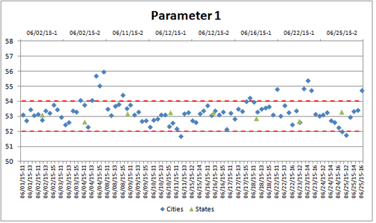
The table above is a simplified version of the data. The charts themselves include data from multiple worksheets, but the series I would like to add would be a breakdown of the Cities series shown above.

Any and all help is appreciated.

Sabrina

Posted 2015-07-22T14:29:44.567

Reputation: 43

How about a pivot table with Source in the Legend Field, Date in the axis field, and Parameter1, Parameter2 and Parameter3 in the Values field? – Adam – 2015-07-22T15:01:28.033

Thanks for the suggestion - I added an example of the chart I am trying to update in the original post. Just based on the data I have I'm not sure I can make a PivotChart present the data in a way that's easy to read. – Sabrina – 2015-07-22T15:35:10.153

Answers

1

To break out your series based on a value in your source (or any other column), you could use helper columns.

  1. Create an additional column for each value you want to break out.
  2. For your Boston column, use the formula =IF([Source] = "Boston", [Parameter 1],na()).
  3. Repeat for each additional source, replacing the comparison value as appropriate.
  4. Define the helper columns as named ranges.
  5. Chart those newly created ranges. The n/a values won't chart, so you'll be left with the appropriate parameter values for each chart/series combination.

dav

Posted 2015-07-22T14:29:44.567

Reputation: 8 378

I have seen solutions like that but my understanding is that if I go down that road I would have to create helper columns for each parameter and as I have 12 of them I wanted to see if there was another way rather than increase the table. – Sabrina – 2015-07-23T13:27:27.910

1It's true that you'll need a helper column for each unique series you want to create. If you don't need them all, you don't have to create them all. But if you consider what you're trying to accomplish, the only way to chart a series is to have a source for it-so unless you can filter the data before it gets to your table and encode the info from the source, you'll need the additional helper columns to show the data. – dav – 2015-07-23T14:14:14.563

1Helper columns or pivot tables, take your pick. – Jon Peltier – 2016-06-07T12:15:14.460