Excel won't dynamically add new series, so I'm going to assume while the data can change, the names and number of series won't.
What I would recommend is transforming the data in a dynamic way that is easier to place a spot for each series by itself.
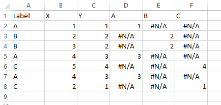
In Column D put:
=A2&COUNTIF(A2:A$2)
This will give values such as B3 for the 3rd element of the B series. Now that you have sequential labels for all elements of all series you can do lookups.
In a new sheet put
A1="Number"
A2=1
A3=A2+1

B1="A"
B2=Match(B$1&$A2,Sheet1!$D$1:$D$100,FALSE)

C1="A - X"
C2=IF(ISERROR(B2),"",INDEX(Sheet1!$B$1:$B$100,B2))

D1="A - Y"
D2=IF(ISERROR(B2),"",INDEX(Sheet1!$C$1:$C$100,B2))
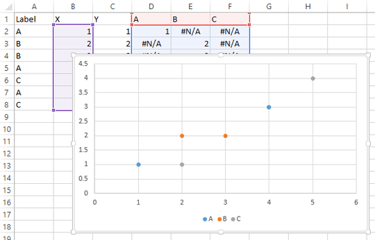
And just add 3 columns just like that for each of your series. So it'll find which row the series named "A" has its first entry, the one you labeled A1, and then in column C it'll look up the X value, and in column D it'll look up the Y value. Then create a series A on your graph with X coordinates from column C and Y coordinates from column D, and as your underlining data gets more rows or rows change which series they are in, the graph will automatically update.


Re: pivot tables, Excel doesn't permit scatter plots using pivot tables as input data, at least in MS Office 2010 – Michael Rusch – 2014-10-24T19:25:39.423
@MichaelRusch You can make a regular (i.e., XY) chart from a pivot table.
– Jon Peltier – 2016-08-11T19:17:54.6501
What have you tried? Have you considered using a pivot table to organize your data, then make a chart from there? Regular Charts from Pivot Tables might help you.
– CharlieRB – 2014-05-06T14:11:27.2571@CharlieRB PivotTable's give aggregates of the data right? I want all the data points to be visible in the chart, so how can PivotTables help me? – dtech – 2014-05-06T14:20:59.433
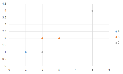
I've also added the plotted chart to show what I want to achieve, but automatically. – dtech – 2014-05-06T14:24:42.967
No, you'll need to add each series individually. Whether you want to try to automate that with a macro or use the built in tools. – Raystafarian – 2014-05-06T15:58:11.963
1Are there meant to be more points for A in the graph? Eg, (4,3)? – binaryfunt – 2014-05-06T18:55:40.130
@BrianFunt Yes I forgot that point – dtech – 2014-05-06T20:12:29.567