How to draw a 'sane' scatter plot in Excel?

5

1

I've been at it for over 2 hours now and am just a bit flustered :)

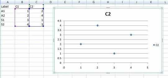
I have the following data (for example):

Label | Criterion 1 | Criterion 2 |
  A1  |      7      |      3      |
  A2  |      1      |      6      |
  S1  |      7      |      7      |
  S2  |      1      |      1      |

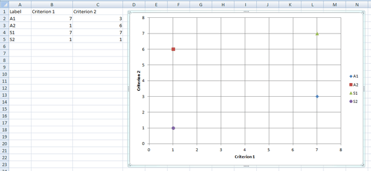
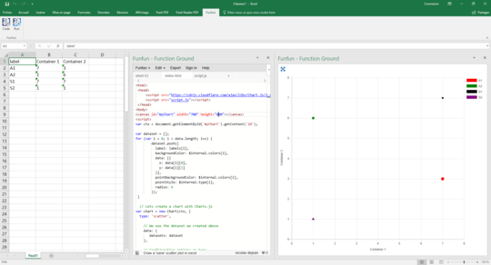
All I wish to see is a scatter plot with Criterion 1 and 2 as the X and Y axes and the 'label' elements as values on the graph (i.e. each 'dot' on the graph is labeled as whether it belongs to A1 or A2 or S1 or S2). Basically the items under the label column being shown as a legend. So it looks like this:

  A
C |
r |
i |                            Legend
t | ^      +                   ^ A1
e |                            + A2
r |                            # S1
i | *                          * S2 
o |      #
n |
2 |
  +-------------------->
       Criterion 1   

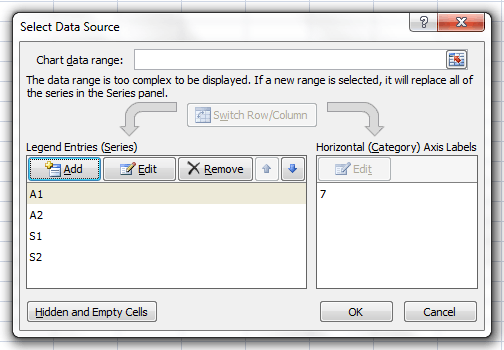
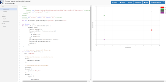
I'm sure this is NOT rocket science but I'm getting the most weird graphs imaginable if I just select all 3 columns (label, criterion 1 and 2) and ask for scatter plot. I've tried playing around with everything and for some reason the scatter plot just doesn't show up the way I want it to! Here's how it looks:

enter image description here

I've pretty much given up :( Any ideas?

PhD

Posted 2012-03-02T05:03:46.753

Reputation: 329

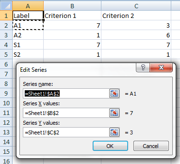
You could plot the data in columns B and C, then use a free utility such as Rob Bovey's Chart Labeler to add the labels from column A to the data points. If you're using Excel 2013 or later, you can even just add labels, then use the option to get the labels from cells.

– Jon Peltier – 2016-01-30T15:09:29.420

Answers

5

You mean like this?

enter image description here

In Excel, a series usually consists of multiple data points and gets its own entry in the legend. Since you want each data point to get its own entry in the legend, you can simply create multiple series, each with only one data point.

To reproduce the above image, create a scatter plot, as usual. Ensure the chart is selected, then go to Chart Tools -> Design tab -> Select Data. You should see this dialog box:

enter image description here

For each row in your table, add a new series, with the series name, x, and y values like this:

enter image description here

For the chart axis titles, you can add them as usual, select them, then in the formula bar select the cell with the label you want, then press Enter.

In silico

Posted 2012-03-02T05:03:46.753

Reputation: 355

I would like to avoid entry one by one... – Pedro77 – 2019-10-15T18:50:14.133

3

For people with the same problems, there is a usefull tool named FunFun, which allows people to use web languages like Html, Css and JavaScript in Excel.

Javascript has a lot of powerful libraries for data visualization, like Charts.js and D3, that you can use with this Excel add-on to create any chart you want.

If you want to test out different libraries, Funfun hosts an online editor with an embedded spreadsheet, where you can see the output of your code instantly.

I made this chart with Chart.js on the FunFun website that I directly loaded in Excel by pasting the link of the playground below:

https://www.funfun.io/1/edit/5a2959d1cf76561801b73403

Here are some screenshots(Website to Excel Add-in):

playground

load

code

final

nicolas dejean

Posted 2012-03-02T05:03:46.753

Reputation: 271