6
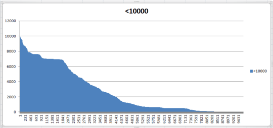
I have a sorted list of values that I'd like to see graphed in an Excel chart just to see the shape of the curve. Here is the initial chart:
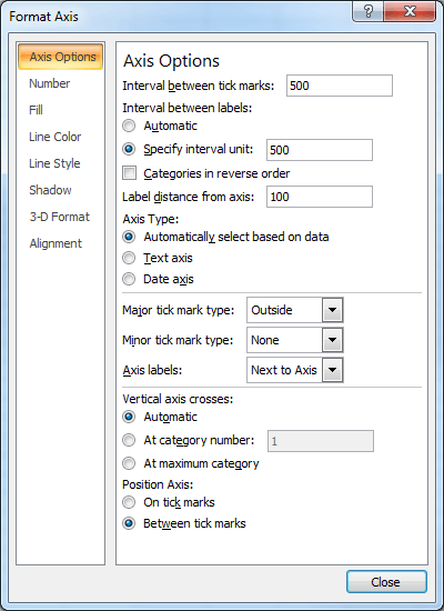
Looks ok, but the X-axis is ugly, so lets clean that up a bit by spacing out the tick marks ("Interval between tick marks") and making the X-axis labels into nice round numbers ("Specify interval unit"):
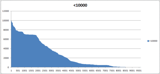
Well that didn't quite work:
Is there any way to get X-axis labels like "0, 500, 1000, ..." or "1, 500, 1000, ..." without adding an extra column of data just for those labels? I'm going to be creating a lot of graphs and that will double the size of data for each one.

Ed Norris
Posted 2014-01-06T21:50:50.037
Reputation: 263