4
I'm having some trouble in Excel producing a line graph for the following data:
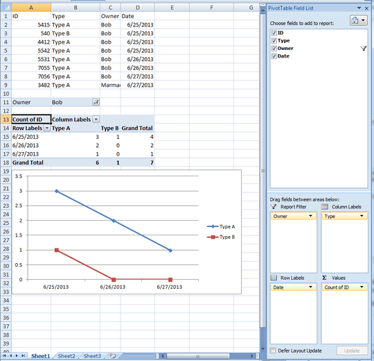
+------+--------+-----------+-----------+
|  Id  |  Type  |   Owner   |   Date    |
+------+--------+-----------+-----------+
| 5415 | Type A | Bob       | 6/25/2013 |
|  540 | Type B | Bob       | 6/25/2013 |
| 4412 | Type A | Bob       | 6/25/2013 |
| 5542 | Type A | Bob       | 6/25/2013 |
| 5531 | Type A | Bob       | 6/26/2013 |
| 7055 | Type A | Bob       | 6/26/2013 |
| 7056 | Type A | Bob       | 6/27/2013 |
| 3482 | Type A | Marmaduke | 6/27/2013 |
+------+--------+-----------+-----------+
I would like to graph the number of rows for Owner Bob of Type A across each day in one line, and in another line graph the number of rows for Owner Bob of Type B in another line.
So in this case, it would produce one line on the chart corresponding to the sum of "Type A" rows for Bob on each day, and one line on the chart corresponding to the sum of the "Type B" rows for Bob on each day.
From this example excel file, the chart have a "Type A" line indicating:
- Hor Axis Pt: 06/25, Ver Axis Pt: 3 (3 Excel rows with Type A)
- Hor Axis Pt: 06/26, Ver Axis Pt: 2 (2 Excel rows with Type A)
- Hor Axis Pt: 06/27, Ver Axis Pt: 1 (1 Excel row with Type A)
The chart would also have a second line "Type B" indicating:
- Hor Axis Pt: 06/25, Ver Line Pt: 1 (1 Excel row with Type B)
- Hor Axis Pt: 06/26, Ver Line Pt: 0 (0 Excel rows with Type B)
- Hor Axis Pt: 06/27, Ver Line Pt: 0 (0 Excel row with Type B)
So the Type A line would have three points moving in a downward direction. The Type B line would have three points also moving downward. The owner Marmaduke would be completely ignored.
So the chart's horizontal X-axis would be the date: 06/25 -- 06/26 -- 06/27
I'm using Microsoft Excel 2007. Any ideas?

zoombini
Posted 2013-07-11T13:58:10.567
Reputation: 43

Pivot Tables! This is exactly what I was looking for, much appreciated. – zoombini – 2013-07-11T16:24:10.947