6
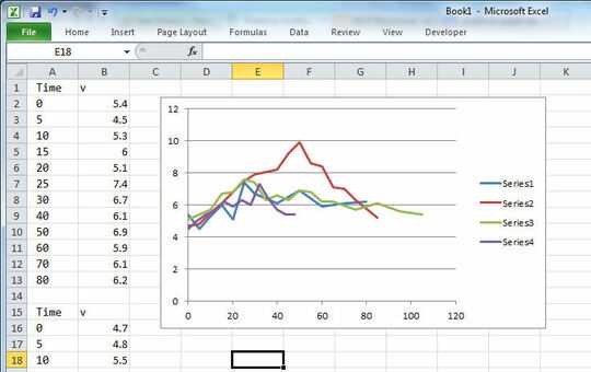
I have the following data:
Time    v
0   5.4
5   4.5
10  5.3
15  6
20  5.1
25  7.4
30  6.7
40  6.1
50  6.9
60  5.9
70  6.1
80  6.2

Time    v
0   4.7
5   4.8
10  5.5
15  6.1
20  6.8
25  7.5
30  7.9
40  8.2
45  9.2
50  9.9
55  8.6
60  8.4
65  7.1
70  7
75  6.3
85  5.2

Time    v
0   5.1
5   5.4
10  5.7
15  6.7
20  6.8
25  7.6
30  7.4
35  6.3
40  6.6
45  6.3
50  6.9
55  6.8
60  6.2
65  6.2
75  5.7
85  6.1
95  5.6
105 5.4

Time    v
0   4.5
4   5
8   5.4
12  5.6
16  6.2
20  5.9
24  6.3
28  6
32  7.3
36  6.4
40  5.7
44  5.4
48  5.4
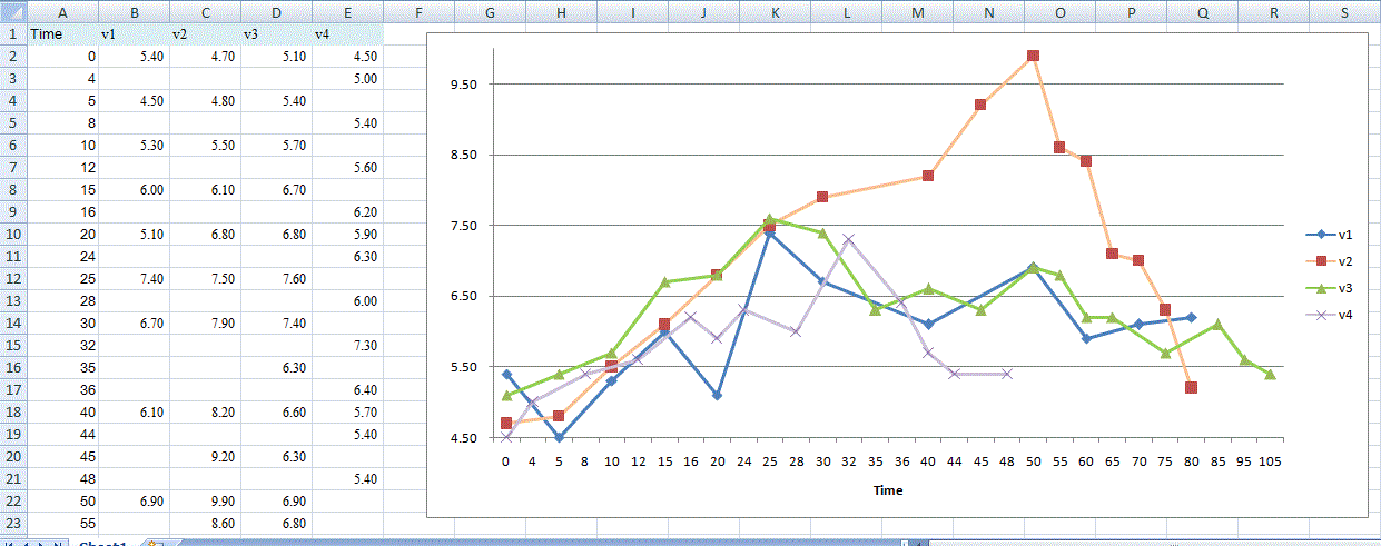
And each section represents a separate line that I want to be plotted on a graph. As you can see, the time values are different for each recordings and I am not able to figure out a way to embed all these different sections into their individual lines in a excel line graph.
Any help?
(I am using both Google Docs and Microsoft Excel spreadsheet)


Rather than saying what he should be using, do you have instructions on how? Where is the option to configure the X-Axis in this specific way? – Douglas Gaskell – 2017-03-06T02:07:35.430
@DouglasGaskell On Excel 2010, when I add or edit a series, I can specify a name, the series X values, and the series Y values. So there's really nothing to configure to make it work. If you want to change the range of an axis, just double click it. – user276648 – 2017-06-22T03:41:24.510