10
4
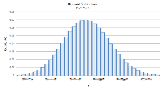
Here i have a column chart of binomial distribution, showing how many times you can expect to roll a six in 235 dice rolls:
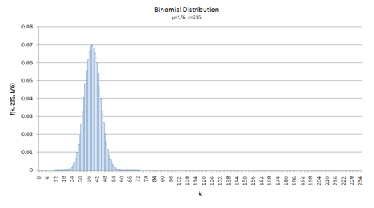
Note: You could also call it a binomial mass distribution for
p=1/6,n=235
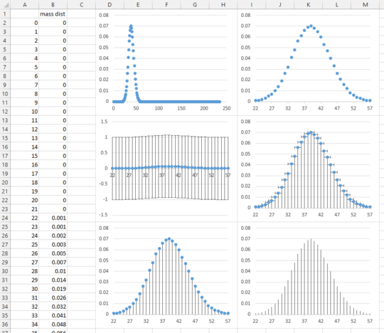
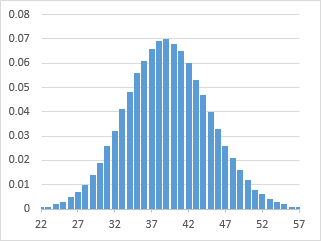
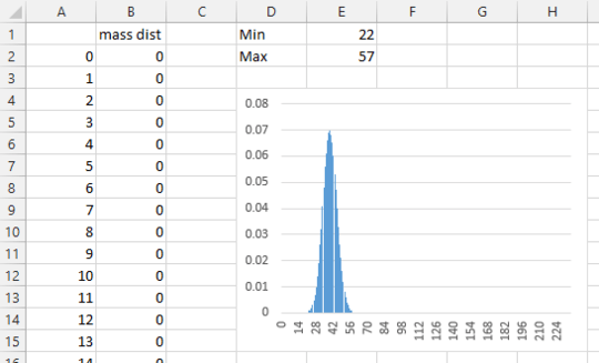
Now that graph is kinda squooshed. i'd like to change the Minimum and Maximum on the horizontal axis. i'd like to change them to:
- Minimum: 22
- Maximum: 57
Meaning i want to zoom in on this section of the graph:
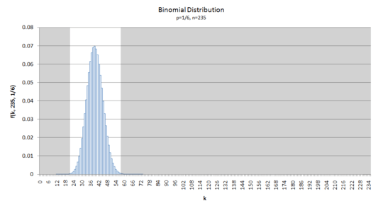
Bonus points to the reader who can say how the numbers 22 and 57 were arrived at
If this were a Scatter graph in Excel, i could adjust the horizintal axis minimum and maximum as i desired:
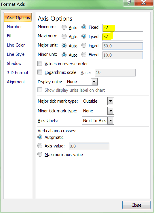
Unfortunately, this is a Column chart, where there are no options to adjust the minimum and maximum limits of the ordinate axis:
i can do a pretty horrible thing to the graph in Photoshop, but it's not very useful afterwards:
Question: how to a change the x-axis minimum and maximum of a Column chart in Excel (2007)?

Ian Boyd
Posted 2011-01-02T18:33:23.810
Reputation: 18 244


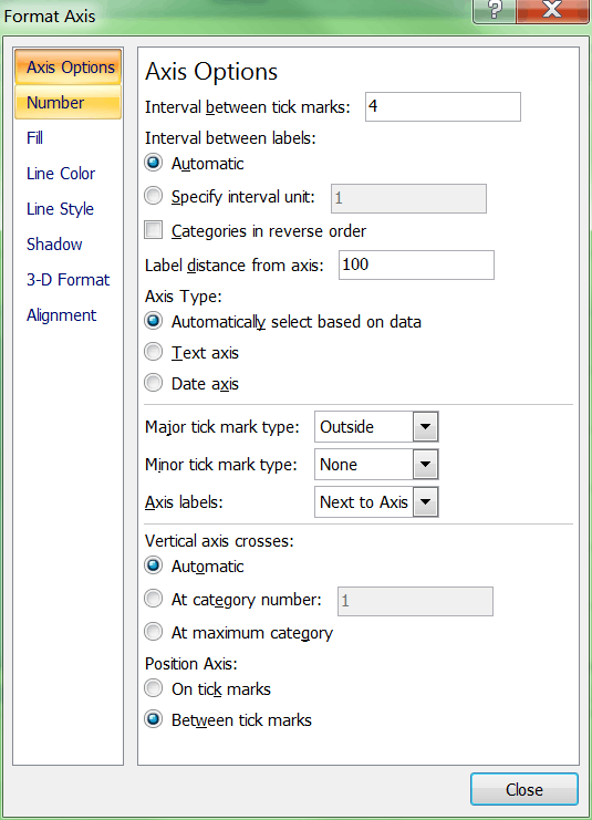
1You also have to change the x-axis label range (turns out there is an x-axis label range). Otherwise it just ends up starting at zero, rather than 23. But it works. – Ian Boyd – 2011-01-03T03:36:51.237