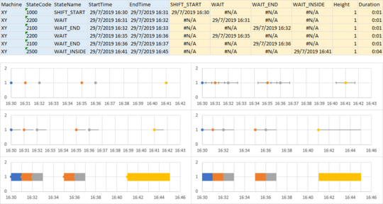
This is a variation of a gantt chart. Usually they're done with bars, but if you have some bars repeating and others not, it gets confusing. So I'm going to use an XY chart, use points for the start of each bar, and use error bars with thick lines as the bars.
So below you'll find my data and charts. The blue shaded data was supplied above, and the gold shaded data is what I produced. I pivoted the data (manually with formulas) to get four columns of start times (Shift Start, Wait, Wait End, and Wait Inside). Height is just arbitrary: I need a Y value for the center of the bars. (If I have multiple machines I'm comparing, I could use 1 for one machine, 2 for another machine, etc.) Duration is just the end time minus the beginning time.
The top left chart has four series. Series 1 uses X=Shift Start and Y=Height,; series 2 uses X=Wait and Y=Height, etc. The X axis minimum is 43675.6875, which is how Excel represents 29/7/2019 16:30 as a number, and the X axis major unit is 0.000694444446708076, which is one minute.
I've added error bars to each series in the top right chart. I've deleted the Y error bars, and temporarily used a very short amount (0.0005, less than one minute) for the X error bars.
In the middle left chart, I've changed the error bars to plus only, and no cap.
In the right middle chart, I've used custom error bar values, using the Duration column for the plus values and zero for the minus. I also had to change the X axis spacing from 1 to 2 minutes.
In the bottom left chart, I've colored the error bars to match the markers, and used a thick line (15 points).
Finally in the bottom right chart, I've formatted the data series to have no markers.


1What have you tried so far? – DavidPostill – 2020-01-08T15:14:00.853
Is the chart picture you need to get as result? Or what's the problem with the Chart picture? – Lee – 2020-01-09T09:06:57.410
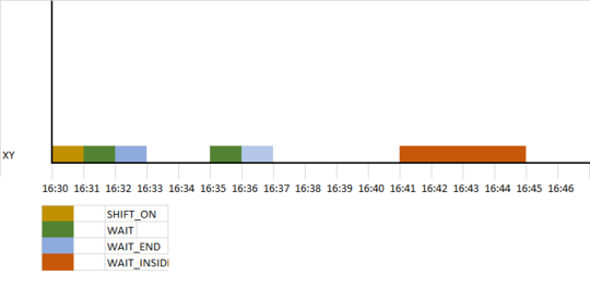
With the data provided, i want to show the chart like that. – Waqas – 2020-01-09T13:05:40.297