1
I am trying to build a scatterplot chart visualization of instructor scores for a series of classes to show performance metrics, relative class size (size of bubble), plotted over time. Classes are taught by academic quarter (by season within an academic year: fall, winter, spring, and summer). Each quarter may have two or three classes taught but there is no series relationship between one course to another (hence, the scatterplot).
I wasn't sure how to display the data by "quarter" (more specifically, I wasn't sure if Excel has a concept of seasonal quarters) so I entered "January 1, 2018" for "Winter 2018", "April 1, 2019" to substitute for "Spring 2019", and so on. I have data starting from Winter quarter 2014 (effectively, starting the first week of January 2014) through Spring 2018 (or April 1, 2018)
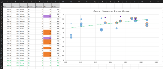
When I graphed this, I noticed that the year horizontal axis appears to look like at the 'end of period' rather than the 'beginning of period'. Refering to the attached image, it looks like the starting values start in mid-2013 when in actuality, they start in 2014.
Data & Bubble scatterpoint chart:

It is possibly caused from the custom field / format code of [$-en-US]yyyy;@, but if I use general "Date", it will show the day and month in the axis which is what I don't want.
How do I set the axis so it's effectly treating the years as the 'start of the year', rather than the 'end of the year'? Or more generally, how do I show seasons/years in the axis in a manner that makes sense to readers?
Version: I'm using the latest version of Excel in Office 365 on Windows 10.

I'm using a bubble scatterplot (updated visualization image) as classes are independent of each other, not in series, yet I want to show general improvement over time. The array that feeds the X axis is the date column, not year (so it is taking in 1/1/2014 for the first three values).
I think this may have something to do with how the date field is presented. What I want is to show just the year, so I have to use the Custom field (Date forces it to show day/month) that includes yyyy. Will update my thread with the options settings. – Wibble – 2019-06-05T23:26:45.430