To do this, you need a scatter chart (XY chart). The X axis needs to be handled as numerical values, otherwise it will treat them as categories, with the values being just labels and each successive value stacked. Here's an example, and I'll explain how I did it:
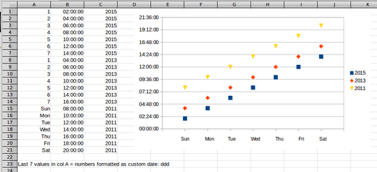
The day values are numbers. You can get them by applying the WEEKDAY function to your dates (1=Sun through 7=Sat). These need to be stored as numbers, but if you want them readable as days, format them with a custom date format of ddd, which I did for the last seven values.
Each year is a separate data series, so you want the data presorted, which it looks like you have. Start the chart by selecting the first year's data (Day, time, year), which will give you the first series. For the series name, select one cell in the year column. Verify that the X axis range points to the day column range and the Y axis range points to the time column.
For each additional year, add a series with the + button at the bottom and repeat the process to specify the data ranges.
The automatic settings for the X axis will start at 0 and end at 8, which is fine. That will keep your data in the interior of the chart. It looks like LO Calc won't format the numbers for the X axis in a scatter chart. What I did was add an X axis title. For the title text, I entered the day names with spaces between them, then adjusted the space so the names lined up with the axis ticks. Then I formatted the axis to not show the axis labels.
This is how to get the chart to appear as you ask, but the 40,000 data points is a different issue. Assuming your computer has the resources to handle it, it will take some time. Your computer may be busy and locked up for minutes even with enough RAM. If it doesn't have a ton on RAM, the process could get extremely lengthy, swapping chunks to disk, even to the point of swapping "forever". You may need to divide the data into subgroups and plot those separately, or plot just a sample of the data (random sample or every Nth point), or a combination of methods. Even 10% of the data (4,000 points) is a lot of data for one graph, but you can experiment to see how much data your system can deal with.


1What does the data look like? What happens when you plot it as a scatter diagram (XY chart)? – fixer1234 – 2019-02-05T05:02:03.123
I've updated the question with this informatioin, as comments appear very restrictive of content. – Gordon – 2019-02-06T14:52:41.750
Just noticed the point at the end about the system hanging due to the amount of data. Added that to the answer. – fixer1234 – 2019-02-07T22:13:59.303
Indeed ... just too much data to digest was likely. I may try some other tricks like sorting it first; I may try multiple graphs. Just leaving it to run overnight may do it, or there are other tools/methods .. Excel, gnuplot or whatever. Having days numeric should also mean I can get a better visual distribution by using a DoW with a fractional part, which is ideal. Thanks very much for your help. – Gordon – 2019-02-09T09:40:26.620