Excel Pivot chart - displaying values not in the source data

1

I have data from a feedback survey in an Excel spreadsheet. The questions are rated on your typical Likert scale.

1  Strongly disagree
2  Disagree
3  Neutral
4  Agree
5  Strongly agree

In the main sheet the responses are only recorded as the number. The corresponding text description is by itself in another sheet, like in a database.

So I have

Response ID  Q1  Q2  etc
001          4   5
002          5   5

I'm creating a chart from the main sheet to display the results for each question, but there are no 1 or 2 responses, so the Pivot chart only goes from 3 to 5. Is there a way to still display 1 and 2 even though these values aren't found anywhere in the source data?

Also is there a way to make the label in the chart reference the text description i.e. change "1", "2", etc, to "strongly disagree", "disagree", etc?
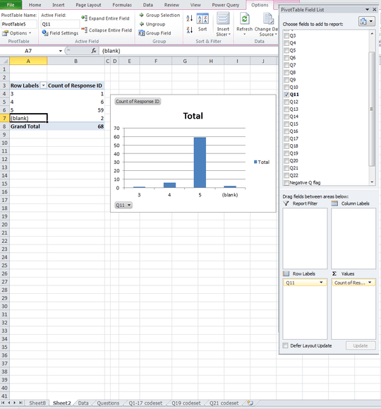
Edit: picture of chart Screenshot of Excel

fidrildid6

Posted 2017-09-06T00:56:08.210

Reputation: 13

Can you describe your chart (maybe uploading an image of it), and the steps you followed to create it? – Scott – 2017-09-06T01:17:09.807

Updated with a picture. I created a pivot table with all the data in the main sheet, put the question in the rows and count of response ID as the value, then made it into a chart. – fidrildid6 – 2017-09-06T01:51:19.213

Thanks for the update. I spent the past hour trying to figure this out, and I couldn’t do it. (Disclosure: I’m fairly knowledgeable about Excel worksheets, formulas, and charts; I’m not so well versed in pivot tables. There are a lot of people here who know pivot tables better than I do; you’ll probably get an answer soon.) Good luck! – Scott – 2017-09-06T03:07:05.413

I lied.  I found an answer, but it’s a kludge, so I assumed that you wouldn't want it.  But, since nobody else has come up with anything, I’ve posted mine. If you don’t like it, my feelings won’t be hurt. – Scott – 2017-09-09T05:27:58.017

Answers

0

Simply add dummy data including all the values that you want in your chart:

   spreadsheet with dummy data

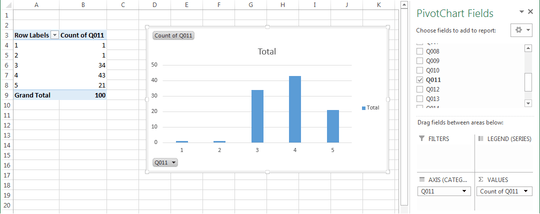
Alternatively, use dummy data only for the values that are missing from your real data; i.e., 1 and 2.  Then the Pivot Table and the chart derived from it trivially have all five values (or six, if you include (blank)):

Pivot Table and Clustered Column chart

The above chart is based on 100 data rows: 5 fake and 95 real.  If you have thousands of data points, the bumps (columns) for responses 1 and 2 will automatically get very short.  Otherwise, you can wave your hands and tell your customers that the bumps are an idiosyncrasy of your charting software.

Or, you can select the columns for responses 1 and 2 and format them as white:

      same chart but with columns 1 and 2 colored white

If you do this, you might especially want to insert dummy data only for the missing values (1 and 2), so the proportions of the other columns will be correct.  I don’t know whether it’s easy to do this automatically for all of your questions, but it’s probably possible to script it (in VBA).

Scott

Posted 2017-09-06T00:56:08.210

Reputation: 17 653

Hey! So this may have been a kludge but it actually helped me to figure out how to do it! All you have to do is input the dummy data without a ResponseID. That way, it will see all the available options, but since I'm counting ResponseID which has been left blank, it won't mess with my data.

link

Thanks for getting me on the right track! (FWIW I gave you an upvote but since I'm a new user I don't think it did anything.)

– fidrildid6 – 2017-09-20T00:20:06.067

Well, I’m not telling you that you should do this, but, since you found my answer helpful (and it is the only one), you *can accept* it by clicking on the checkmark on the left (below the voting buttons) — see What should I do when someone answers my question?

– Scott – 2017-09-20T00:44:54.253