I'm trying to figure out something that's counter-intuitive for me in Graphite.
I am collecting (for now) test data (with statsd). In Graphite's dashboard, I'm seeing lower peaks for the same set of data for a longer time series.
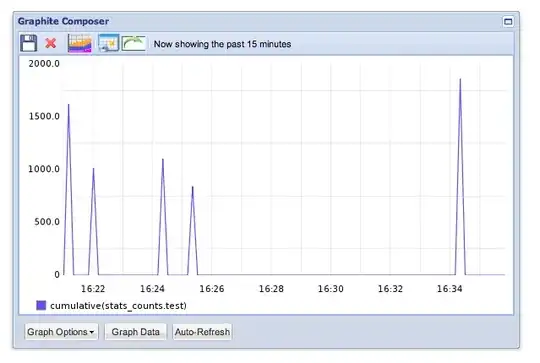
My retention is set to:
retentions = 10s:15m,60s:1d,5m:7d,1h:4w,1d:5y
Why wouldn't the second chart showing 30 minutes not have peaks at least as high as the highest peaks in the 15 minute chart? How can I get this chart to accurately reflect these stats over time?