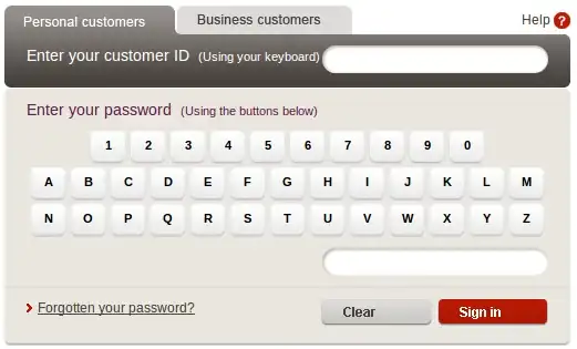
The graphical entry of passwords is initially an attempt to thwart keyloggers. When such things began to appear, keyloggers naturally evolved (the people who write keyloggers have not stopped developing them; they adapt to new conditions) and modern keyloggers are also mouseloggers which record, for each click, a partial snapshot of the screen (a small area surrounding the click point).
Another reason why some banks use graphical password entry methods is because they do not like Web browsers which remember passwords. This can be for legal technicalities: if the browser remembers the password, then the user is not entering it, and this may make it more difficult for the bank in case of some conflict between the bank and the user. But, in practice, as a security measure, the graphical password backfires: if the user cannot have his browser remember the password, he will use another storage medium, for instance a stick-up note.
A more compelling reason, for a bank, to implement a graphical reason is trust management. The banking system foundation is trust: a bank is an entity to which you give your money, on the belief that it will give it back to you whenever you want. But since the bank uses that money (to lend it to other people), it intrinsically relies on the idea that not all its customers will want their money back simultaneously (that would be a bank run). As long as all the customers share that idea, the bank lives. That's the reason why bank buildings are always impressive (in the 19th century, they were all full of stone pillars and iron and marble, with extremely "massive" architecture): this is a conscious display of stability and robustness, so that you think of the bank in those terms.
In the age of the Internet, the graphical password entry is a stone pillar: it establishes a firm psychological distance between the bank and the less serious sites. It would not look good if the online bank Web site was too similar to the site you use to order a pizza. When they log into their bank account, the customers must have a feeling that they enter a "high security" zone in which their safety is taken seriously. The "graphical password entry", like all things graphical, is a nice gimmick for that (humans are visual animals, they react strongly to what they see). The Web site of my bank does not have a graphical password entry, but it takes care to open a popup window with a picture of a padlock, for the same reasons.
