Maps
Maps are graphs that show the position of destinations in relation to other places. They can be used for reference, planning, or travel, or a combination of these.
- See also: Wikivoyage Mapmaking Expedition
Understand
History
Maps have existed for hundreds of years and mapmaking become more common once exploration and discoveries of new lands began. However, these maps, such as those made by explorers in the 1500s, were often not drawn very accurately.
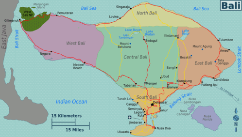
Mapmaking gradually became more accurate as the related technologies evolved, and with satellites and GPS maps have become extremely accurate. Maps are commonly incorporated into encyclopedias and travel guides such as this one; the map on the right was specifically created for Wikivoyage.
Map types
Layouts and designs
Many maps, particularly in historic times, were on a single sheet of paper; however, maps in more recent times have been in other layouts, including those in leaflets and whole books, which are called atlases. An entire three-dimensional world map to scale is a terrestrial globe, free of projection distortions but inherently much less portable than its two-dimensional counterparts.
While historic maps were often hand drawn, maps today are mostly computer-made.
Projections
Mapmakers have throughout history faced the problem that Earth is more-or-less a sphere, a round, three-dimensional object, while maps are two-dimensional and rectangular. Therefore, mapmakers have used varying methods to convert the physical Earth's shape onto a two-dimensional, rectangular map. The most common projection method is to squeeze a farther distance into a smaller distance for locations near the equator and stretch out the distances at higher latitudes. This is why relatively small landmasses near the North Pole appear as large as continents near the equator despite the fact that the continents are much larger.
Maps can be made so that distances, angles, or areas remain true, but not so that all are true at the same time. The distortions are also not equal all over the map. Different projections can get a quite accurate image along a meridian, along a latitude or around a point, with bigger distortion away from the area of main interest. Sometimes the differences are subtle, but for accurate measurement over long distances, such as in navigation, the specifics of the projection have to be taken in account. For maps of the world the distortions are obvious, but somebody accustomed to a specific projection may believe it gives the true image.
Purposes
Maps can serve many purposes, varying from a road map to a political map (one that shows national borders) to a geographical map (one that shows mountains, rivers, etc.). Many modern maps, particularly dynamic maps, try to incorporate all three of these to some degree.
Buying a map

General store chains in the USA, such as Walmart, sell maps including the Rand McNally road maps.
Maps are often available from stores catering to users of the specific map type; road maps can often be bought at petrol stations, hiking maps from visitor centres or stores for hiking equipment and so on. Also e.g. book stores may sell maps. Maps can also be bought on the web.
Map-making companies
Physical maps
- The Geographers' A-Z Street Atlas makes maps for urban areas in the United Kingdom. The first atlas of London was published in 1936 after its artists, Phyllis Pearsall, had completed the monumental task of walking the 3000 miles it took to cover every single one of London's 23,000 streets, to verify their names and locations, and even pinpoint house numbers, stations and points of interest. As well as being mapped, the streets were listed in the lengthy index, from Aaron Hill Road to Zoffany Street! While the London atlas is still the most iconic, every urban area in Britain now has its own A-Z, and the series has spawned numerous copies from commercial competitors.
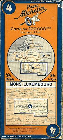
- Car tyre company Michelin produces some of the best road maps in Europe, most notably of its native France, but also of most other European countries and of the continent as a whole. They were first made in 1905 to complement their famous Guides rouges (for hotels and restaurants, responsible for doling out the prestigious Michelin stars); the Guides verts (for tourist attractions, scenic routes and interesting cities) followed in the 1930s. Other prominent road atlas makers in the European market are the AA, Collins and Philip's.
- The Ordnance Survey was first conducted across Great Britain in the wake of the Jacobite uprising (1745) and was a pioneering attempt to map first the whole of Scotland, then all of the British Isles, at a scale of 1:36,000. Throughout the 18th, 19th and early 20th centuries, these maps were refined and updated using the method of triangulation - the trig points which stand on most peaks in the country are the product of the 1936 effort. Today, the OS use satellite mapping like everyone else, and they make by far the most detailed topographic maps of Britain, which are essential to any traveller wanting to stray off the beaten path, with the pink-covered Landranger general-purpose maps (1:50,000) and orange Explorer walking and cycling maps (1:25,000) being the two most popular series.
- Rand McNally is well-known for their maps of the United States. The company publishes books, with each page in the book showing a map of one of the fifty states. The books include other sections as well, such as information on certain routes and destinations. Use Rand McNally's national road atlases if you're interested in using them for transportation over large distances (such as a hundred miles or more), but not if you're driving around a city or interested in the detailed topography of a certain place.
- No city's map is more familiar to inhabitants and visitors than that which depicts its public transport system. Perhaps the single most influential of these is London's Tube map, specifically the 1933 version created by draughtsman Harry Beck, which was the first to dispense with geographical accuracy and focus on a simplistic 'circuit diagram' rendering of the lines using bold primary colours and only verticals, horizontals and 45° diagonals allowed. Beck's influence can be seen in the modern Tube map, as well as metro maps of systems around the world. Other iconic transit maps, not all of which have signed up to Beck's ideals, include those depicting systems in Berlin, Chicago, Madrid, Moscow, New York City, Paris, Tokyo and Washington, D.C.
- The United Kingdom Hydrographic Office issues the Admiralty charts on most areas relevant for international shipping. Although locally produced maps may give more detail, the nearly global coverage make these charts a common choice.
Online maps
- Google Maps are one of Google's many products and are fairly similar to OpenStreetMaps. Google Maps also provide directions, so you can enter the place you're departing and your destination into the system and it will give you directions, which you can print. Also run by Google is Google Earth, a map of the world created from satellite images that is detailed to even individual houses. Earlier versions of the application, which were downloadable, enabled users to draw routes on top of the map and construct models of buildings.
- OpenStreetMaps are an open-source online map service. The dynamic maps on Wikivoyage are based on OpenStreetMaps.
Using a map
Activites
Certain activities, especially those where transportation is involved, are made easier with a map.

Driving
- See also: Driving
This is where a road atlas like Rand McNally becomes useful. It is easier to use a map for driving when you're traveling long distances on major highways than when you are driving down a narrow street in a large city.
Public transport
Railroads and public transit services will include maps showing the extent of their service. These are used so travelers using the transport services know where they can go while still being on the same train or using the same service.
Hiking
- See also: Hiking, Orienteering
Many parks, especially those at a national level, will provide maps of their trail network. These will include other locations, like a visitor center or points of interest, as a reference for comparison with the trails. Park maps are often topographic, showing hills by contour lines, with each contour line representing a particular elevation. The farther apart the contour lines are, the flatter the area. Therefore, trails that cross many contour lines within a short distance will be more difficult hikes than trails that cross only a few or no contour lines. Also vegetation types are often shown, at least on the level of distinguishing forest from open terrain, and marking marshes and stone fields. Where deviating from the trails is allowed, they should be detailed enough to let one choose and keep to a feasible route in the terrain.
Cycling
- See also: Cycling
In some cases there are maps showing cycling routes for a particular area. These are often made in a general attempt to further cycling, for commuters or tourists, which means areas with cycling maps often have relatively well developed cycling infrastructure, or at least a good amount of safe and comfortable routes, be it by roads or along dedicated bikeways. On ordinary road maps it is hard to see whether there are bikeways or wide enough paved shoulders, and whether the roads otherwise are suited for cycling. Cycling maps can also point out especially nice routes along minor roads, and relevant services.
Boating
- See also: Navigation
Sea charts are meant for navigating boats and ships. They show coastlines and harbors, anchorages, fairways, depths, navigational aids etc.
Common symbols
While different mapmakers and mapmaking companies design their maps differently, there are a lot of general similarities between maps, especially within particular types, that make using them easier. Here is a key that will generally apply to maps:
- Blue represents water, either in lakes, seas, or rivers. This is seldom true for sea charts, where navigable water often is white.
- Solid lines are used to represent national borders and roads. In some cases, such as the dynamic map of London shown on this page, solid lines are also also used to show railroad lines.
- Green represents parkland or other protected wildlife areas. On orienteering maps, green is used for thick vegetation. On some maps green is used for forested areas.
- Small circles are used to represent settlements, on small scale maps. On large-scale maps they can represent other features, such as chimneys or wells.
- Labels are included next to these markings to tell you the name of them.
