Marion Cultural Centre
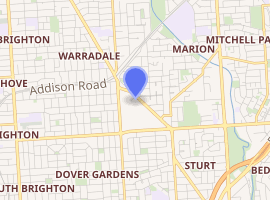
Marion Cultural Centre is located in the City of Marion, a local government area and suburb in Adelaide, South Australia.
| Marion Cultural Centre | |
|---|---|

| |
| General information | |
| Type | Cultural Center |
| Architectural style | Modernism |
| Location | Oaklands Park |
| Town or city | City of Marion |
| Country | Australia |
| Completed | November 2001 |
| Cost | $8.5m (A$) |
| Client | Marion City Council |
| Technical details | |
| Floor area | 2500sqm |
| Design and construction | |
| Architect | Ashton Raggatt McDougall and Phillips Pilkington Architects in Association |
History
The building, designed by Melbourne architects Ashton Raggat McDougall (ARM) in collaboration with the Adelaide studio of Phillips/Pilkington Architects (PP), is located in Marion, Adelaide, South Australia.[1] It opened on 23 November 2001. The Cultural Centre was funded by the Marion City Council to create a cultural meeting place for the community of Marion. The building houses a library, information centre, art gallery, multipurpose space, cafe, workshop space, multipurpose performance hall and plaza.[2]
Architecture
Themes
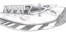
The building was created in the Postmodern style, is intended to emphasize the importance of the creative agenda for Marion’s future sustainability.[3] ARM Architecture have given the Cultural Centre a connecting theme for residents and visitors by incorporating the word MARION into the façade and external features of the building, The intent is to encapsulate the vision of Marion as a technology-driven smart zone, in a striking and unique design. The design is made to be boldly unfamiliar when first sighted, but close up there are aspects, like the verandah, that are colloquial in nature.
The entry, mid-way along the Arcade, brings the user into an open circulation space that is partially filled with a café and wide steps leading up to the library. The building contains the library, a modest gallery and auditorium. The latter is the most interior of all, with no windows and clad internally with plywood panels. These stained panels feature many small holes in groupings. A more direct symbol is used on the ceiling, with a two pixilated hands.[4]
Design approach and key influences

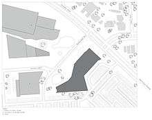
The Marion Cultural Centre is situated in between the large Westfield Shopping centre (second largest in Australia, Westfield Group) and SA Aquatic and Leisure Centre.
The building is significantly smaller than the shopping centre, using its proximity to the road to enhance the effect of the word MARION to the passer-by.[5]
The centre is designed to be a vibrant public place where people can come to meet and relax. The building design is driven by the spirit of education. The centre was commissioned to redefine a new generation cultural complex. It aims to encourage and sustain the local arts community – creating something that has a sense of community and commitment to a positive future. In addition, the design of the building is intended to reflect the public’s commitment to environmental awareness and energy efficiency.[6]
Where architects require, complex programs go beyond the purer architectural triad of structure, form, and light at the service of space. They suggest an architecture of bold communication rather than one of subtle expressions.[7] The Marion Cultural Centre is an embodyment of iconography; in architectural jargon called a duck. Its small size does not correspond to its complex form. The silhouette describes a symbolical duck in itself, as decorated with the collage of letters for its content; an Objets Trouvẻs – bas-reliefs in masonry. Robert Venturi & Denise Scott Brown’s “Leaning from Las Vegas”[8]
Façade treatment

The architects claim to have been inspired by the name of the suburb (Marion), forming the name with six letters to produce a highly expressionist, communicative form of architecture. The letters are not only seen from the exterior of the building, but are dragged through the facade to create interior spaces. The M and the A form the main facade and continue inside the building to form the library space with its strong sloping walls and daring spatial solutions. The R is elongated along one side to create a winding terrace . An iron sculpture at one corner of the site forms the I, while the circumference of the letter O, made of local limestone, forms the garden next to the building. Lastly, the N is a rusted metal structure defining the café entrance. The building's lettering is legible from far away, standing out in red and orange to give the building a strong character which immediately made it into a landmark identifying the district.[9] This use of text has occurred frequently in the work of Robert Venturi & Denise Scott Brown’s “Leaning from Las Vegas”.
The space as an architectural element is dominated by communication . Some examples of this are:
1) The Decorated Shed - consisting of a building with simple program and embeished surfaces. The sign at the street is important, the building becomes a modest necessity.
2) The Duck – consisting of a building with symbolic form used to advertise the function.
Venturi approaches the use of words from both a position similar to signage - the post-war American commercial Vernacular Architecture; and the semiotic discussion of classicism as demonstrated in Complexity and Contradiction.[10]
The Plaza
The two main elements of the Plaza are the undulating lawn and the band of paving slate that intersects the area interpreting a creek bed pattern flowing from hills to sea. Landscaping themes are also designed to be simple and contemporary incorporating tree species that reflect pioneer agricultural settlement of the Marion district as well as recalling the site's earlier role as the site of Warracowie House. Spotted Gums will blend with locally identifiable Red and Lemon Scented gums that dot the Westfield precinct. Outer landscape elements are stone/slate seating-retaining walls. Garden areas are simple, low maintenance and water efficient with provision for seating and relaxation.
The river
The key concept towards the architecture reflects that of the Sturt River; an effluviam, a flow of a river. It symbolises the cultures of the area, the western and the eastern. It signifies learning with a rapid flow of intake. The letters MAR can be seen as a source, whilst the flow is articulated by the roof lights, the floor pattern, the northern façade, the ceiling, the paving etc. The flow of direction from the architecture starts at the hills and ends at the sea.
Strip shops
The plan layout of the architecture and programs emulate the tradition of strip shops. This model of layout has been the main retail typology in Australian cities, rather than the big industrial shopping complexes. The reasoning is that it encourages outdoor usage; with the plaza as the primary circulation. The shop, gallery and café are all accessible from outside.
Sustainability
The Sustainable design of the Marion Cultural Centre incorporates a stormwater retention system that allows surface run-off to be stored, filtered on site, then pumped into the ground to replenish the aquifer under Adelaide and is also used for greywater in the building itself. The Centre also features a solar hot water system, water efficient fixtures and fittings, energy efficient artificial lighting, low energy evaporative systems and economy cycle air conditioning - even the external landscaping is low maintenance and water efficient. The centre uses a building management system that includes night purge, C-Bus Lighting Control combined with senor activation; low-e-glass to the eastern facade and gas boosted solar hot water system . The architects were linked with the project managers, sub-consultants and Marion Council by an Internet-based project management system to ensure tight and responsive management during the construction process. Considerable community consultation also went into the design of the building to create a sense of identity that truly reflects the City of Marion [11]
Program
The Library
The library is located at the eastern side of the building, and is intended to be the 'information hub' of the centre. The floor plan in library is designed to be both open and flexible, with the Service and Information desk located conveniently at the main entrance. The eastern facade is all glazed and screened to let high levels of natural light in, the eastern verandah also creates a certain amount of shading.
The Domain Theatre
The Domain Theatre is the centre's 'performing art' focus. The floor can be arranged into different configuration, which can provide seating ranging from 80 to approximately 250 people. Along with having a versatile seating area, this area incorporates a raised movable stage for theatrical and musical performances. The floor area is the same as the old Pioneer Hall; the facility it replaces. Internal finishes of sprung timber over a concrete slab and acoustic wall paneling means this multi-purpose facility provides an excellent venue for a wide range of 'performance-based' activities. Subsidiary spaces including, a backstage area, rehearsal space, storage area and a box office, means the Domain Theatre can host a diverse range of activities including, performing arts, functions, meetings, seminars, concerts and conferences.
Gallery M
Located at the western side of the centre, Gallery M has been designed as arts facility with minimum invasion of office areas and workspaces into the gallery. Its overall floor area is over twice what was available at the former Red House Gallery, and allows for a wide range of display an exhibition options. A gallery shop occupies an open area screened from the rest of the Gallery space. A general- purpose storage area and an area specifically designed for the care and storage of artworks also forms part of the gallery complex. The gallery has 76 metres of hanging space and is fitted with an advanced system of climate control and a specialised lighting and hanging system. This 'state of the art' facility is the ideal setting for both local and touring art exhibitions.
Meeting rooms
The Cultural Centre has three main meeting rooms, all varying sizes, and for different needs. Meeting room 1 can accommodate 30 people and provides an ideal venue for small-scale presentations, lectures and launches. Rooms two and three are designed for smaller numbers that would suit planning meeting, while at the same time doubling as changing rooms for Domain Theatre performers and players.
Foyer and café
The foyer is a flexible split-level. Located in the foyer are the café and an open space with the hub of the Centre's three other functional zones. These zones then links to the outside plaza space.
The café is the 'conviviality' hub of the Centre, providing opportunities for alfresco dining on the Plaza forecourt. With a floor area of approximately 200m², the foyer operates simply a main lobby, a display space, performance area with the steps providing an informal amphitheater or a cafe area with partial or full exposure to The Plaza.
2013 upgrade
A competition was run by the Marion City Council (10 November 2012) to upgrade and revitalize the Marion Cultural Centre Plaza. The winner was unanimously decided by a panel of specialists in separate fields, with ASPECT studios in association with Roarkus Moss Architects and Groundplay winning. The approach taken recognises the possibility for the space to "bristle with the life, familiarity and relaxed nature of a big backyard.1" Taking into consideration the responsibility to serve the public, the town square is transformed through removing traffic and placing numerous green rooms disjointed through the centre, linked by a finely crafted arbour that generates a strengthened connection between social activities and pedestrians who want to relax.
The plan "Promotes opportunities for social interaction – a place that fosters togetherness, robust and relaxed conversation alike, a place for people to reconnect with their local condition on common ground."
The upgrades were to commence in early 2013 with the first stage to be completed by the end of 2013, but the plans have since been postponed until further notice.[12]
Awards
2002/ RAIA (SA CHAPTER): Award of Merit
2002/ Urban Development Institute of Australia (SA Division): Award of Excellence
2002/ Design Institute of Australia: Award of Merit 'Interior Design'
2002/ Australian Timber Design Award: Winner Interiors
2006/ Venice Architecture Biennale: Internationally recognised and was one of the Australian buildings selected to feature in the Australian Pavilion
References
- "About the City of Marion". City of Marion. Retrieved 22 March 2016.
- Schematic Drawings courtesy of ARM Architects Accessed 5 March 2012
- http://www.floornature.com/projects-learning/project-marion-cultural-centre-pp-arm-adelaide-australia-2002-4193/ Accessed 5 March 2012
- Harrison, Stuart. Words on Buildings: the role of text on civic buildings, in SAHANZ International Conference, Proceedings, 2004 Accessed 5 March 2012
- http://www.floornature.com/projects-learning/project-marion-cultural-centre-pp-arm-adelaide-australia-2002-4193/ Accessed 5 March 2012
- http://www.architecture.com.au/awards_search?option=showaward&entryno=20025009
- Alan Colquhoun, "Typology and Design Method," Arena, Journal of the Architectural Association (June 1967), pp. 11-14.
- Venturi, Robert. Brown, Denise Scott, "Learning From La Vegas; The Forgotten symbolism of Architectural Form: Historical and Other Precedents: Towards an Old Architecture" pp. 105-108.
- Harrison, Stuart. Words on Buildings: the role of text on civic buildings, in SAHANZ International Conference, Proceedings, 2004 Accessed 5 March 2012
- Venturi, R. Brown, D. Izenour, S.(1994) Learning from Las Vegas. MIT Press
- http://www.a-r-m.com.au/projects_marioncc.htmlAccessed 5 March 2012
- http://www.aspect.net.au/wps/wcm/connect/web/w/news/news+aspect+wins+marion+cultural+centre