Launchpad (macOS)
Launchpad is an application launcher for macOS introduced in Mac OS X Lion. Launchpad is designed to resemble the SpringBoard interface in iOS. The user starts an application by single-clicking its icon. Launchpad provides an alternative way to start applications in macOS, in addition to other options such as the Dock (toolbar launcher), Finder (file manager), Spotlight (desktop search) or Terminal (command-line interface).[1]
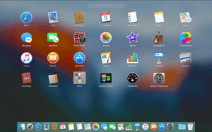
 Launchpad as seen in OS X El Capitan. | |
| Operating system | macOS |
|---|---|
| Type | Application launcher |
| Website | www |
Features
Launchpad is populated with icons corresponding to the applications found in the /Applications folder as well as in the ~/Applications, that is, in a folder named "Applications" in user's home directory, and in any subfolders within the two above folders.[1] The user can add application icons to Launchpad. The user can also remove an application's icon, but the application itself might not be deleted if it was not originally downloaded from the Mac App Store. Apps can be arranged in named folders much like iOS. The user can then remove apps downloaded from the Mac App Store. In Mac OS X Lion, Launchpad had eight icons per row; this was changed in OS X Mountain Lion to seven icons per row.However, with proper root permission, by adjusting some settings users can change the number of icon rows and columns in launchpad.[2]
Since Mac OS X Lion, the function key F4 is a keyboard shortcut to Launchpad. If enabled, Apple's gesture recognition software interprets a thumb-and-three-finger pinch on a touchpad as a command to open Launchpad.
The ability to search applications was added in OS X Mountain Lion.[3]
In OS X Mavericks, Launchpad's background became a blurred version of the user's desktop background, and folders departed from the "linen" texture underlay, replaced with a darker translucent background (part of the move away from skeuomorphism).[4]
In OS X Yosemite, folders in Launchpad now closely resemble those of iOS; rounded translucent squares with a 3x3 icon grid preview (of the contained applications) when closed, expanding into larger rectangular variants when opened. Furthermore, folders can now be paginated to accommodate more applications.[5]
In macOS Big Sur, the Launchpad icon changed to a 3x3 grid with icons of different colors, resembling apps. However, the usage of Launchpad remained the same.
See also
- At Ease
- Comparison of desktop application launchers
- Mac App Store
- SpringBoard
References
- Siracusa, John (July 20, 2011). "Mac OS X 10.7 Lion: the Ars Technica review". arstechnica.com. Retrieved August 23, 2018.
- "Change launchpad icon rows and columns to fit more icons". TutPosts. May 23, 2015. Archived from the original on February 17, 2016. Retrieved February 13, 2016.
- "Use Launchpad Search to Quickly Open Apps in OS X". OS X Daily. October 8, 2012. Retrieved March 4, 2013.
- "Launchpad folders are now semi-translucent in Mavericks". Tips and tricks in Mavericks. Retrieved February 8, 2016.
- Viticci, Federico. "OS X Yosemite: Tips, Tricks, and Details". MacStories. Retrieved February 8, 2016.
External links
- Mac Basics: Launchpad is the fast way to find and open your apps at Apple.com
- WinLaunch—Launchpad alternative for Windows