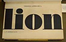
Fat face
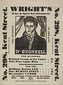
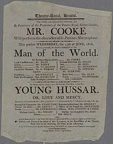
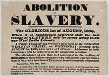
In typography, a fat face letterform is a serif typeface or piece of lettering in the Didone or modern style with an extremely bold design.[2] Fat face typefaces appeared in London around 1805-10 and became widely popular; John Lewis describes the fat face as "the first real display typeface."[3][4][5][6] While decorated typefaces and lettering styles existed in the past, for instance inline and shadowed forms, the fat faces' extreme design and their issue in very large poster sizes had an immediate impact on display typography in the early nineteenth century. Historian James Mosley describes a fat face as "designed like a naval broadside to sock its commercial message by poster to the unconsenting reader at a distance of ten or twenty yards by sheer aggressive weight of heavy metal."[1]

The same style of letters was also widely used executed as custom lettering rather than as a typeface in the nineteenth century, in architecture, on tombstones and on signage.[7] Versions were executed as roman or upright, italics and with designs inside the main bold strokes of the letter, such as a white line, patterns or decorations such as flowers or harvest scenes. They are different in style to the slab serif typefaces which appeared shortly afterwards, in which the serifs themselves are also made bold in weight.[1]
Definition
Thomas Curson Hansard (1825) describes the then new "fat face, or fat letter" as "a broad-stemmed letter".[8] Thomas Ford (1854) writes that "any type with a very bold face is so called. Such type is much used in jobbing offices."[2] Mosley explains that (unlike slab serif typefaces) "while the thick lines were very thick, the thin ones remained the same - or in proportion, very thin indeed."[1]
Historical background
Great changes took place in the style of printed letters available from type foundries in the hundred years after 1750. At the beginning of this period, fonts in Latin-alphabet printing were predominantly intended for book printing. The modern concept of text faces having companion bold fonts did not exist, although some titling capitals were quite bold; if a bolder effect was intended blackletter might be used.[9]
From the arrival of roman type around 1475 to the late eighteenth century, relatively little development in letter design took place, as most fonts of the period were intended for body text, and they stayed relatively similar in design, generally ignoring local styles of lettering or new kinds of calligraphy.[lower-alpha 1]
Starting in the eighteenth century, typefounders developed what are now called transitional and then Didone types.[lower-alpha 2] These typefaces had daringly slender horizontals and serif details, catching up to the steely calligraphy and copperplate engraving styles of the period, that could show off the increasingly high quality of paper and printing technology of the period.[10][11][12] In addition, these typefaces had a strictly vertical stress: without exception, the vertical lines were thicker than the horizontals, creating a much more geometric and modular design.[lower-alpha 3][13][14][15]
A major development of the early nineteenth century was the arrival of the printed poster and increasing use of printing for publicity and advertising material. This presumably caused a desire to make eye-catching new types of letters available for printing.[16][17][18][19] Typefaces clearly intended for poster use-in particular for advertising stagecoach services-began to appear in the second half of the eighteenth century, introduced by the typefounders William Caslon II and Thomas Cottrell, although casting large metal type in sand for book titles was used for centuries before that.[20][21][22] The typeface designs used were generally magnified body text forms, rather than a new departure, although they did establish one precedent later followed by both fat face typefaces and modern face types generally, that numerals were at a fixed height rather than the old text figures of variable height.[21]
First appearances
Contemporary sources concurred that fat face letters were popularised by the typefounder Robert Thorne.[23] He had been an apprentice to Thomas Cottrell,[24] who pioneered large-size poster types, before setting up his own company, often called the Fann Street Foundry, in North London.[24] According to Hansard (1825), "the extremely bold and fat letter, now prevalent in job-printing, owes its introduction principally to Mr. Thorne, a spirited and successful letter-founder" and according to William Savage (1822) he "has been principally instrumental in the revolution that has taken place in Posting Bills by the introduction of fat types."[24][25] Unfortunately few typeface specimen books from the period survive, making it difficult to confirm this.[26] As to the clients for these types, Mosley writes that "it is tempting to see" the lottery agent Thomas Bish as a force behind them: Bish, a famous lottery promoter, was well-known for brash, startling advertising; a fat face in a later specimen book was simply showcased with the specimen word "Bish".[27][lower-alpha 4]
According to Alfred F. Johnson, bold typefaces begin to appear in the 1800s with the more extreme fat face types appearing on advertisements for the state lottery from around 1810.[34] The Fry Foundry's French Canon No. 2 of around 1806 has been described as a "semi-fat face";[35] in the opinion of Paul Barnes the letterforms in Thorne's specimen of 1803 are not yet true fat faces, only bold.[26] Such letterforms were certainly used in signpainting and architectural lettering, although dating surviving examples is often difficult or impossible. Nicolete Gray in her book Nineteenth Century Ornamented Typefaces describes the Fry Foundry's as an early paradigm but not quite the "fully developed fat face": "a superb, wide, generous letter, magnificently roman, but with a good deal less of order and more of pomp than Trajan's classic. It is the same style as the best English architectural lettering...it is not a modern face...this noble letter is merely transitional; by 1815 it has entirely disappeared from the specimen books. It is replaced by the fully developed fat face."[36]
Nineteenth century
Fat faces rapidly became popular, and were also used in the USA, where they were used on gravestones.[7]
Mosley has particularly praised those of Vincent Figgins' foundry (digitised by Matthew Carter as Elephant, above): "exaggeration puts a huge strain on the designer if the result is to retain any coherence at all. Whoever cut the fat-faces of Vincent Figgins...handled the problems with what can only be described as elegance."[1] Various varieties were made by different foundries, including condensed, wide and contra-italic versions.
Ornamented designs
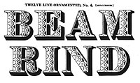

Besides simple typefaces, variants were designed with patterns and decorations. These extended from simple inline designs to artwork such as flowers and harvest scenes. Decorated fat face typefaces were cut in wood and reproduced by dabbing or stereotype. Digital font designer Andy Clymer reports finding that it was more common for bold lettering on engraved maps to be decorated than it was to be plain: "whenever things would get heavier, they would often just get more ornamented…not filled in solid [but] with some kind of ornamentation or decoration."[38][lower-alpha 5] One foundry particularly known for decorated designs was the London foundry of Louis John Pouchée.[35][40] Pouchée was a Freemason, and some of his foundry's wood patterns, many of which survive, were inspired by Masonic emblems.[41][42]
Twentieth century and later
Fat faces returned to some popularity in the twentieth century, in the UK as part of the Victoriana style promoted by John Betjeman and others in the 1930s.[43][44] Post-nineteenth century fat face fonts include:
- Ultra Bodoni by Morris Fuller Benton at American Type Founders.[45]
- Falstaff by Monotype[46]
- Normande by Berthold[47]
- Brunel and Isambard by Barnes & Schwartz[48][26]
- Thorowgood by Linotype.[49]
Notes
- This was not the only way in which fonts could appear different, however: differences in x-height, spacing, condensation and colour on the page can make body text fonts look different in design even if individual letters are not that different.
- Elements of what became transitional typefaces appeared from the late seventeenth century, as lettering and particularly in the groundbreaking Romain du Roi alphabet of the French crown, but generally typefounders stayed using typefaces of conservative design into the eighteenth century.
- Didone types were at the time called 'modern' for their sophisticated image; the name has fallen from use as they have become less common in body text from around the end of the nineteenth century.
- There were two Thomas Bishes, father and son. Both have been extensively discussed in literature on the history of advertising; see following sources.[28][29][30]
- See, for example, A Specimen of the Print Hands, an internal specimen of lettering styles used by the Ordnance Survey, in the early nineteenth century.[39]
References
- Margaret Re; Johanna Drucker; James Mosley; Matthew Carter (1 July 2003). Typographically Speaking: The Art of Matthew Carter. Princeton Architectural Press. pp. 61, 84, 90. ISBN 978-1-56898-427-8.
- Ford, Thomas (1854). The Compositor's Handbook. T. Ford. p. 243.
- Lewis 1962, p. 12.
- Kennard, Jennifer (3 January 2014). "The Story of Our Friend, the Fat Face". Fonts in Use. Retrieved 11 August 2015.
- Phinney, Thomas. "Fat Faces". Graphic Design and Publishing Centre. Retrieved 10 August 2015.
- Nesbitt, Alexander (1998). The History and Technique of Lettering. Mineola, NY: Dover Publications. pp. 158–161. ISBN 9780486402819.
- Shaw, Paul. "By the Numbers no. 2—Fat Faces in New England Cemeteries". Paul Shaw Letter Design. Retrieved 13 May 2020.
- Hansard 1825, p. 926.
- Mosley, James. "Comments on Typophile thread "Where do bold typefaces come from?"". Typophile. Archived from the original on 20 December 2016. Retrieved 16 December 2016.
John Smith says in his Printer’s grammar (London, 1755). ‘Black Letter … is sometimes used … to serve for matter which the Author would particularly enforce to the reader.’
- Meggs, Philip B. & Purvis, Alston W. (2006). "Graphic Design and the Industrial Revolution". History of Graphic Design. Hoboken, NJ: Wiley. p. 122.
- Sutton, James & Sutton, Alan (1988). An Atlas of Typeforms. Wordsworth Editions. p. 59. ISBN 1-85326-911-5.
- Mosley 1993, p. 8.
- Phinney, Thomas. "Transitional & Modern Type Families". Graphic Design & Publishing Center. Retrieved 30 October 2015.
- De Jong, Cees W.; Purvis, Alston W. & Friedl, Friedrich (2005). Creative Type: A Sourcebook of Classical and Contemporary Letterforms. Thames & Hudson. p. 223.
- Hoefler, Jonathan. "Didot History". Hoefler & Frere-Jones. Retrieved 11 August 2015.
- David Raizman (2003). History of Modern Design: Graphics and Products Since the Industrial Revolution. Laurence King Publishing. pp. 40–3. ISBN 978-1-85669-348-6.
- Eskilson, Stephen J. (2007). Graphic Design: A New History. New Haven: Yale University Press. p. 25. ISBN 9780300120110.
- Frere-Jones, Tobias. "Scrambled Eggs & Serifs". Frere-Jones Type. Retrieved 23 October 2015.
- John Lewis (April 2007). Typography: Design and Practice. Jeremy Mills Publishing. pp. 13–17. ISBN 978-1-905217-45-8.
- Mosley, James (1990). A Specimen of Printing Types & Various Ornaments 1796: Reproduced Together with the Sale Catalogue of the British Letter-Foundry 1797. Printing Historical Society. pp. 5–12.
- Wolpe, Berthold (1964). "Caslon Architectural: On the origin and design of the large letters cut and cast by William Caslon II". Alphabet. pp. 57–72.
- Howes, Justin (2004). "Caslon's Patagonian". Matrix. 24: 61–71.
- Johnson 1970, p. 409.
- Hansard 1825, p. 360.
- Savage 1822, p. 72.
- Barnes, Paul. "Isambard: read the story". Commercial Type. Retrieved 16 May 2020.
- Mosley 1993, p. 10.
- Strachan, John (2007). "'Publicity to a lottery is certainly necessary': Thomas Bish and the culture of gambling". Advertising and Satirical Culture in the Romantic Period. Cambridge University Press. pp. 162–203. ISBN 978-0-521-88214-9.
- Short, Gill. "The Art of Advertising: an exhibition in waiting". Bodleian Library. Retrieved 26 May 2020.
- Hicks, Gary. "The First Adman: Thomas Bish and the Birth of Modern Advertising". Victorian Secrets. Retrieved 26 May 2020.
- Caslon, William IV (1816). Untitled fragment of a specimen book of printing types, c. 1816. London: William Caslon IV. Retrieved 19 May 2020.
- Berry, John (3 February 2016). "A History: English round hand and 'The Universal Penman'". Typekit. Adobe Systems. Retrieved 19 May 2020.
- Shaw, Paul. "Flawed Typefaces". Print magazine. Retrieved 20 May 2020.
- Johnson 1970, p. 410.
- Coles, Stephen (7 May 2016). "Ornamented Types Introduction and Prospectus". Fonts in Use. Retrieved 26 May 2020.
- Gray 1977, p. 14.
- The Specimen Book of Types Cast at the Austin Foundry by Wood & Sharwoods. London. 1838. Retrieved 12 July 2020.
- Clymer, Andy (3 April 2015). "Designing Obsidian with Andy Clymer". Vimeo. Cooper Union. Retrieved 22 May 2020.
- "A Specimen of the Print Hands, for the Instruction of the Cadets, in the Corps of Royal Military Surveyors and Draftsmen, Engraved by desire of Lieutenant General Mann, Inspector General of Fortifications". National Library of Scotland/Ordnance Survey. Retrieved 22 May 2020.
- Mosley 1993.
- "Ornamented types: a prospectus" (PDF). imimprimit. Archived from the original (PDF) on 22 December 2015. Retrieved 12 December 2015.
- Daines, Mike. "Pouchee's lost alphabets". Eye Magazine. Retrieved 12 March 2016.
- Johnson 1970.
- Rennie 2001, p. 110.
- "Ultra Bodoni". MyFonts. Retrieved 4 March 2016.
- "Falstaff". MyFonts. Monotype. Retrieved 4 March 2016.
- "Bitstream Normande". MyFonts. Bitstream. Retrieved 4 March 2016.
- "Brunel". Fonts In Use. Retrieved 4 March 2016.
- "Thorowgood". MyFonts. Linotype. Retrieved 4 March 2016.
Sources
Cited literature
- Bartram, Alan (1986). The English Lettering Tradition from 1700 to the present day (1st ed.). Lund Humphries. ISBN 9780853315124.
- Gray, Nicolete (1977). Nineteenth Century Ornamented Typefaces.
- Hansard, Thomas Curson (1825). Typographia: an Historical Sketch of the Origin and Progress of the Art of Printing: With Practical Directions for Conducting Every Department in an Office: with a Description of Stereotype and Lithography. Illustrated by Engravings, Biographical Notices, and Portraits. Baldwin, Cradock, and Joy.
- Johnson, Alfred F. (1970). "Fat Faces: Their History, Forms and Use (1947)". Selected essays on books and printing. Van Gendt & Co. pp. 409–415. ISBN 9789063000165.
- Lewis, John (1962). Printed Ephemera: the changing uses of type and letterforms in English and American printing. Ipswich: W. S. Cowell.
- Mosley, James. "The Typefoundry of Vincent Figgins, 1792-1836". Motif (1): 29–36.
- Mosley, James (1963). "English Vernacular". Motif. 11: 3–56.
- Mosley, James (1966). "Nineteenth-century decorated types at Oxford". Journal of the Printing Historical Society: 1–35.
- Mosley, James (1984). British Type Specimens before 1831: a hand-list. Oxford Bibliographical Society, Bodleian Library in association with the Dept. of Typography & Graphic Communication, University of Reading. ISBN 9780901420114.
- Mosley, James (1993). Ornamented types: twenty-three alphabets from the foundry of Louis John Poucheé. I.M. Imprimit in association with the St. Bride Printing Library.
- Rennie, Paul (2001). "Fat Faces All Around: Lettering and the Festival Style" (PDF). Twentieth Century Architecture. 5: 109–115. Retrieved 26 May 2020.
- Savage, William (1822). Practical Hints on Decorative Printing. London. p. 72.
- Wolpe, Berthold (1967). Vincent Figgins: Type specimens, 1801 and 1815. London: Printing Historical Society.