Emphasis (typography)
In typography, emphasis is the strengthening of words in a text with a font in a different style from the rest of the text, to highlight them.[1] It is the equivalent of prosodic stress in speech.

Methods and use

The most common methods in Western typography fall under the general technique of emphasis through a change or modification of font: italics, boldface and small caps. Other methods include the alteration of LETTER CASE and spacing as well as color and *additional graphic marks*.
Font styles and variants
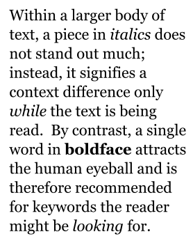
The human eye is very receptive to differences in "brightness within a text body". Therefore, one can differentiate between types of emphasis according to whether the emphasis changes the "blackness" of text, sometimes referred to as typographic color. A means of emphasis that does not have much effect on blackness is the use of italics, where text is written in a script style, or oblique, where the vertical orientation of each letter of the text is slanted to the left or right. With one or the other of these techniques (usually only one is available for any typeface), words can be highlighted without making them stand out much from the rest of the text (inconspicuous stressing). This is used for marking passages that have a different context, such as book titles, words from foreign languages, or internal dialogue.
By contrast, a bold font weight makes letters of a text thicker than the surrounding text.[2] Bold strongly stands out from regular text, and is often used to highlight keywords important to the text's content. For example, printed dictionaries often use boldface for their keywords, and the names of entries can conventionally be marked in bold.[3]
Small capitals are also used for emphasis, especially for the first line of a section, sometimes accompanied by or instead of a drop cap, or for personal names as in bibliographies.
If the text body is typeset in a serif typeface, it is also possible to highlight words by setting them in a sans serif face. This practice is often considered archaic in Latin script, and on computers is complicated since fonts are no longer issued by foundries with a standard baseline, so switching font may distort linespacing. It is still possible using some font superfamilies, which come with matching serif and sans-serif variants, though these are not generally supplied with modern computers as system fonts. In Japanese typography, due to the reduced legibility of heavier Minchō type, the practice remains common.
Of these methods, italics, small capitals and capitalization are oldest, with bold type and sans-serif typefaces not arriving until the nineteenth century.
Capitalization
The house styles of many publishers in the United States use all caps text for:
- chapter and section headings;
- newspaper headlines;
- publication titles;
- warning messages; and
- words of important meaning.
Capitalization is used much less frequently by British publishers, and usually only for book titles.
All-uppercase letters are a common substitute form of emphasis where the medium lacks support for boldface, such as old typewriters, plain-text email, SMS and other text-messaging systems.
Socially, the use of all-caps text in Roman languages has become an indicator of shouting when quoting speech. It was also often used in the past by American lawyers to flag important points in a legal text.[4] Coinciding with the era of typewriter use, the practice became unnecessary with the advent of computerised text formatting, although it is still found on occasion in documents created by older lawyers.[5][6][7]
Letter-spacing

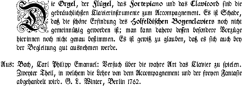
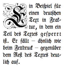
Another means of emphasis is to increase the spacing between the letters, rather than making them darker, but still achieving a distinction in blackness. This results in an effect reverse to boldface: the emphasized text becomes lighter than its environment. This is often used in blackletter typesetting and typewriter manuscripts, but by no means restricted to those situations.[8]
This letter-spacing is referred to as sperren in German, which could be translated as "spacing out": in typesetting with letters of lead, the spacing would be achieved by inserting additional non-printing slices of metal between the types, usually about an eighth of an em wide. On typewriters a full space was used between the letters of an emphasized word and also one before and one after the word.
For black letter type boldface was not feasible, since the letters were very dark in their standard format, and on (most) typewriters only a single type was available. Although letter-spacing was common, sometimes different typefaces (e.g. Schwabacher inside Fraktur), underlining or colored, usually red ink were used instead.
Since blackletter type remained in use in German speaking parts of Europe much longer than anywhere else, the custom of letter-spacing is sometimes seen as specific to German, although it has been used with other languages, including English.[9] Especially in German, however, this kind of emphasis may also be used within modern type, e.g. where italics already serve another semantic purpose (as in linguistics) and where no further means of emphasis (e.g. small caps) are easily available or feasible. Its professional use today is very limited in German. This use of spacing is also traditionally found in Polish.[10]
German orthographic (or rather typographic) rules require that the mandatory blackletter ligatures are retained. That means, ſt, ch, ck, and tz are still stuck together just as the letter ß, whereas optional, additional ligatures like ff and ſi are broken up with a (small) space in between. Other writing systems did not develop such sophisticated rules since spacing was so uncommon therein.
In Cyrillic typography, it also used to be common to emphasize words using letter-spaced type. This practice for Cyrillic has become obsolete with the availability of Cyrillic italic and small capital fonts.[11]
Underlining
Professional Western typesetting usually does not employ lines under letters for emphasis within running text, because it is considered too distracting. Underlining is, however, often used with typewriters, in handwriting and with some non-alphabetic scripts. It is also used for secondary emphasis, i.e. marks added by the reader and not the author.
Overlining
In Arabic, it is traditional to emphasize text by drawing a line over the letters.[12]
Punctuation marks
.png)
Sometimes quotation marks are used for emphasis.[13]
In Chinese, emphasis in body text is supposed to be indicated by using an "emphasis mark" (着重號/着重号), which is a dot placed under each character to be emphasized. This is still taught in schools but in practice it is not usually done, probably due to the difficulty of doing this using most computer software. Consequently, methods used for emphasis in Western text are often used instead, even though they are considered inappropriate for Chinese (for example, the use of underlining or setting text in oblique type).
In Japanese texts, when katakana would be inappropriate, emphasis is indicated by "emphasis dots" (圏点 or 傍点) placed above the kanji and any accompanying furigana in horizontal writing and to the right in vertical writing. Japanese also has an "emphasis line" (傍線) used in a similar manner, but less frequently.
In Korean texts, a dot is placed above each hangul syllable block or hanja to be emphasized.[14]
In Armenian the շեշտ (šešt) sign ( ՛ ) is used.
In Internet usage, asterisks are sometimes used for emphasis (as in "That was *really* bad"). Less commonly, underscores may be used, resembling underlining ("That was _really_ bad"). These are seen on sites where input is restricted to plain text with no method to apply markup tags (e.g. <i> for italics, or <b> for boldface). In some cases, the engine behind the text area being parsed will render the text and the asterisks in bold automatically after the text is submitted.
Color
Colors are important for emphasizing. Important words in a text may be colored differently from others. For example, many dictionaries use a different color for headwords, and some religious texts color the words of deities red, commonly referred to as rubric. In Ethiopic script, red is used analogously to italics in Latin text.[15]
Post-print emphasis added by a reader is often done with highlighters which add a bright background color to usual black-on-white text.
Design

There are many designs. With both italics and boldface, the emphasis is correctly achieved by swapping into a different font of the same family; for example by replacing body text in Arial with its bold or italic style. Professional typographic systems, including most modern computers, would therefore not simply tilt letters to the right to achieve italics (that is instead referred to as slanting or oblique), print them twice or darker for boldface, or scale majuscules to the height of middle-chamber minuscules (like x and o) for small-caps, but instead use entirely different typefaces that achieve the effect. The letter 'w', for example, looks quite different in italic compared to upright.
As a result, typefaces therefore have to be supplied at least fourfold (with computer systems, usually as four font files): as regular, bold, italic, and bold italic to provide for all combinations. Professional typefaces sometimes offer even more variations for popular fonts, with varying degrees of blackness. Only if such fonts are not available should the effect of italic or boldface be imitated by algorithmically altering the original font.
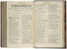
The modern Latin-alphabet system of fonts appearing in two standard weights, with the styles being regular (or "Roman"), italic, bold and bold italic is a relatively recent development, dating to the early twentieth century. Modern "Roman" type was developed around the 1470s, while italic type was developed around 1500 and was commonly used for emphasis by the early 17th century. Bold type did not arrive until the nineteenth century, and at first fonts did not have matching bold weights; instead a generic bold, sometimes a Clarendon or other kind of slab-serif, would be swapped in.[16] In some books printed before bold type existed, emphasis could be shown by switching to blackletter.[17][18] Some font families intended for professional use in documents such as business reports may also make the bold-style numbers take up the same width as the regular (non-bold) numbers, so a bold-style total lines up below the digits of the sum in regular style.[19]
Recommendations and requirements
Linguistics professor Larry Trask stated that "It is possible to write an entire word or phrase in capital letters in order to emphasize it", but adds that "On the whole, though, it is preferable to express emphasis, not with capital letters, but with italics."[20] Many university researchers and academic journal editors advise not to use italics, or other approaches to emphasising a word, unless absolutely essential, for example the Modern Language Association "discourages the use of italics in academic prose to emphasize or point, because they are unnecessary—most often, the unadorned words do the job without typographic assistance".[21] Although emphasis is useful in speech, and so has a place in informal or journalistic writing, in academic traditions it is often suggested that italics are only used where there is a danger of misunderstanding the meaning of the sentence, and even in that case that rewriting the sentence is preferable; in formal writing the reader is expected to interpret and understand the text themselves, without the assumption that the precise intended interpretation of the author is correct. Italics are principally used in academic writing for texts that have been referenced, and for foreign language words. Similarly capitals and underlining have particular meanings, and are rarely used in formal writing for emphasis.
References
- Twyman, Michael. "The Bold Idea: The Use of Bold-looking Types in the Nineteenth Century". Journal of the Printing Historical Society. 22 (107–143).
- Bigelow, Charles; Holmes, Kris. "On Font Weight". Bigelow & Holmes. Retrieved 4 September 2018.
- This technique may also be used to "deemphasise" text, as in the "Concordant Literal (Bible)" (OT, ISBN 0910424098; NT, ISBN 0910424144): "The type is large and readable, with boldface representing the actual English translation of the original Hebrew and Greek and lightface showing English words added for idiomatic clarity or to reflect grammatical significance."
- Butterick, Matthew. "All Caps". Practical Typography.
- "Why is your Contract YELLING AT YOU? All Caps in Contracts, Explained". Shake Law. Retrieved 29 July 2015.
- Garner, Bryan A. (2013). Legal writing in plain English: a text with exercises (Second ed.). University of Chicago Press. ISBN 978-0226283937. Retrieved 2 August 2015.
- Butterick, Matthew. "Small caps". Practical Typography. Retrieved 29 July 2015.
- An example of an English translation of Russian original, with a non-typewriter font (i.e. variable-width letters) is in Eigeles, M. A., Kinetics of adhesion of mineral particles to air bubbles in flotation suspensions, Comptes Rendus (Doklady) de l'Académie des sciences de l'URSS, XXXIV(4), 340–344, 1939.
- Example: Schäfer EA, Canney EL, Tunstall JO. On the rhythm of muscular response to volitional impulses in man. The Journal of Physiology 1886;VII(2):111–117.
- Jak zaznaczyć emfazę? – PWN
- Bringhurst: The Elements of Typographic Style, version 3.0, page 32
- Charette, François (2010). "ArabXeTeX: an ArabTeX-like interface for typesetting languages in Arabic script with XeLaTeX" (PDF). Archived from the original (PDF) on 2012-04-25. Retrieved 2011-10-10.
- "The 'emphatic' use of quotation marks | Macmillan Dictionary Blog".
- "Hangul/Korean (draft)". Retrieved 2 January 2020.
- Hudson, John (2003). "RED, WHITE & BLACK True colors?".
- Tracy, Walter. Letters of Credit. pp. 65–6.
The other kind of secondary type, the related bold face, is a twentieth-century creation. Although the use of bold type for emphasis in text began when display advertising became a feature of the family magazines of the mid-nineteenth century, the bold types themselves were Clarendons, Ionics and Antiques quite unrelated to the old styles and moderns used for the text. As late as 1938 the Monotype Recorder, a distinguished British journal of typography, could say, "The 'related bold' is a comparatively new phenomenon in the history of type cutting."
- Mosley, James. "Comments on Typophile thread 'Where do bold typefaces come from?'". Typophile. Archived from the original on 20 December 2016. Retrieved 16 December 2016.
For the record, the Clarendon type of the Besley foundry is indeed the first type actually designed as a 'related bold' – that is, made to harmonize in design and align with the roman types it was set with. It was registered in Britain in 1845...but the idea of a 'bold face' goes back much further. Before the launch of Clarendon type printers picked out words in slab-serifs or any other heavy type. In the 18th century they used 'English' or 'Old English' types, which is why they became known as 'black letter'. John Smith says in his Printer's grammar (London, 1755). 'Black Letter ... is sometimes used ... to serve for matter which the Author would particularly enforce to the reader.'
- Frere-Jones, Tobias. "From The Collection: 012". Frere-Jones Type. Retrieved 11 November 2018.
- "Gotham Numerics". Hoefler & Frere-Jones. Retrieved 27 September 2014.
- Trask, Larry (1997). "Capital Letters".
- "Is it OK to italicize a word for emphasis in my paper? – the MLA Style Center".
External links
![]()