BBC One pre-1969 idents
BBC1 used a number of different idents from the time of the station launch on 2 November 1936 until the station took on the Mirror Globe Idents on 15 November 1969.
Idents
The original idents used when the station launched were slides with the words BBC TELEVISION SERVICE written in a stylised way. These slides also featured waved lines in different shades and a number of circles in the centre, suggesting that this slide could work in the same way as a Testcard. Slides of the BBC Coat of Arms were also shown.
Upon war being declared on 1 September 1939, the Television Service was closed down, with all BBC output being made on Radio instead. Many of the staff at BBC Television went to work in the forces, or on the Chain Home Radar System. The BBC Television Service returned following the war on 7 June 1946 and continued with the same identification.
The Bat's Wings

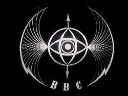
The ident they called the "Bat's Wings" was introduced on 2 December 1953. A new media needed a new way to brand itself, and this was it. It was a model made of piano wire, brass and flashing lights, created by Abram Games. it featured a spinning globe in the centre and two spinning eyes, each going in different directions. It also features two lightning bolts to either side which lit up with lightning flashes in time to the harp music.[1][2] The model was filmed, rather than the live mechanics used later by the BBC, due to the models' delicate and temperamental nature, even breaking down after being filmed.[3] The design itself was meant to represent, in the BBC's own words:
"The abstract pattern consists of two intersecting eyes which scan the globe from north to south and east to west, symbolising vision and the power of vision. Flashes of lightning on either side represent electrical forces and the whole form takes the shape of wings which suggest the creative possibilities of television broadcasting"[1]
The Bat's wings were also accompanied by a clock, which featured a simplified Bat's wings design, with the clock face replacing the globe and eyes, and the intrequate lines that made up the bat's wing removed. The noticeable thing about this clock design is the length of the second hand. While the minute and hour hands never went outside the circle at the centre, the second hand went out as far as the bat's wings themselves, making the second hand easily twice as long as the minute hand.[4] The clock was occasionally accompanied by the BBC Pips when a programme started on the hour.[1]
Another part of the look were the regional variations used by the, then few, Nations and Regions. Scotland's variation featured a shield with the Scottish flag inside replacing the eye and world. 'Scotland' was written between the wings at the top of the screen. The regions variation featured the bats wings shape, but with a large eye made up of lines going between both wings. The BBC North variation included the legend 'North of England' within this eye with 'BBC' and 'News' written between the wings above and below respectively. The BBC Midlands variant featured a stylised 'M' in the middle of the eye with midlands written in an eye shape within the 'M'. The BBC legend is written above. The BBC West variation included the same design as the midlands, but with a 'W' and the BBC legend at the bottom.[1] The West region also included some areas of Wales at this point. Wales would not get its own service until 1964, however a number of viewers could receive services via overspill of the Wenvoe Transmitter.
As part of the look, captions were also made featuring the Bat Wings outline on black captions, used to introduce the next programme, programmes for Schools and Colleges[5] and even the testcards used early in the BBC's existence were updated with the Bats Wings.[2]
The Map
By the late 1950s and with the introduction of their new logo of square boxes with slanted letters a number of things changed. Firstly the clock design was changed c.1958 to two circles, one inside the other, containing the clock and the new logo. The large second hand was retained, reaching the larger of the two circles. The clock element itself was made larger and more consipcous.[4] This was changed again on 8 October 1960 to a digital clock, featuring the BBC logo above a line, with the 'TV' box and time below.[1]
The Map logo itself was introduced c.1962 and featured the BBC logo in the middle of a circle containing a segmented map of the regions.[4] This logo also had a variant of a plain circle with BBC logo, used for Breaking News.[1] Regional variations were changed from this point to a similar design to that of the digital clock. The design featured the 'BBC TV' logo above a line with the region name below.[6][7]
The Globe

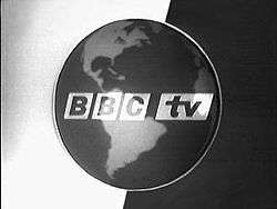
The, now famous, symbol of BBC Television, and later BBC One was the globe. The very first incarnation was introduced on 30 September 1963 and featured a large globe on its axis with the new slanted BBC logo with a background of black and white, split down the axis of the globe. The globe, like all that followed, spun. This was accompanied by the previous clock used in 1958 with modifications made, namely the logo updated and colours changed to greys. The large second hand was still retained.
Alas this globe only lasted a little while, as it was replaced a few months later with a variation on the theme. Following the 1962 Pilkington Report that suggested that the third television station be awarded to the BBC, the BBC launched BBC2 on 20 April 1964. In preparation to this, all 'BBC TV' branding had to disappear from the presentation of the soon to be called BBC1. The Globe was made smaller, surrounded by a thich black circle and encompassed in a large white box on a grey background. There was also a slanted BBC logo in the bottom right corner.[4] The lack of on screen branding is unusual, but as this ident began its life on BBC TV and ended on BBC1, the lack is justified. However the lack is also because BBC2 was unseen by many viewers: the new 625-line system meant new equipment had to be purchased and poor coverage meant few could view it. A clock also accompanied this look, with the same design as the globe, but with clock replacing the globe. It had a black background and normal length second hands.[1]
The next globe design was introduced on 18 April 1966, nicknamed the 'Watch Strap' it featured a smaller globe in the centre of screen with three stripes of grey and white running to the left and right, on a black background. It was also the first ident to use the name 'BBC1', using the slanted logo in white.[4] The watchstrap globe also featured a clock, with the same design as the globe but with the clock in place of the globe.[4] Alongside the look, a slide was used to introduce newsflashes, and featured a thick stripe, white on the left hand side and grey on the right, on a black background with a large angled '1' above the grey section and filling most of the screen. The strip held the slanted 'BBC TV' logo, with the BBC logo in the white section and the grey section containing the 'TV' logo.[8]
The final variation of the globe was introduced on 7 July 1968 and was a variation on the watchstrap theme. The globe now spins on a black background with a white stripe below containing a black BBC1 logo. This version was used only a few months until some time into 1969. It is unknown whether a new clock design accompanied the look, however it is more than likely that the clock was modified. The newer globe look appears to use the same model as the previous looks but with a modified legend and background, however we can't be certain.[4]
References
- MHP Ident Zone
- Transdiffusion Broadcasting System - Video of Startup and Symbol
- Transdiffusion Broadcasting System - Baird - Oh, that Symbol
- TBBC1 1950s - 1960s Idents Archived 18 March 2012 at the Wayback Machine at TVARK
- BBC Cult Flash Recreation
- BBC South Archived 4 March 2012 at the Wayback Machine at TVARK
- BBC South West at TVARK
- MHP Ident Zone BBC1
External links
| Preceded by First |
BBC television idents 2 November 1936 – 15 November 1969 |
Succeeded by BBC One 'NODD Globe' ident |