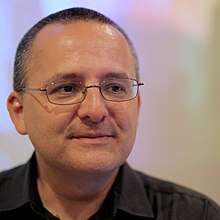
Alberto Cairo
Alberto Cairo (born 1974 in A Coruña) is a Spanish information designer and professor. Cairo is the Knight Chair in Visual Journalism at the School of Communication of the University of Miami.[1][2]
| Alberto Cairo | |
|---|---|
 | |
| Born | 1974 A Coruña |
Education
Cairo holds a BA in Journalism from the University of Santiago de Compostela, and MA and PhD from the Universitat Oberta de Catalunya (in Barcelona).[1]
Career
Cairo began working as a journalist in the late 1990s, at La Voz de Galicia (The Voice of Galicia), and then at Diario 16 (Diary 16) where he worked on print graphics.[3] He then worked as a data-journalist and information designer at El Mundo, Spain's second largest printed daily newspaper, where he experimented with emerging tools like Macromedia Flash to make multimedia infographics.[3][4] He became the director of the paper's online component, supervising five people, at a time when very few global newspapers were doing similar graphical work.[3] Notable multimedia articles included the paper's coverage of the September 11 attacks in the US in 2001, and the 2004 Madrid train bombings.[3]
In 2005, Cairo was hired by the University of North Carolina at Chapel Hill to teach Flash, 3D animation, and interactive graphics.[3] He returned to the publishing world in 2007, now based in São Paulo, Brazil, where he worked on graphics for the magazine Época.[3] He was the director for Infographics and Multimedia at Editora Globo in Brazil.[4]
Cairo returned to the world of education in 2012 at the University of Miami.[4] That year, he created the first Massive Open Online Course in journalism, “Introduction to Infographics and Data Visualization,” with the Knight Center for Journalism in the Americas.[4][5] Cairo teaches for the journalism department and the Master of Fine Arts in Interactive Media program, and is the director of the visualization program at the Center for Computational Science.[3]
Books
- The Functional Art: an Introduction to Information Graphics and Visualization (2012)[6][7]
- The Truthful Art: Data, Charts, and Maps for Communication (2016).[8]
References
- "Profile of Alberto Cairo at the School of Communication of the University of Miami". Archived from the original on 2018-03-28. Retrieved 2018-03-28.
- García, Fernando (2008-10-09). ""No soy nada de 'gadgets'"". El País. Archived from the original on 2014-08-14. Retrieved 2019-11-21.
- Kohnstamm, Thomas (2016). "Show, don't tell: Alberto Cairo, Power BI & the rise of data journalism". Microsoft Story Labs. Retrieved 2020-01-09.
- "Profile of Alberto Cairo on his personal web page". Archived from the original on 2015-09-26. Retrieved 2015-09-26.
- "Alberto Cairo, University of Miami". Data Journalism Awards. Retrieved 2020-01-09.
- McGhee, Geoff (16 October 2015). "The "Rules" of Data Visualization Get an Update". National Geographic News. Archived from the original on 24 January 2019. Retrieved 24 January 2019.
- Alan Smith. "The six best books for data geeks". Financial Times. Archived from the original on 2019-01-24. Retrieved 2019-01-24.
- Alan Smith. "When dense makes sense: explaining complex data in charts". Financial Times. Archived from the original on 2019-01-24. Retrieved 2019-01-24.