À la poupée
À la poupée is a largely historic intaglio printmaking technique for making colour prints by applying different ink colours to the printing plate using ball-shaped wads of cloth, one for each colour. The coloured print has just one run through the press, but the inking needs to be carefully re-done after each impression is printed. Each impression will usually vary slightly, sometimes very significantly.[2]
%2C_c._1793%2C_NGA_124909.jpg)
Though invented much earlier, the technique became common from the late 17th century into the early 19th century. It was always an alternative to, and often combined with, hand colouring, usually with watercolour and brush.[3] Large areas, such as the sky in landscapes, might be done à la poupée, with more detailed parts hand coloured.[4] It was used with all the various intaglio printmaking techniques, but tended to be most effective with stipple engraving, "giving a bright and clean look".[5]
The term à la poupée means "with the doll" in French, the "doll" being the wad of cloth, shaped like a ball.[6] The term only came into use after about 1900, with a variety of contemporary terms being used in different languages. In fact technical descriptions make it clear that the ink was applied with a "stump brush" at least as much as by the "doll".[7] It may be called the "dolly method" in English.[8]
Technique
.jpg)
As with a monochrome print in an intaglio technique (such as engraving, etching, mezzotint and aquatint), the ink was spread on the plate (normally copper) and then wiped off the surface, leaving ink only in the lines or other areas below the main level of the plate. This was much more difficult, and slower, when different colours of ink were applied to different areas, requiring what was in effect a painting process rather than just spreading a single colour over the whole plate with what we would call today a squeegee. Where "surface tone" was wanted, not all the ink was wiped off the face of the print. The high-pressure press pushed the slightly damp paper into these recesses to collect the ink and print the image. To ready the plate for the next impression, it was wiped clean and the whole process was repeated. Presumably the printer normally worked off a model, probably in watercolour.[10]
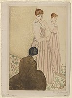
Unusually for a significant artist, Mary Cassat did the inking for her famous group of 1891 herself, and found printing 25 impressions of ten prints, with the help of a professional printer, "a great work ... Sometimes we worked all day (eight hours) both as hard as we could work and only printed eight or ten proofs in the day".[11]
The technique varied somewhat; an account based on a 19th-century Parisian practice said a fairly light "ground tint, usually brown black or grey" was applied first, all over except for flesh areas, giving a "slight tone" which "dominated the picture".[12] But the leading early practitioner Johannes Teyler for one did not do this, inking purely linear plates in different colours, risking that, according to Antony Griffiths, the results "look very odd".[13] Later printmakers generally used à la poupée inking with techniques that gave tone rather than just line, such as stipple engraving, mezzotint and aquatint. It was commonly used with mezzotint plates that had begun to wear out (as they rather quickly did) to disguise this, although this is not always the case, as some proof impressions use it.[14]
History
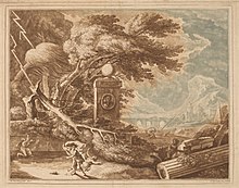
The earliest known example of the technique is an impression of a religious engraving of about 1525 by Agostino Veneziano, where the Virgin and Child are printed in red, and the surrounding saints and background in blue. When this was printed is uncertain. Other early uses of the technique, many decades later, are to colour illustrated title pages of books otherwise illustrated in black and white. The earliest title page to use this was the Architectura of Wendel Dietterlin, with various Nuremberg editions from 1593 to 1598; this was a heavily-illustrated and very influential book on architectural ornament.[15]
The revival in interest in the technique about a century later was due to the Dutch artist (among various other professions) Johannes Teyler, who in 1688 received a patent for the technique and financed a Dutch workshop to produce prints in the technique.[16] This was not very long-lived; over about ten years, the workshop produced over 800 different prints using up to eight colours. These were mostly of decorative subjects of all the various types of the day, but included reproductive prints of old masters, more often French than Dutch or Italian.[17] The technique was soon taken up by others, especially in the Netherlands, and later France. From about 1695, a number of Amsterdam publishers began putting out prints in the technique.[18]
The first published description of the technique is in the 3rd edition of 1745 of the manual on etching by the French artist Abraham Bosse, De la manière de graver à l'eaux-forte et au burin..., first published a century earlier.[19]
In the second half of the 18th century the technique began to be used to colour more elaborate prints that were also issued in monochrome,[20] the coloured impressions being much more expensive, and probably intended for framing.[21] Considerably different colour schemes across different impressions of some prints suggest that at times coloured versions were pulled individually for a specific order.[22] In England, Elisha Kirkall was an early user, in mezzotints of the 1720s, and Robert Laurie, an engraver of maps and other subjects later in the century, extended the number of colours that were used, helping to make the technique fashionable again.[23] Towards the end of the century, the Italian Francesco Bartolozzi and his followers made much use of it, and in France it was used for the illustrations to luxury scientific books, culminating in those of the botanical illustrator Pierre-Joseph Redouté, such as his Les Roses (1817–24).[24] Redouté had the many artists working from his watercolours print them with inking à la poupée and then hand-colour details where necessary.[25]
As other, cheaper, methods of colour printing developed in the mid-19th century, the usage of à la poupée declined. But at the end of the century, a set of ten prints by Mary Cassatt proved an early example of the technique being applied individually by a significant artist, rather than a printshop worker following a painted model. She used drypoint, etching and aquatint and colour applied à la poupée. The prints were influenced by Japanese woodblock prints, especially those of Utamaru, which were made using complicated multiple blocks.[26] Peter Ilsted also used the technique, mainly with mezzotint.[27] and the French printmaker Manuel Robbe used it with aquatint.[28] Various later artists have used the technique at times.
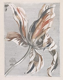 Dutch à la poupée print in three colours, of a tulip, c. 1690s. Workshop of Johannes Teyler
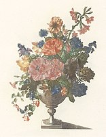 Vase with flowers: 4 colours à la poupée, with additional hand-colouring, Teyler workshop, 1688-98
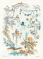 Anne Allen after Jean-Baptiste Pillement, etching, Chinese Arabesque with a Boat, early 1760s
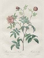 Pierre-Joseph Redouté, plate from Les Roses, Rosa cinnamomea, 1817, with hand-colouring
Notes
- Impression in the Rijksmuseum
- Gascoigne, 26a; Griffiths, 117
- Gascoigne, 26a; Griffiths, 117
- Gascoigne, 26a
- Gascoigne, 26a
- "Colorful impressions: Techniques". National Gallery of Art. Archived from the original on February 21, 2015. Retrieved March 25, 2015.
- Stijnman and Savage, 46–47
- Portland Art Museum, Glossary
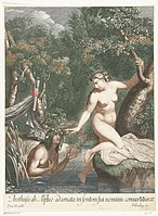
- The whole print. There is also a light black or grey wash, seen on Psyche's hair.
- Lambert, 88, 97; Griffiths, 31–34 on "normal" intaglio printmaking
- Ives, 45–46
- Lambert, 88 (quoted), 97
- Griffiths, 119
- Griffiths, 119; Lambert, 102
- Stijnman and Savage, 43
- Stijnman and Savage, 43
- Les estampes en couleurs de Johannes Teyler, INHA, Paris
- Stijnman and Savage, 45–46
- Stijnman and Savage, 43
- Lambert, 101, her 82A and B show monochome and colour impressions of the same print
- Griffiths, 118
- Lambert, 102
- Griffiths, 118
- Grove, 557
- Grove; "Redoute, Les Roses, Antique Prints, Paris, 1817–24", George Glazer Gallery
- Ives, 45–54
- The National Museum of Western Art, The Dining Room at Liselund, 1917
- "Manuel Robbe", Galerie Maximillian
References
- Gascoigne, Bamber. How to Identify Prints: A Complete Guide to Manual and Mechanical Processes from Woodcut to Inkjet, 1986 (2nd Edition, 2004), Thames & Hudson, ISBN 050023454X. Uses section numbers rather than page numbers.
- Griffiths, Antony, Prints and Printmaking, British Museum Press (in UK), 2nd edn, 1996 ISBN 071412608X
- "Grove", The Grove Encyclopedia of Materials and Techniques in Art, ed. Gerald W. R. Ward, 2008, Oxford University Press, ISBN 0195313917, 9780195313918, google books
- Ives, Colta Feller, The Great Wave: The Influence of Japanese Woodcuts on French Prints, 1974, The Metropolitan Museum of Art, ISBN 0-87099-098-5
- Lambert, Susan, The Image Multiplied; Five centuries of printed reproductions of paintings and drawings, 1987, Trefoil Publications, London, ISBN 0862940966
- Stijnman, Ad, Savage, Elizabeth, Printing Colour 1400–1700: History, Techniques, Functions and Receptions, 2015 BRILL, ISBN 9004290117, 9789004290112, google books
| Wikimedia Commons has media related to À la poupée. |