My pivot chart has the wrong Y axis values but correct data point values

0

1

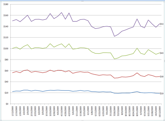
I created a pivot chart based on some raw data for the x axis (dates) and 4 calculated fields for the Y values.

The values on resulting lines are correct (see the data label at the end of the line) but the Y axis is off by about 100, but not off by any consistent amount. I have played with auto axis on and off, turn log scale on and off. All to no avail.

Does anyone have any thoughts?

Image link

Mark Harnett

Posted 2010-01-15T22:49:59.260

Reputation: 1

Answers

5

You are using a Stacked Line chart. This causes your data points to accumulate amongst all the series of data. So, your purple line which should have the value of $53 is actually being reflected as a $53 delta on top of ($43 (green) + $30 (red) + $19 (blue)). If you change the chart type to Line, it will fix this.

user33312

Posted 2010-01-15T22:49:59.260

Reputation:

comment from Mark Harnett: Stacked line it was. Thanks.

– quack quixote – 2010-05-27T23:00:32.547

Thank you, I'd made the same mistake and was going crazy. – Todd Pierzina – 2011-11-08T16:22:11.957

0

Very strange indeed. Have you tried moving the chart to a new sheet (ie so it is a chart sheet, not an object on a worksheet)? What happens if you change the chart type to a column (for example)? and back?

The lowest (blue) series seems about right - the $19 is just below the $20 gridline. The spacing between them also looks OK - 11, 13, 10. Except the 19 would be a little low compared to those space values, as if the Y axis did not have a true zero.

Daft question time - why use a Pivot Chart at all if you have all these data points? Why not go for a standard XY chart?

What Excel version is this? (looks like 2007, but could be 2010 I guess) Can you share a (sanitised) version of the data?

AdamV

Posted 2010-01-15T22:49:59.260

Reputation: 5 011

0

Have you tried manually modifying the y_min, y_max, y_step values ? (in y axis properties)

Btw, what is a "pivot chart" ... this is a regular line plot, is it not ?

Rook

Posted 2010-01-15T22:49:59.260

Reputation: 21 622

A pivot chart is a chart tied to a pivot table, which is a particular object in Excel (and other spreadsheets) that allows easy on-the-fly switching of variables among different axes, handy auto-aggregations, etc. http://en.wikipedia.org/wiki/Pivot_table

– phoebus – 2010-01-16T00:29:59.953

-1

Workaround: Create a new series (stacked format) on the primary axis that is equal to the series with the highest values in the data set (the purple data set in the example above).

Once created, colour this new line (or bar in my case) the same as the background (border too) so it does not appear on the graph. Now switch all the series you had before to the secondary axis. This will create two axes on the graph, hopefully with the proper one (in terms of scale) on the right.

Now just colour the axis you don't want the same as the background. Don't delete it - it will muck it all up.

Death by Excel

Posted 2010-01-15T22:49:59.260

Reputation: 1