A little finicky, but if your data (or more importantly, you vertical category labels) are relatively stable, this works:
Setup you data as:
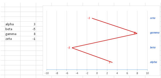
|alpha| 3|1|
|beta |-5|2|
|gamma| 8|3|
|zeta |-1|4|
Create a scatter plot with the second two columns. You should now have the line in the shape you want.
- Copy the first two columns, select the chart, and use Paste Special to add cells as a "New Series".
- Now you'll have a second line, rotated. Right click on the new series, and "Change Series Chart Type" to Bar (horizontal bars).
- In the Ribbon, under Chart Tools->Layout->Axes select Secondary Vertical Axis->Show Default Axis.
- Format the bar chart series to have No Fill and No Border Line to make them invisible.
- Format the Primary Vertical Axis and adjust the Min to 0.5. You may have to fiddle with Min/Max, and unit size to get things to line up.
- Set Axis Labels to "None" to remove the irrelevant numerical vertical labels.
- Optionally remove the duplicate horizontal axis.


User the excel camera tool. See https://www.ablebits.com/office-addins-blog/2014/07/09/rotate-chart-graph-excel/
– DavidPostill – 2015-07-05T14:10:17.467...out of excel 2003? – Serge – 2015-07-05T14:34:45.017
2This is an XY scatter graph. – wbeard52 – 2015-07-05T17:09:30.837
Agree with @wbeard52. The important part is getting the order of points correct because Excel will connect them in the order they are shown. Getting the labels down the side is harder. It can be done with some help from a dummy series with data labels. See: http://stackoverflow.com/questions/30300014/how-to-create-a-text-based-y-axis-on-excel-chart/30399690#30399690
– Byron Wall – 2015-07-06T15:03:55.483the scatter graph is horizontal, not vertical – Serge – 2015-07-07T09:04:32.687