I was wondering the same thing, and spent some time playing with Terminal today. It seems that the text selection colour for an unfocused Terminal window is actually derived from the background colour set for that window.
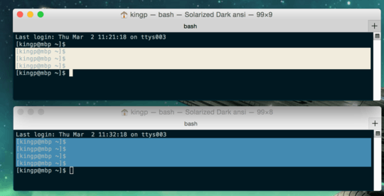
Try this: open up the Profiles tab in the terminal settings window, double click on a profile you don't use to open a new Terminal with that profile, and then switch to the 'Window' sub-tab in the settings. Here you can set the background colour. If you select some text in your new Terminal window, and drag the background colour slider around (ensure that the Terminal window has lost focus), you'll see that the colour of the selection highlight changes also.
Specifically, it seems that there is a cutoff at "45% brightness" or so. For background colours lighter than this the selection colour is a darkened version of the background, and for background colours darker than this the selection colour is lightened.
Ultimately this is a disappointing discovery; it means that we can't control the text highlight colour in unfocused windows directly! In particular this is bad news for Solarized inspired designs, because the legibility of the text depends on the carefully chosen contrast balance between the text colour, and the light and dark background/selection colours.
For reference, here are the colours I'm running with in my modified Solarized Dark theme:
- Text colour: #90A6A9
- Selection colour: #EEE8D5
- Background colour: #021319