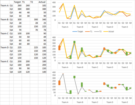
To plot all the teams (it's a little cluttered, but I bet if there was more order in the data it would look better) you can arrange the data as shown below. Make a line chart (top chart), add and format the up-down bars (middle chart), then format the Target and Actual series to use no lines, and the T1 and T2 series to use the same format. I used two series that alternate teams so there is no connecting line from one team to the next.
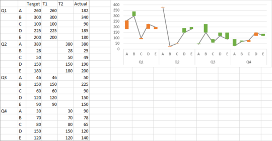
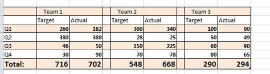
Or you could sort the data this way, so all teams are together for each quarter.
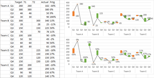
For labeling the bars, you really will label the Actual series. I've inserted another column with labels, using this formula in H3 (the data range is B2:H22)
=IF(G3>=D3,TEXT(G3/D3-1,"0%"),"")&CHAR(10)&IF(G3<D3,TEXT(G3/D3-1,"0%"),"")
What this does is give me a two line label, separated by CHAR(10), which is a carriage return. If there is an increase, the positive percentage change is shown in the top line, a carriage return, and a blank ("") in the bottom line. If there is a decrease, there is a blank in the first line, a carriage return, and the negative percentage in the bottom line.
Select the (invisible) Actuals line and add data labels (right click menu, ribbon, or plus icon in Excel 2013; top chart below). Use the Center position for the labels, so they are centered on the Actuals points (positive percentages above, negative below), and in Excel 2013, use the Values from Cells label option, using the labels constructed in column H. In earlier versions of Excel, Rob Bovey's free Chart Labeler add-in (http://appspro.com) will allow you to add labels from a cell range.
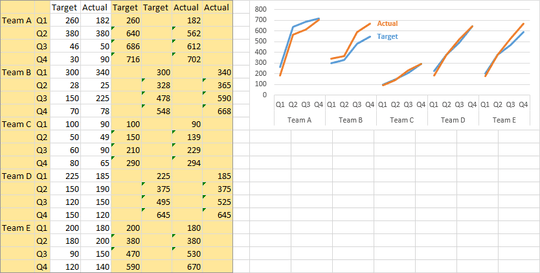
It doesn't make sense to try to plot cumulative values in the same chart, whatever your boss wants. Here's the data. The formulas in the last four columns simply perform the cumulative sums based on the unshaded quarterly data. I've used two columns each for computed cumulative Target and Actual so that the lines break between teams. Copy the first two and last four columns (shaded in the data below) and insert the chart.
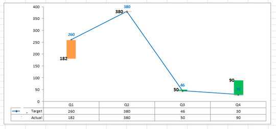


woah, @JonP , thanks very much, This is such an amazing response. And very helpful. I am not 100% sure I understood the concept of T1 and T2. You said, you didn't want lines to be connected. I am not understanding that :(
Also, you said **so all teams are together for each quarter ** - for that one, why are we showing connected lines between different teams? Shouldn't they be just discrete points in space with up or down bar? Point A has orange down bar, Point B has green up bar but Point A and B are different teams. So, why connect? How to read, present, explain this graph/chart? – RedChrys – 2015-03-14T03:27:14.863
I use two separate series to connect alternate groupings of data, rather than having one series that I would have to manually hide the line between groups. A common trick I use. And I connect the groups, even if they show different teams, because it helps to delineate the groups. In this case, the lines group the points in a gestalt sense, not in a trend sense. – Jon Peltier – 2015-03-15T13:20:14.413