Excel - How to create a stacked radar chart?

4

1

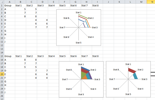
I am trying to create a stacked radar chart in Excel similar to this:
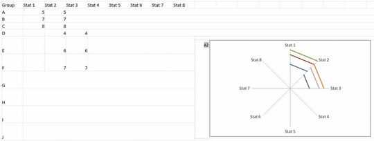
SO28503056 question example.

I have to fill color in the space between the red and blue lines. I have tried every which way I can think of but to no avail.

Would really appreciate any help.

Spreadsheet here: https://www.dropbox.com/s/lzj3d0iyrjfpwtx/ExcelRadar.xlsx?dl=0

user1542743

Posted 2015-02-13T15:32:41.633

Reputation: 43

Is this not the right place for this question? Is there a more appropriate forum? Thanks. – None – 2015-02-13T15:40:37.943

What do you mean fill color between red and blue? – Raystafarian – 2015-02-13T16:42:04.063

Answers

3

If you want a colored band between the red and blue lines in your example, then use the Filled Radar chart type. You'll have to organize your series from largest to smallest - the reverse of what it is now - and then set the fill for the smallest series to be white. This will give the appearance of just a band of color instead.

This solution might not work for you based on how complicated your real data is - I'm asuming this is just a mockup - but there's not a native way to make a "donut" version of the radar chart. (I.E, Pie Chart is to Doughnut Chart as Radar Chart is to #ERROR! VALUE NOT FOUND!)

Screenshot of Radar Charts

Engineer Toast

Posted 2015-02-13T15:32:41.633

Reputation: 3 019

Thank you so much!! I am really appreciative of your help. I think I can work with this and make the chart I need to. Thanks again. One other question on this -- is there a way to fill the last cone (i.e. between Stat 8 and Stat 1) with data -- it can't be done with the way I am currently using. Thanks – user1542743 – 2015-02-13T17:16:14.107

I can't upvote your answer yet as I don't have 15 reps yet. The solution is great! – user1542743 – 2015-02-13T17:33:00.817

1@user1542743 To get it to connect from 8 to 1, you just need to repeat the numbers from Stat8 in the Stat1 column on the corresponding rows. – guitarthrower – 2015-02-23T20:10:49.477