Finding the right graph to display inter-department connections

1

1

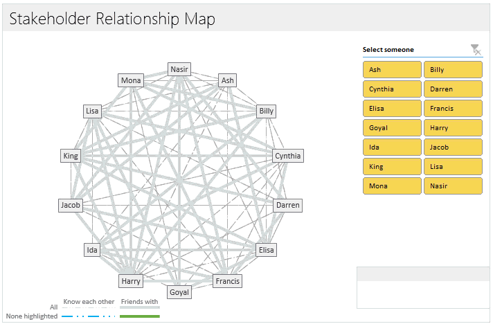
I have a task of displaying the interconnection between departments at my university. The idea is to show how many departments come together to work on a project. The data I have lists the projects in an Excel file, the collaborators, and the collaborators' departments. How would you go about drawing a graph from this data? It is required that the names of departments are showcased and that there are lines connecting departments to departments. If one department (through more projects) is connected to an other department multiple times, the line should get thicker... In what software / environment would this be the easiest implement? I have familiarity with programming languages as well.

Thank you in advance!

user3616457

Posted 2014-11-26T07:51:55.123

Reputation: 13

Question was closed 2014-12-05T15:01:22.480

Try http://softwarerecs.stackexchange.com/ but please first read What is required for a question to contain “enough information”.

– DavidPostill – 2014-11-26T08:32:51.850

Answers

1

If you want to do it in Excel, Chandoo has a tutorial on creating a network relationship chart here

enter image description here

teylyn

Posted 2014-11-26T07:51:55.123

Reputation: 19 551

Now only if I could figure out how add more than 20 stakeholders... – user3616457 – 2014-11-26T23:31:04.547

Teylyn, would you mind expanding this answer-right now its essentially a link-only answer. – dav – 2014-12-01T12:48:40.647

1@dav If somebody asks what the best software is to do tabular calculation, one possible answer would be that it's Microsoft Excel and a link to where it can be downloaded. This answer is the same concept. You wouldn't expect me to provide the Excel source code and I don't think I need to provide the code for this tool to make this a valid answer. Yes, it contains a link to the tool, but it also shows what the product is called, what it does and who created it. That's not a link-only answer. – teylyn – 2014-12-01T19:11:20.827

0

teylyn's answer is definitely the best choice.

But you can do this many different ways. From a coding standpoint, you could do this with any language that supports reading data from an Excel file, reading data from a file type Excel can either export or save as, or has an API for Microsoft Documents.

It would also be useful if the language chosen supports rendering images to the screen or creating some sort of image file (bmp/png/jpg/...) or has an API that does either of the aforementioned. So that you can either view the graph on your computer or print the graph.

If the language chosen to read the Excel file differs from the language to create the graph, then that is ok too. You can use both languages and figure out a way to resemble the data gathered from language one in such a way as to be usable by language two.

I would personally use Java, although VB.net can apparently read Excel files without the need of an API.


Here are some APIs for Microsoft Documents with their respective languages:

Here are some links about the graphical portion:

Jonny Henly

Posted 2014-11-26T07:51:55.123

Reputation: 540