6
3
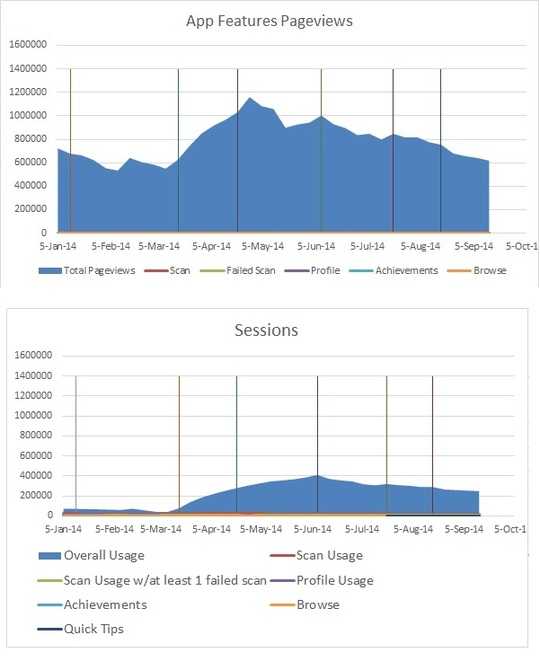
I am trying to add in vertical lines to my line charts to represent an important data/event, and the way I went about doing so was adding in the max value of the y range for the specific date as seen below and making it into a bar chart.
But the problem is I have over 22 charts that I want to have these vertical lines on, and all of them have different y ranges.
What ends up happening is the lines look either too short or in the case in the bottom, go off range to make the data look too small/unviewable.
Does anyone know any other solutions for adding in vertical lines like seen below, but a solution that doesn't require me to make a unique vertical line for each chart?

Michelle Park
Posted 2014-10-13T17:19:02.670
Reputation: 63
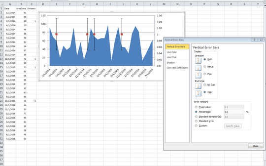

Thank you F106dart! That worked! I'm now trying to figure out to apply this solution to charts that already have a secondary axis... – Michelle Park – 2014-10-14T17:15:44.000
Try determining the average of the data already plotted on the secondary axis, and use that average in place of the "1" values shown in column C above. Then the technique of using a 100% error bar should still work. Your secondary axis shouldn't need to be changed in this case, if I'm not mistaken. – F106dart – 2014-10-14T18:29:06.767
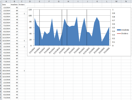
Hi F106dart. Thank you! It does work even with a secondary axis. – Michelle Park – 2014-10-22T18:29:37.933