Create a stacked bar chart that displays data in monthly intervals?

4

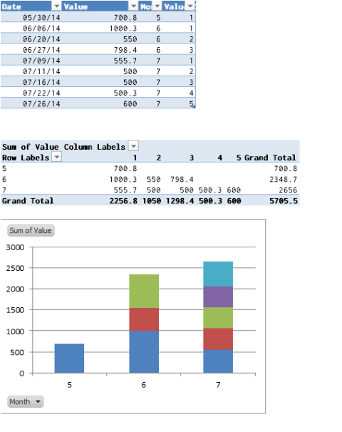
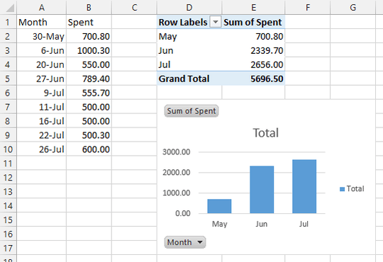
I have a table with dates and prices, and I want to create a bar chart, which shows me total amount spent in months. Table looks like this:

30.5.2014   700,80 CZK
6.6.2014    1 000,30 CZK
20.6.2014   550,00 CZK
27.6.2014   789,40 CZK
9.7.2014    555,70 CZK
11.7.2014   500,00 CZK
16.7.2014   500,00 CZK
22.7.2014   500,30 CZK
26.7.2014   600,00 CZK

I created a stacked bar chart with help of this article. It displays 3 bars - for May, June and July (correct), with values on them (also correct - in June there is 1000.30, 789.40 and 550.00). However it is displayed as one bar and the value where the bar meets Y axis is always the first value - in June it is 1000.30, not 2339.70:

Example screenshot

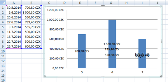
How can I modify this chart, so it displays all prices in one month on one bar, but each with different color stacked one on another?

WellBloud

Posted 2014-07-30T07:35:23.813

Reputation: 143

Answers

3

For Excel to create a Stacked Column Chart, you'll need to separate the items you want "stacked" into separate series so Excel will know what to do with them. Here's a quick way to accomplish that:

  1. Convert your data into an Excel Table. Name Column A Date & Column B Value.
  2. Add two helper columns to your Table (not completely necessary, but they'll make it easy):
    • Month =Month(A1)
    • ValueID =IF([@Month]=A1,B1+1,1) Basically counts each month's values. If you have another way to identify the values, you can use it instead of this.
  3. Insert a Pivot Table based upon your chart, with the following values:
    • Row Labels = Month
    • Column Labels = ValueID
    • Values = Values (sum)
  4. Create a Stacked Column Pivot Chart from your Pivot Table.

Here's what it looks like with Excel defaults:

Stacked Pivot Chart

dav

Posted 2014-07-30T07:35:23.813

Reputation: 8 378

0

You asked for single bars showing totals for each month, so the stacked bar chart is overkill.

Make a pivot table of your data, with date in the rows area and amount spent in the data area. Right click on one of the dates in the pivot table, select Group from the pop-up menu, check Months and make sure other options are unchecked. This shows the monthly totals in the pivot table.

Insert a chart. This is a pivot chart, which tracks exactly the data in the pivot table.

Data, pivot table, and pivot chart

Jon Peltier

Posted 2014-07-30T07:35:23.813

Reputation: 3 470