How to antialias trendline in Excel?

4

I have created a couple of line charts in Excel 2011 for Mac. The actual data line looks good and is antialiased in a nice way but when I then add a trendline it is jagged and ugly:
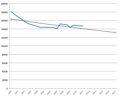
Example of antialiased data line and ugly trendline

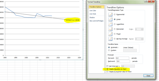
I have tried "all" options available under Format Trendline, to no avail. There is an option "Soft Edges" but it doesn't seem to work as expected: when I increase the value there the trend line gets more and more narrow until it disappears.

d-b

Posted 2014-06-09T16:37:51.450

Reputation: 392

3Not aware of any antialias option, however can you right-click the trendline, make the formula governing the trendline visible, and use that to plot a second series on your chart to replace the jagged trendline? – Andi Mohr – 2014-06-09T16:46:46.310

Thanks. Really stupid but I guess it works. – d-b – 2014-06-10T17:30:54.930

Yep, hardly ideal but glad it worked for you. – Andi Mohr – 2014-06-11T09:12:40.220

1@AndiMohr please add this as an answer so that the OP can mark it as accepted (if they choose). – dav – 2014-06-11T16:54:56.537

Answers

2

There's no way to set the anti-alias status of the trendline, but one workaround would be to replicate the trendline by adding another standard series to your chart.

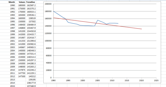
Here's our workbook (the trendline isn't as jagged on this image because my graphics editor helpfully reduces the jaggedness - believe me it is there):

enter image description here

  1. Right-click the trendline and select Format Trendline. Tick the box towards the bottom titled Display Equation on chart. The formula for the trendline will appear to the right of the line.

    enter image description here

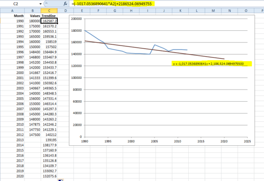
  2. Add a new column to your data, titled Trendline. Copy the text of the formula label on your chart and paste it into cell C2. Now alter the formula so that any x references are replaced with cell references for your x-axis value (in this case the month or year).

    Copy the formula down, and add the Trendline series to your chart. A red line appears - however it's not where we expect!

    enter image description here

  3. The reason for this is that the formula Excel shows you on the chart has been rounded (as explained very well here).

    We need to right-click the formula label and select Format Trendline Label. Change the number format to show lots of decimal places. 10DP should be plenty. Note that the label has changed on the chart.

    enter image description here

  4. Revise the formula you created in step 2 with the more precise calculation, then copy down. You should find that the red line moves to sit over the top of your trendline.

    enter image description here

  5. The final step is to remove the jagged non-antialiased trendline. All done! That's much better.

    enter image description here

Andi Mohr

Posted 2014-06-09T16:37:51.450

Reputation: 3 750

Thank you. Microsoft, this is ridiculous! Next time I am gonna try iWork. I am 100% sure that Apple wouldn't make such an oversight. Trendlines and antialiasing has been available in more than 10 years, it is impossible that I am the first that complains about this. – d-b – 2014-06-12T14:47:58.610

The more you use Excel, the more little niggles you find that seem 'ridiculous' that Microsoft have not yet addressed. But in fairness to Microsoft their engineers do have to ruthlessly prioritise which features to work on and which are niggles that are minor, and can be ignored. I can understand them allowing this relative tiddler of a problem to slip through the net. Still very frustrating though! – Andi Mohr – 2014-06-12T15:59:25.060